Modal
Modal (popup) component, in fullscreen and centered-block. Includes a Btn component for triggering the modal, and a Flow component for when there are multiple modals that follow a wizard-style of flow.
Usage
The simplest way to use the modals is with a the <Btn> component, which will handle the logic for showing and hiding them.
The <Btn> will pass through all properties to the modal.
import ModalBtn from 'patchkit-modal/btn' // define the "forms" to go inside the modal:Component // ...Component // ... // single modal<ModalBtn = ="fullheight" =>Click to open</ModalBtn> // modal flow<ModalBtn = ="fullheight" =>Click to open</ModalBtn>The <Btn> wraps its children in a clickable region, but adds no visual elements, so you can put custom elements inside to control its appearance:
<ModalBtn = ="fullheight" => <a ="btn highlighted">Click to open</a></ModalBtn>However, you can use the modals directly, if you want to show/hide the modal using different logic.
import ModalSingle from 'patchkit-modal/single'import ModalFlow from 'patchkit-modal/flow' <ModalSingle = ="fullheight" = = /><ModalFlow = ="fullheight" = = />The 'Form' should implement a submit(cb) function, to be called when the Modal's next/finish button is pressed.
It should also call...
this.props.isValid(true|false)to indicate whether next/finish should be clickable.this.props.isHighlighted(true|false)to indicate whether next/finish should be highlighted blue or not.this.props.setHelpText(str)to set some help-text at the bottom of the modal.
Example:
Component { thisstate = inputValue: '' } { thisprops this } { thisprops thisprops } { console } { const onInputChange = { this } return <div => <form> <h1>Modal Form</h1> <p><label>What is your name?<br/><input ="text" = = /></label></p> </form> </div> }} <Btn = ="center-block" =>Click to open</Btn>Other properties:
- On
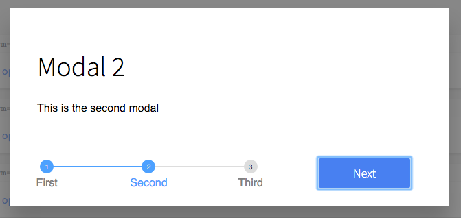
<Single>, you can setnextLabelandcancelLabelto control the button text at the bottom of the modal. - On
<Flow>, you can setlabelsto an array of text labels to be put on the stepped progress-bar. - On single modals (or a
<Btn>to one), you can setformPropsto an object of properties to pass to the Form on render. - On flow modals (or a
<Btn>to one), you can setformsPropsto an object of properties to pass to the Forms on render.
Styles
There are two classes that are included with the styles, "fullheight" and "center-block".
Use the .less file:
"node_modules/patchkit-modal/styles.less"