Sherpany UI Core
📚 General information
React components library based on Ant Design. Main ideas:
- isolated development of components
- organize global components structure
- show all available states for each component
Installation
Clone this repository and install dependecies with command yarn.
Run
yarn storybookfor develpoment.yarn buildfor build static files.
Testing
yarn testfor run all testsyarn test:watchfor run tests in watch mode
Tools
There is list of used tools for develop our components:
Project Structure
.ui-core├── .storybook # all files related storybook configuration │ ├── addons.js # setup addons │ ├── config.js # global configuration │ ├── postcss.config.js # config for postcss-loader │ ├── sherpanyTheme.js # custom theme │ └── webpack.config.js # custom webpack config ├── build # public folder for host on server ├── source # sources (components, utils, constants) │ ├── components│ │ └── ui # ui related components (buttons, dropdowns, inputs, tables, etc...) │ └── framework # some usefull libraries that can be used across the app│ ├── static # all static files (images, fonts, music, videos, files for localization) │ ├── fonts│ └── images├── .eslintrc.json # ESLint config └── index.js # file with exports of components for reusing in our projects Component structure
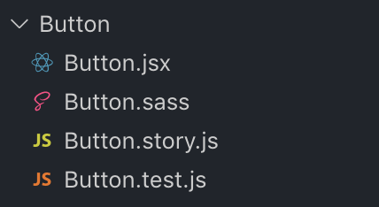
Usually component includes four files:
[name].jsxcomponent itself[name].sasscomponent styles[name].story.jscomponent story[name].test.jscomponet tests