tabSlider 1.0.0
重构了原有tabSlider的底层实现,自定义程度更高。
综述
TabSlider: 横滑交互组件
API说明
属性
| 名称 | 类型 | 默认值 | 描述 | 是否必填 |
|---|---|---|---|---|
| tabList | Array | null | 内容列表,一个item对应一个tab | 是 |
| itemWidthList | Array | null | 每一个头部tab item的宽度,用以计算切换时滚动的距离 | 是 |
| tabStyle | Object | null | 头部tab的样式,scrollview父容器的样式 | 是 |
| tabInnerStyle | Object | null | 头部tab内容的样式,scrollview的样式 | 是 |
| tabFocusStyle | Object | null | 选中tab item的样式,使用了该样式时,会增加选中tab的动画 | 否 |
| renderTabItem | Function | null | 渲染每一个tab item的方法 | 是 |
| renderPage | Function | null | 渲染每一个tab对应主体内容的方法 | 是 |
| renderNav | Function | null | 渲染每一个tab nav的方法,对应着头条的下拉展示更多 | 否 |
| renderLoading | Function | null | 作用于非当前页,用于渲染loading提示 | 否 |
| tabClickCallback | Function | null | 点击头部tab或者切换列表内容时的回调函数 | 否 |
| pageTop | Number | 取tabStyle或者tabInnerStyle的高度 | tab内容距离头部的高度 | 否 |
| sidesDisablePan | Boolean | false | 第一帧禁止往左滑动,最后一帧禁止往右滑动 | 否 |
| active | number | false | 默认初始化的tab | 否 |
| navTop | bool | false | tab nav在头部还是在底 | 否 |
| width | number | 750 | tab渲染宽度,默认全屏 | 否 |
| height | number | 全屏 | tab渲染高度,默认包含tab nav全屏 | 否 |
事件
| 名称 | 类型 | 默认值 | 描述 | 是否必填 |
|---|---|---|---|---|
| onChange | Function | null | 点击头部tab或者切换列表内容时的回调函数 | 否 |
方法
this.refs.TabSlider.slideTo(2)
- 用于从外部主动切换到对应的tab项
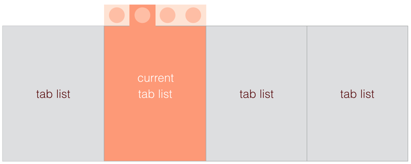
布局说明
tabSlider的布局是使用绝对定位布局,大致的布局方式如下图。所以,使用该组件时,需要在tabbar的外层有足够宽高让其撑满,建议tabbar的外层容器使用绝对定位布局。
使用方法
tabSlider 1.0.0 采用了类似ListView renderRow的渲染方法。对tab头、tab体的渲染都需要使用对应的渲染方法。具体来说,如果需要例子中效果,需要实现几步:
1、定义tabItem,既demo中的热门、黑板报等导航内容。eg:
/** @jsx createElement */'use strict';;;;;; { const itemData index currentIndex isRenderCurrent = thisprops; if itemData return <View style= isRenderCurrent && index === currentIndex ? stylestabItem stylestabItemCur : stylestabItem > itemDataname ? <View style=stylestabTitle> <Text style= isRenderCurrent && index === currentIndex ? stylestabText stylestabTextCur : stylestabText > itemDataname </Text> </View> : null </View> ; return null; } ;2、 tabItem的传入数据包括 itemData, index, currentIndex, isRenderCurrent。
其中itemData是开发者自己定义的导航list数据如下,根据渲染方法的不同。数据格式和内容均是可以自定义的:
tabList: ,3、定义renderPage,渲染tab的contain部分,以下是一个典型的tabPage。
{ const index = thisprops; return <ListView id=`list` ref=`list` renderRow=thisrenderRow dataSource=thisqdList /> ; } { const index = thisprops; return <Item itemData=itemData index=i pageIndex=index />; }; 4、可选定义切换时的动画组件 renderLoading
{ return <View style=stylespageLoading data-ignore="true"> <Image style=stylesloadingImg source= uri: '//gw.alicdn.com/tfs/TB1x9J7PXXXXXcHXVXXXXXXXXXX-140-80.gif' /> </View> ; } 5、 其他API请参考上面的API文档和使用demo。
** PS:如果依旧无法实现,可使用脚手架打开场景场景市场,查看tabSlider的使用源代码。**