
NgxUtilitarioRclt
This library was generated with Angular CLI version 8.0.1.
The library is in developmenting
documentation with compodoc
testing with jasmine and karma
quality with sonaqube
documentation
Run npm run compodoc
testing
Run npm run test
quality
Run npm run sonarqube
Further help
send a email to renatoclt@hotmail.com. i try help you.
Installation
Install ngx-utilitario-clt from npm:
$ npm install ngx-utilitario-rcltFeatures
- Pipes:
-- highlight
-- numberToArray
- Components (Adding manual):
-- Loading
--- Spinner, ellipsis.
-- cards
-- chat
-- Dynamic-Component
-- form dynamic
-- graphics
-- icons
-- mapbox
-- menu
-- modal
-- perfect-scroll
- Class (Adding manual):
-- Fecha
Usage
Highlight
Add package to NgModule imports:
 imports: [
    NgxUtilitarioPipesModule
  ],
Example
.html
<div innerHTML="{{ message | highlight : search}}">.ts
export class AppComponent {
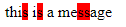
message = 'this is a message';
search = 's';
}.css
::ng-deep .search-highlight{
    background: red;
}
Result
NumberToArray
Add package to NgModule imports:
 imports: [
    NgxUtilitarioPipesModule
  ],
Example
.html
<div *ngFor="let i of number | numberToArray">
  {{i}}
</div>
.ts
export class AppComponent {
  number = 5;
}
Result

loading
Add package to NgModule imports:
    import {NgxUtilitarioLoadingModule,
        LOADING_INDICATOR_CONFIG,
        EllipsisComponent} from 'ngx-utilitario-rclt';
  @NgModule({
    imports: [
      NgxUtilitarioLoadingModule
    ],
    providers: [
      {provide: LOADING_INDICATOR_CONFIG, useValue: {
        size: '5.5',
        color: '#fff',
        overlayColor: 'rgba(100,100,100,0.3)',
        indicatorComponent: EllipsisComponent
        }}
      ],
    })
  ],
or you can use configuration for default
  providers: [
    {provide: LOADING_INDICATOR_CONFIG, useValue: DEFAULT_CONFIG}
  ],
You can use "Ellipsis Component" or "Spinner Component". I use spinner for default. i try add more loading
Example I recommend use inside app.component.html .html
<ngx-utilitario-loading></ngx-utilitario-loading>.ts
export class AppComponent implements OnInit {
  ngOnInit() {
    this.triggerLoadingIndicator();
  }

  @startLoading
  triggerLoadingIndicator() {
    setTimeout(this.triggerLoadingIndicatorStop.bind(this), 2000);
  }

  @stopLoading
  triggerLoadingIndicatorStop() {
  }
}
add clt.scss in angular.json pd: i trying delete this step.
"styles": [
  "./node_modules/ngx-utilitario-rclt/clt.scss",
],
pd: i add more styles soon
Handle-error
This component catch their error in a modal
  imports: [
    NgxUtilitarioErrorHandlerModule.forRoot()
  ],
  providers: [
    {provide: ERROR_HANDLER_CONFIG, useValue: DEFAULT_ERROR_HANDLER_CONFIG}
  ],
add clt.scss in angular.json
pd: i trying delete this step.
"styles": [
  "./node_modules/ngx-utilitario-rclt/clt.scss",
],
optional
If you want to see console errors
Create a class, i recommended create a directory helpers, and create the class error-logger
export class ErrorLogger {
  public static logErrorMessage({ message }): void {
    console.error(`An error with the following message has occured: ${message}`)
  }
}
const CustomErrorHandlerConfig: ErrorHandlerConfig = {
  errorHandlerHooks: [
    ErrorLogger.logErrorMessage,
    console.error,
  ]
};

@NgModule({
  imports: [
    NgxUtilitarioErrorHandlerModule.forRoot()
  ],
 {provide: ERROR_HANDLER_CONFIG, useValue: CustomErrorHandlerConfig}
})
pd: soon i adding error send option