
*copy/paste won't work neither in stackblitz or codesandbox because these websites use an iframe to run the code and the clipboard api is not allowed in the iframe
| SpreadTable Version | Angular Version |
|---|---|
| 7.* | 17 |
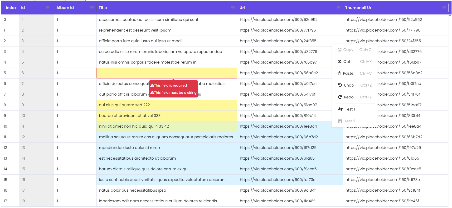
✅ copy/paste/cut functionality with keyboard shortcuts
✅ copy/paste/cut in bulk
✅ copy/paste/cut from and into excel
✅ custom validators support
✅ custom renderer and editor
✅ disabled columns
✅ undo/redo on single or batch changes
✅ resizable columns
✅ extensible column/context menus with events
npm
npm i ng-spread-tableor yarn
yarn add ng-spread-tableimport { SpreadTableModule } from "spread-table";
@NgModule({
imports: [
// Other module imports
...// spread-table modules
SpreadTableModule,
],
})
export class AppModule {}import { HttpClient } from "@angular/common/http";
import { Component } from "@angular/core";
import { Column } from "spread-table";
@Component({
selector: "app-root",
templateUrl: "./app.component.html",
styleUrls: ["./app.component.scss"],
})
export class AppComponent {
title = "spread-table-test";
columns: Column[] = [new Column({ displayName: "Id", name: "id", editable: false, resizable: false }), new Column({ displayName: "Album Id", name: "albumId", minWidth: 120 }), new Column({ displayName: "Title", name: "title", minWidth: 400, validators: [RequiredValidator.required(), RequiredValidator.requiredString()] }), new Column({ displayName: "Url", name: "url", minWidth: 300 }), new Column({ displayName: "Thumbnail Url", name: "thumbnailUrl", minWidth: 300 })];
data: any;
gridInstance: ISpreadTable = new SpreadTable();
@ViewChild("spreadTable") set grid(gridInstance: SpreadTable) {
this.gridInstance = gridInstance;
}
constructor(private httpClient: HttpClient) {
this.getData();
}
private async getData() {
const products: any = this.httpClient.get("https://jsonplaceholder.typicode.com/photos");
}
}<div class="p-3 w-100" style="height: 700px;">
@if(this.data){
<spread-table #spreadTable [columns]="columns" [minColumnWidth]="100" [rowHeight]="36" [indexWidth]="60" [rawData]="data" [undoRedoStackSize]="20" [extraContextMenuItems]="extraContextMenuItems" [extraColumnMenuItems]="extraColumnMenuItems" (cellValueChange)="onCellValueChange($event)" (contextMenuEvent)="onContextMenuEvent($event)" (columnMenuEvent)="onColumnMenuEvent($event)"> </spread-table>
}
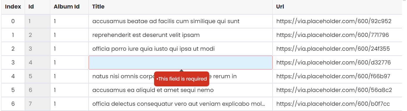
</div>In order for the validators to work correctly they have to be custom. Even the required validator. This way you can set a custom message for the error. See the example bellow:
import { AbstractControl, Validators } from "@angular/forms";

export class RequiredValidator extends Validators {
  public static required() {
    return (control: AbstractControl): { [key: string]: any } | null => (control.value ? null : { required: "This field is required" });
  }
}columns: Column[] = [
new Column({
displayName: "Id",
name: "id",
width: "40px",
editable: false,
}),
new Column({
displayName: "Album Id",
name: "albumId",
width: "70px",
validators: [RequiredValidator.required()]
}),
...
];
| Input | Type | Default | Required | Description |
|---|---|---|---|---|
| [rawData] | any | yes | json data for the table | |
| [columns] | Column[] | yes | column definition for the table. The columns should match the data structure in rawData and also configure the properties of the columns in the grid. See Column class. |
|
| [minColumnWidth] | number | 100 | no | default column min-width in px |
| [rowHeight] | number | 24 | no | default row height in px |
| [indexWidth] | number | 60 | no | default Index column width in px |
| [headerBgColor] | string | '#634be3' | no | header background color |
| [headerColor] | string | '#efefef' | no | header text color |
| [extraContextMenuItems] | ContextMenuModel[] | copy,cut,paste,undo,redo | no | you can define extra context menu items for the grid. See ContextMenuModel class |
| [columnMenuItems] | ContextMenuModel[] | reset column size, reset all columns | no | you can define extra column menu items for the grid. See ContextMenuModel class |
| Output | Type | Description |
|---|---|---|
| (cellValueChange) | Change[] | event fired when a cell value is edited. See Change class. |
| (contextMenuEvent) | ContextMenuModel | event fired when a context menu item is clicked. See ContextMenuModel class. |
| (columnMenuEvent) | ContextMenuModel | event fired when a column menu item is clicked. See ContextMenuModelClass. |
export class Column {
  public name = "";
  public displayName? = "N/A";
  public minWidth?: number;
  public editable? = true;
  public resizable? = true;
  public validators?: any[] | undefined;

  constructor(obj?: Column) {
    Object.assign(this, obj);
    if (!obj?.displayName) {
      this.displayName = obj?.name;
    }
  }
}
export class ContextMenuModel {
faIconName?: string = "";
menuText?: string = "";
menuEvent?: string = "";
shortcut?: string = "";
disabled?: boolean = false;
}export class Change {
beforeValue: any;
afterValue: any;
coordinates = { rowIndex: 0, columnIndex: 0 };
constructor(pagObj?: Change) {
Object.assign(this, pagObj);
}
}
The idea was to implement a web spreadsheet with minimal functionality. The beauty of this plugin is that you can build on this and implement your custom scenarios rather than use some generic implementation of different features.
Note: This plugin is till work in progress
- update to angular 17
This repository is licensed with the [MIT].