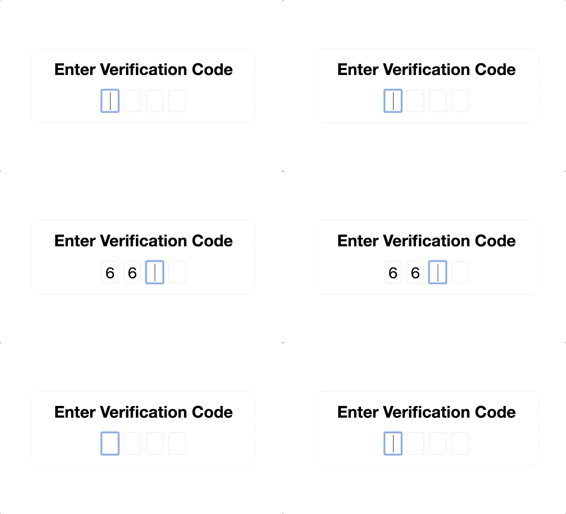
Ngx-SplitInput

Usage
-
Install library:
npm install --save ngx-splitinput -
Import the
NgxSplitInputModuleinto your Angular module:import {NgxSplitInputModule} from 'ngx-splitinput'; @NgModule({ imports: [ NgxSplitInputModule, ... ], ... }) export class AppModule { } -
Use the
NgxSplitInputComponentin you template as follows:<ngx-split-input> <input ngxSplitInput type="text" maxlength="1"> <input ngxSplitInput type="text" maxlength="1"> <input ngxSplitInput type="text" maxlength="1"> <input ngxSplitInput type="text" maxlength="1"> </ngx-split-input>
Currently only input elements of type 'text', 'number' and 'password' are supported. The ngxSplitInput directive has to be places on every input element contained in the SplitInput component. The 'type' and 'maxlength' arguments are required for every input.
For an example implementation see the code of the Sample App.
Options
This section describes the inputs of the component. All inputs are optional.
Inputs
autofocus: boolean = true: If set totruethe first input element will be focused on page load.clipboard: boolean = true: If set totrueautofill for textual content from clipboard is enabled.
Outputs
completed: any: Is emitted when the SplitInput fields are filled out completely and contains the concatenated value of the SplitInput fields.
