
The library it's compatible with bootstrap 3 and angular 4 and it's possible add a image as a help to message.
https://angular-popover-image.stackblitz.io
https://stackblitz.com/edit/angular-popover-image
To install this library, run:
$ npm install ngx-popover-image --saveYou can import your library in any Angular application by running:
$ npm install ngx-popover-imageand then from your Angular AppModule:
import {BrowserModule} from '@angular/platform-browser';
import {NgModule, ViewChild} from '@angular/core';
import {Component} from '@angular/core';
import {platformBrowserDynamic} from '@angular/platform-browser-dynamic';
import {NgxPopoverImageModule} from 'ngx-popover-image';

@Component({
    selector: 'app',
    templateUrl: 'app.component.html'
})
class AppComponent {

    public imageUrl = 'image.svg';
    image = 'https://www.completedietsolutions.org/Member/completedietsolutions/Images/woman-smiling-png-e1422243041656.png';
    constructor() {
    }
}

@NgModule({
    bootstrap: [AppComponent],
    declarations: [AppComponent],
    imports: [BrowserModule, NgxPopoverImageModule]
})
class AppModule {
}
Once your library is imported, you can use its components, directives and pipes in your Angular application:
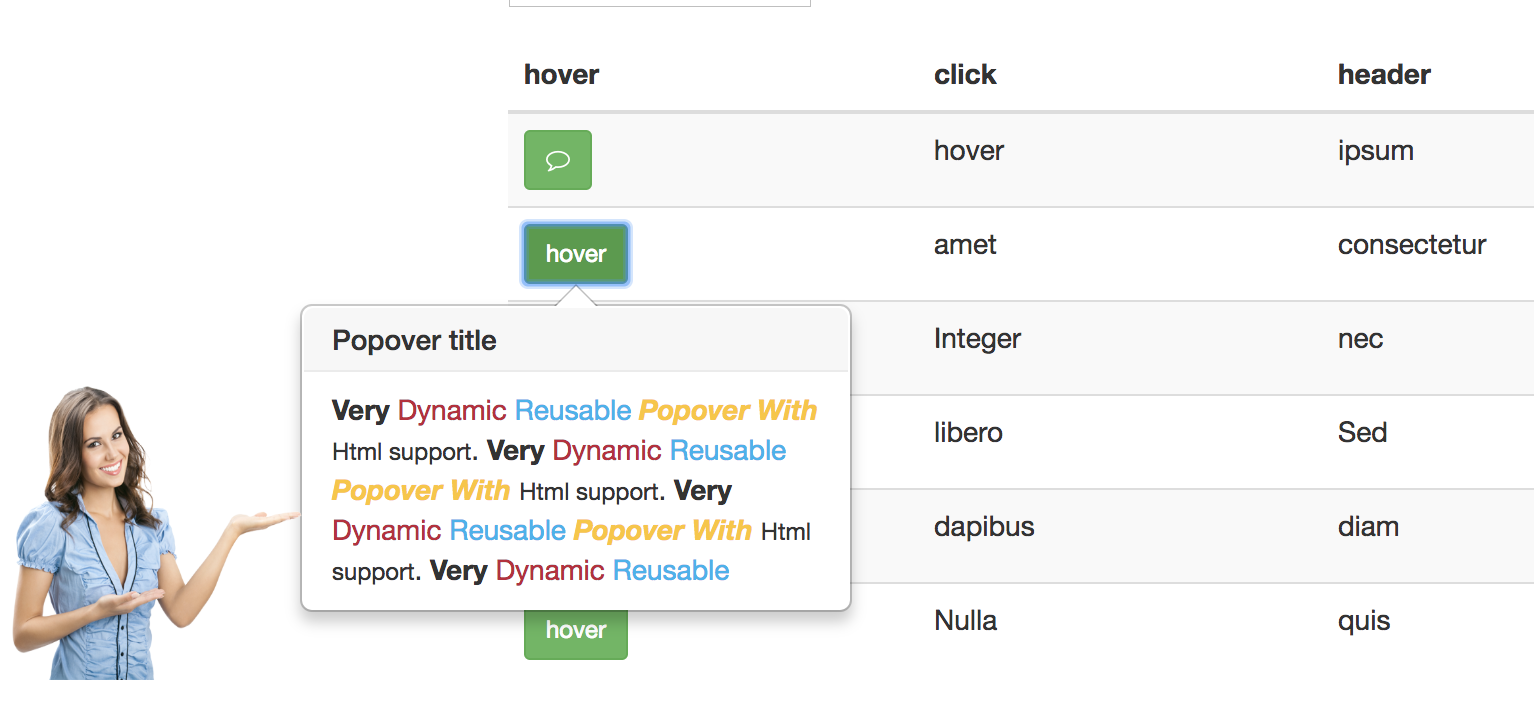
<ngx-popover-content #myPopover
                 title="Popover title"
                 placement="right"
                 [animation]="true"
                 [imageUrl]="imageUrl"
                 [closeOnClickOutside]="false" >
    <b>Very</b> <span style="color: #C21F39">Dynamic</span> <span style="color: #00b3ee">Reusable</span>
    <b><i><span style="color: #ffc520">Popover With</span></i></b> <small>Html support</small>.
    <b>Very</b> <span style="color: #C21F39">Dynamic</span> <span style="color: #00b3ee">Reusable</span>
    <b><i><span style="color: #ffc520">Popover With</span></i></b> <small>Html support</small>.
    <b>Very</b> <span style="color: #C21F39">Dynamic</span> <span style="color: #00b3ee">Reusable</span>
    <b><i><span style="color: #ffc520">Popover With</span></i></b> <small>Html support</small>.
    <b>Very</b> <span style="color: #C21F39">Dynamic</span> <span style="color: #00b3ee">Reusable</span>
</ngx-popover-content>
<br><br><br><br><br>
<button [popoverImage]="myPopover" class="btn btn-danger">popover.</button>- image: source image url
- customClass: default value ''
To generate all *.js, *.d.ts and *.metadata.json files:
$ npm run buildTo lint all *.ts files:
$ npm run lintMIT © Milver Flores Acevedo