ngOnboarding
ngOnboarding is a tooltip tutorial / onboarding framework for Angular.js that can help give your user a better onboarding experience. The API is still in flux and it is not well-tested, so be aware before using it in production.
Dependencies
This library requires Angular.js 1.2 or greater along with any recent version of jQuery.
Demo
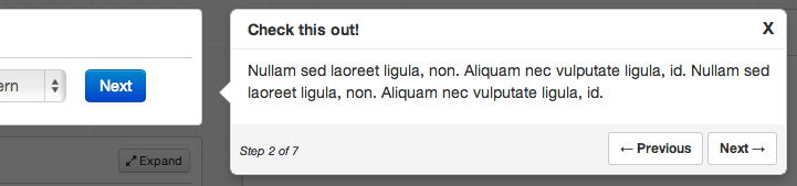
You can find a very simple example of ngOnboarding here.
The Basics
To use the library, add the JS and CSS file, then include the module in your app
app = angularNext, you'll need to configure the steps for the onboarding experience. The configuration is an array of objects, each representing a single popover. Here is an example configuration containing 2 popovers:
$scopeonboardingSteps = title: "Welcome!" position: "centered" description: "Welcome to my app!" width: 300 title: "Account Setup" position: "right" description: "This is the form for configuring your account." attachTo: "#account_form" position: "bottom" ;The directive itself is called onboarding-popover. There are 2 required inline attributes.
enabledshould be set to a boolean scope variable that controls whether the onboarding UX is displayed.stepsshould point to the steps configuration.
There are also 2 optional inline attributes.
onFinishCallbackshould point to a function that will be called when the user either clicks the Close or Done button. This is a good place to set a cookie to disable showing the on-boarding UX every time.stepIndexis an integer that controls the current step being shown. It will default to 0 if not set explicitly.
Step Configuration Options
There are a number of options that can be passed to each step in your on-boarding process. These are set in the array of step objects, as shown above.
| Option | Default | |
|---|---|---|
| Title | null | Title of the popover |
| description | null | Content of the popover. May contain HTML. |
| attachTo | null | CSS selector for the element to attach to. Optional |
| position | null | Position of the tooltip relative to the attached element. Optional. Accepted values are 'left', 'right', 'top', 'bottom', or 'centered', All but centered require that attachTo is set. |
| width | null | Width of the popover. Defaults to the width of the content. |
| height | null | Height of the popover. Defaults to the height of the content. |
| top, right, bottom, left | null | Set the positioning of the popover explicitly. |
| height | null | Height of the popover. Defaults to the height of the content. |
| xOffset | null | Offset the horizontal position of the popover relative to the attached element. |
| yOffset | null | Offset the vertical position of the popover relative to the attached element. |
Overriding Directive Defaults
You can also pre-configure some options during your app's configuration phase.
app| Option | Default | |
|---|---|---|
| overlay | false | Use a modal overlay for popovers by default |
| overlayOpacity | 0.6 | Opacity of the modal overlay |
| showbuttons | true | Show the next and previous buttons |
| showDoneButton | true | Show a 'Done' button on the last popover |
| showStepInfo | true | Shows 'Step X of Y' text on each popover |
| closeButtonText | X | Text/HTML used for the close button |
The CSS classes used in the HTML are also configurable. Please see the source for more info.
Browser Support
So far, it has only been tested in Chrome. There is some CSS that is not compatible with with older browsers, including IE9.
Future Updates
- Test coverage
- Ability to add an enter and leave callback to every step.
Contributing
Contributions are welcome. Whenever possible, please include test coverage with your contribution.
- Fork it
- Create your feature branch (
git checkout -b my-new-feature) - Commit your changes (
git commit -am 'Add some feature') - Push to the branch (
git push origin my-new-feature) - Create new Pull Request
To get the project running, you'll need NPM and Bower. Run npm install and bower install to install all dependencies. Then run grunt in the project directory to watch and compile changes. And you can run karma start to watch for changes and auto-execute unit tests.
Credit
Much of the CSS consists of tweaked versions of several Bootstrap components. The API was partially inspired by a jQuery plugin called Guiders.js, though none of its code was used. And the styling was partially inspired by Tourist.js, though again, no code was used.