netlify-cms-widget-colorpicker
A highly customizable color picker widget for Netlify CMS that supports HEX color codes, alpha channels via RGBA, color names and custom values. Choose from seven different color pickers
Install
As an npm package:
npm install --save netlify-cms-widget-colorpicker; CMS;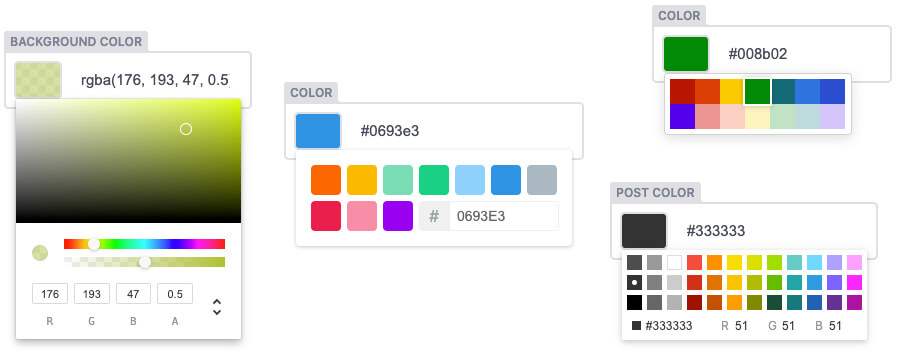
How to use
Add to your Netlify CMS configuration:
fields: - { name: <fieldname>, label: <fieldlabel>, widget: color }Configuration
Color Picker
The default color picker is the chrome picker, change it via the picker options
fields: - { name: <fieldname>, label: <fieldlabel>, widget: color, picker: github }The following options are available:
block
chrome
compact
github
sketch
swatches
twitter
Allow Input
Allow raw text input in the string field:
allowInput: true
Preset Colors
set the preset colors for the block, compact, github, sketch, twitter picker:
presetColors: [ "#F44336", "#9C27B0", "#3F51B5", ...],
for the sketch picker, they may also be described as an array of objects with color and title properties:
[{ color: '#f00', title: 'red' }]
for the swatches picker set the preset colors as an array of color groups, each with an array of colors:
presetColors: [
  ["#FF8A80", "#FF5252", "#FF1744", "#D50000"],
  ["#FF80AB", "#FF4081", "#F50057", "#C51162"],
  ["#EA80FC", "#E040FB", "#D500F9", "#AA00FF"],
  ["#B388FF", "#7C4DFF", "#651FFF", "#6200EA"],
  ...
],
Enable Alpha
enable the alpha-slider for chrome and sketch picker, default is false:
enableAlpha: true
Picker Width
only for block, github, sketch, swatches, twitter picker
pickerWidth: "500px"
Picker Height
only for swatches picker
pickerHeight: "300px"
Support
For help with this widget, open an issue
Development
Fork the repo, pull the code to your local computer and install dependencies:
npm installTo run a copy of Netlify CMS with the widget loaded for development, use the start script:
npm startPublish
change version in package.json
npm run buildnpm publishLicense
MIT Licensed. Copyright Felix Böttcher
Based on the awesome react-color