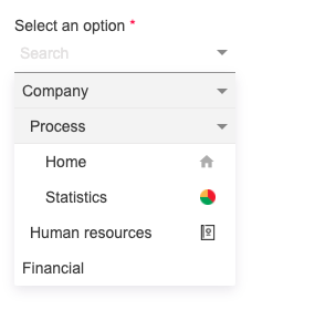
Nested Choice
Nested Choice is an angular component, for nested selections with a virtual offset, Angular Material is also built in.
Demo Stackblitz 📌
Get started 🚀
- Install library
npm i nested-choice- Add the module to your application
import { NgModule } from "@angular/core";
import { AppComponent } from "./app.component";

import { NestedChoiceModule } from "nested-choice";

@NgModule({
  declarations: [AppComponent],
  imports: [
      ...
      NestedChoiceModule
      ...
    ],
  providers: [],
  bootstrap: [AppComponent],
})
export class AppModule {}- Basic example HTML component
<nested-choice-field
  [required]="true"
  [labelText]="'Select an option'"
  [placeholderSearch]="'Search'"
  [data]="data"
></nested-choice-field>- Template options example
<ng-template #optionTpl let-option> {{ option.label }} </ng-template>- Data example
data = [
  {
    label: "Company",
    icon: "",
    id: 1,
    children: [
      {
        label: "Process",
        icon: "",
        id: 3,
        children: [
          {
            label: "Home",
            icon: "home",
            id: 5,
          },
          {
            label: "Statistics",
            icon:
              "https://cdn4.iconfinder.com/data/icons/simplicio/128x128/piechart.png",
            id: 6,
          },
        ],
      },
      {
        label: "Human resources",
        icon:
          "https://cdn4.iconfinder.com/data/icons/top-search-7/128/_contact_book_contacts-_address_phonebook_human_list_profile_resources-256.png",
        id: 4,
      },
    ],
  },
  {
    label: "Financial",
    icon: "",
    id: 2,
  },
];
If you don't already have Angular Material installed in your project 📦
ng add @angular/material
API 🖇️
@Input list
| Property | type | Description |
|---|---|---|
labelKey |
string | It allows customizing access to the label property, which can be defined by the user, the default value is label |
idKey |
string | It allows customizing access to the id property, which can be defined by the user, the default value is id |
iconKey |
string | It allows customizing access to the icon property, which can be defined by the user, the default value is icon |
visibleOptions |
number | Determine the number of elements visible on the virtual scroll, this property is required |
data |
Array | Option list |
currentOption |
object, number, string | Option selected |
optionTpl |
TemplateRef | show list in custom template |
required |
boolean | Add the asterisk to the label |
searchbox |
boolean | Hide or show input search, the default value is true |
placeholderSearch |
string | Placeholder for input search, the default value is Search |
textNoOptions |
string | Message to indicate that there are no options in the list, the default value is No options |
labelText |
string | Text for show in floating label |
width |
number, string | Width component, the default value id 200px |
disabled |
boolean | Disable component |
hidden |
boolean | Hidden component |
@Output list
| Property | type | Description |
|---|---|---|
selectChange |
EventEmitter | Notify when selecting a modified or selected option for the first time, returns the object of the selected item |
opened |
EventEmitter | Notify when select list is opened |
closed |
EventEmitter | Notify when select list is closed |
Built with 🛠️
- Angular - Web Framework
- Angular Material - Component Library
Author ✒️
- Jeison Nisperuza - jnisperuza - jnisperuza.github.io


