mui-editable-table
Multi-row editable table using material-ui with redux
- Requires react 15.3.0 and up
I've seen a few of these, including a great one by emkay (https://github.com/emkay/material-ui-table-edit), but unfortunately none quite gave me the functionality I wanted. I was looking for a table that:
- was object driven
- allowed me to edit the entire table in one go (say you have a record with a set of sub rules, such as a strategy configuration, your users might want to edit the whole thing in one go)
- had the ability to reorder
- returned me the entire modified dataset so I didn't have to maintain the state and mappings myself (becomes a lot more handy when you add in reordering and deletions)
Hopefully this one will give some of you some benefit with enough customisation to play with in your use cases.
I've also left in all the build/demo run code which I used from windows so hopefully other people won't have the same issues I did trying to get the bundling working for a new component.
Install
npm install mui-editable-table --saveUsage
Once installed, reference it and pass it the relevant fields. Take a look at the demo under the example folder, or for a quick read continue below or look at example/src/app/Demo.js.
First include it
;Then in your code include it within a form like so
<MuiEditableTable colSpec=thiscolSpec containerStyle=width: "500px" rowData=thisrowData onChange=onChange reorderable=true/>- colSpec - see below, config for each column
- containerStyle (optional) - styling for the table container div
- rowData - array of records that can be mapped (partially or fully) to the colSpec
- onChange - event to trigger when any changes to the editable table occur, will receive entire data structure back each time
- reorderable (optional) - if set to true, allows rows to be reordered on the table via the up/down arrows
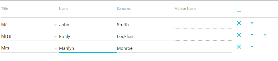
The colSpec would look something like this:
const colSpec = title: 'Title' fieldName: 'title' inputType: "SelectField" selectOptions: "Mr" "Mrs" "Miss" "Other" width: 200 defaultValue: 'Mr' title: 'Name' fieldName: 'foreName' inputType: "TextField" width: 200 title: 'Surname' fieldName: 'surname' inputType: "TextField" width: 200 title: 'Maiden Name' fieldName: 'maidenName' inputType: "TextField" width: 200 isReadOnly: shouldBeReadOnly title: 'Employed' fieldName: 'employed' inputType: "Toggle" width: 200;- Title - the header column value
- fieldName - the value from the rowData object that matches this column and will be used for its data
- inputType - field type to render. Supported types: TextField, SelectField, Toggle (toggle only supports true/false values)
- width - how wide your want the column to be
- defaultValue (optional) - should you wish to default your field, say for a number field you might want to default to 0.0, or a country field to your default country, etc
- selectOptions (SelectField only) - list of options for your select dropdown. Note it can be a list of strings, or a list of key->value pairs. For the latter you'll need to set them up like [{key: 'keyValue', value: 'displayValue'}]
- isReadOnly (optional) - function to check if field should be read only for the given row
The rowData for the above colSpec could look something like this:
const rowData = title: 'Mr' foreName: 'John' surname: 'Smith' employed: true title: 'Miss' foreName: 'Emily' surname: 'Lockhart' employed: false title: 'Mrs' foreName: 'Marilyn' surname: 'Monroe' employed: true;the onChange event would then give you the entire dataset back. you can log it or store it locally to use on the forms submit method:
const onChange = { console};