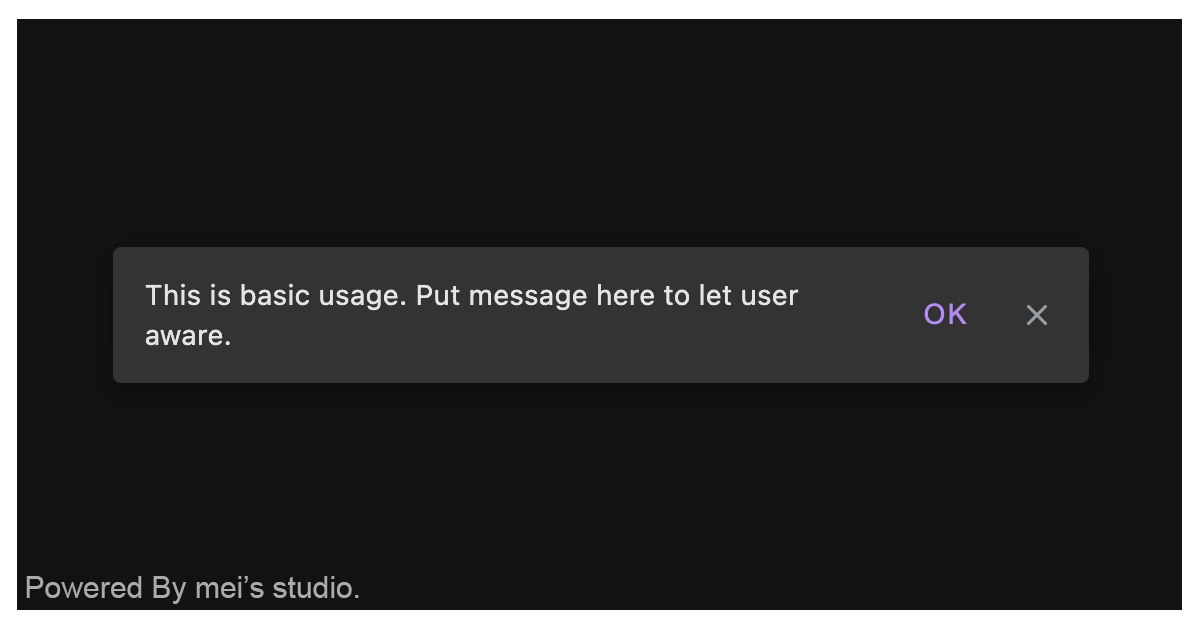
<msc-snackbar /> provide brief messages about app processes at the bottom of the screen. It's a web component and applied Material Design - Snackbar's spec.
<msc-snackbar /> is a web component. All we need to do is put the required script into your HTML document. Then follow 's html structure and everything will be all set.
- Required Script
<script
  type="module"
  src="https://your-domain/wc-msc-snackbar.js">
</script>- Structure
Put <msc-snacker /> into HTML document. It will have different functions and looks with attribute mutation.
<msc-snackbar>
  <script type="application/json">
    {
      "active": false,
      "stack": false,
      "label": "messages",
      "action": {
        "content": "action",
        "hidden": true,
        "params": {
          ...
        }
      },
      "dismiss": {
        "auto": true,
        "hidden": true,
        "duration": 5000
      }
    }
  </script>
</msc-snackbar><msc-snackbar /> could also use JavaScript to create DOM element. Here comes some examples.
<script type="module">
import { MscSnackbar } from 'https://your-domain/wc-msc-snackbar.js';

// use DOM api
const nodeA = document.createElement('msc-snackbar');
document.body.appendChild(nodeA);
nodeA.label = 'Put message here to let user aware';
nodeA.active = true;

// new instance with Class
const nodeB = new MscSnackbar();
document.body.appendChild(nodeB);
nodeB.label = 'Put message here to let user aware';
nodeB.active = true;

// new instance with Class & default config
const config = {
  active: false,
  stack: false,
  label: 'messages',
  action: {
    content: 'action',
    hidden: true,
    params: {
      ...
    }
  },
  dismiss: {
    auto: true,
    hidden: true,
    duration: 5000
  }
};
const nodeC = new MscSnackbar(config);
document.body.appendChild(nodeC);
nodeC.active = true;
</script>Developers could apply styles to decorate <msc-snackbar /> margin distance.
<style>
msc-snackbar {
  --msc-snackbar-margin-inline: 16px;
  --msc-snackbar-margin-block-end: 16px;
}
</style>
Otherwise, apply class - msc-snackbar--leading to make <msc-snackbar /> align flex-start.
<msc-snackbar
  class="msc-snackbar--leading"
>
  ...
</msc-snackbar><msc-snackbar /> supports some attributes to let it become more convenience & useful.
- active
Set active for <msc-snackbar />. It will show up once set true. Default is false (not set).
<msc-snackbar
  active
>
  ...
</msc-snackbar>- stack
Set stacke for <msc-snackbar /> to display stacked view. Default is false (not set).
<msc-snackbar
  stack
>
  ...
</msc-snackbar>- label
Set label for <msc-snackbar />.
<msc-snackbar
  label="put message here"
>
  ...
</msc-snackbar>- action
Set action for <msc-snackbar />. It should be JSON string. Developers could set content、hidden and extra params here.(hidden must be boolean to make action display or not, default is true).
<msc-snackbar
  action='{"content":"retry","hidden":true,"params":{"origin":"extra param you like","id":"extra param you like"}}'
>
  ...
</msc-snackbar>- dismiss
Set dismiss for <msc-snackbar />. It should be JSON string. Developers could set auto、hidden and duration (ms) here.
hidden is for dismiss button display or not (default is true). auto (default is true) and duration (default is 5000) are for auto dismiss behavior.
<msc-snackbar
  dismiss='{"auto":true,"hidden":true,"duration":5000}'
>
  ...
</msc-snackbar>| Property Name | Type | Description |
|---|---|---|
| active | Boolean | Getter / Setter for active. It will make show up or not. |
| stack | Boolean | Getter / Setter for stack. This will set stacked view once set true. Default is false. |
| label | String | Getter / Setter for label. Developers could set message through this property. |
| action | Object | Getter / Setter for action. Developers could set content、hidden and extra params here.(hidden must be boolean to make action display or not, default is true). |
| dismiss | Object | Getter / Setter for dismiss. Developers could set auto、hidden and duration (ms) here. hidden is for dismiss button display or not (default is true). auto (default is true) and duration (default is 5000) are for auto dismiss behavior. |
| Event Signature | Description |
|---|---|
| msc-snackbar-action-click | Fired when <msc-snackbar />'s action has been clicked. Developers could get params through event.detail. |
| msc-snackbar-dissmiss | Fired when dismiss behavior occured. |