msc-ripple
Interaction with UI mutation is usability 101 level stuff. Web developers should always keep this in mind to let user realize which element has beeb tapped.
I like Google Material Design's ripple effect when user taped some clickable elements, suh as <a />、<button />. That's why I deign <msc-ripple /> to wrap clickable elements and let them have ripple effect after user tapped. Besides that, <msc-ripple /> also provide sound & vibrate options to let developers decide turn them on or not.
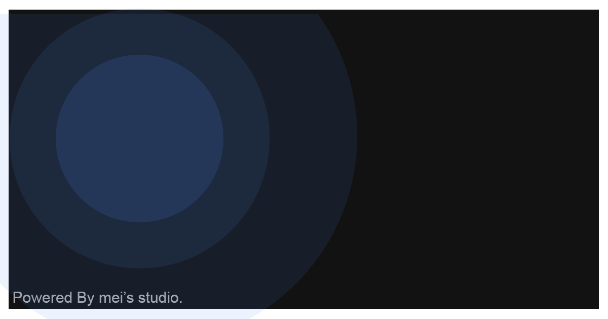
Tap the following area and see what can do.
Basic Usage
<msc-ripple /> is a web component. All we need to do is put the required script into your HTML document. Then follow <msc-ripple />'s html structure and everything will be all set.
- Required Script
<script
  type="module"
  src="https://your-domain/wc-msc-ripple.js">
</script>- Structure
Put the content inside <msc-ripple /> as its child. It will have ripple effect after user tapped.
<msc-ripple>
  <!-- Place any clickable element. -->
  <a ...>
    ...
  </a>
</msc-ripple>
Otherwise, developers could also choose remoteconfig to fetch config for <msc-ripple />.
<msc-ripple remoteconfig="https://your-domain/api-path">
  <!-- Place any clickable element. -->
  <a ...>
    ...
  </a>
</msc-ripple>
JavaScript Instantiation
<msc-ripple /> could also use JavaScript to create DOM element. Here comes some examples.
<script type="module">
import { MscRipple } from 'https://your-domain/wc-msc-ripple.js';

// use DOM api
const nodeA = document.createElement('msc-ripple');
document.body.appendChild(nodeA);
nodeA.sound = true;
nodeA.appendChild(
  document.querySelector(".your-clickable-node")
);

// new instance with Class
const nodeB = new MscRipple();
document.body.appendChild(nodeB);
nodeB.sound = true;
nodeB.appendChild(
  document.querySelector(".your-conclickabletent-node")
);

// new instance with Class & default config
const config = {
  sound: true,
  vibrate: false
};
const nodeC = new MscRipple(config);
document.body.appendChild(nodeC);
nodeC.appendChild(
  document.querySelector(".your-conclickabletent-node")
);
</script>
Style Customization
<msc-ripple /> uses CSS variables to style its interface. That means developer could easy change them into the lookup you like.
<style>
msc-ripple {
  --msc-ripple-color: rgba(0,0,0,.15);
  --msc-ripple-timing-function: cubic-bezier(0,0,.21,1);
  --msc-ripple-duration: 1s;
  --msc-ripple-timing-function: cubic-bezier(0,0,.21,1);
  --msc-ripple-border-radius: 0px;
}
</style>
Attributes
<msc-ripple /> supports some attributes to let it become more convenience & useful.
- sound
Set sound for <msc-ripple />. Once turn on, <msc-ripple /> will have sound effect when user tapped. Default is false (not set).
<msc-ripple sound>
  <!-- clickable node -->
  <a ...>
    ...
  </a>
</msc-ripple>- vibrate
Set vibrate for <msc-ripple />. Once turn on, <msc-ripple /> will have vibrate effect when user tapped. Default is false (not set).
<msc-ripple vibrate>
  <!-- clickable node -->
  <a ...>
    ...
  </a>
</msc-ripple>
Properties
| Property Name | Type | Description |
|---|---|---|
| sound | Boolean | Getter / Setter for sound. Once true, <msc-ripple /> will have sound effect when user tapped. Default is false. |
| vibrate | Boolean | Getter / Setter for vibrate. Once turn on, <msc-ripple /> will have vibrate effect when user tapped. Default is false. |
Event
| Event Signature | Description |
|---|---|
| msc-sidebar-change | Fired when <msc-ripple /> clicked. |