modern-radio-buttons
RadioSet is a react component that allows the user to customize their radio buttons through images for a better user experience, while still getting the same functionality.
Visuals
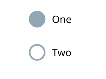
The use of these radio buttons allow the user to input their own images as the blank and checked radio buttons, or use default circle svg's, in a layout they feel is necessary for their project. Below is an example of these radio buttons in a horizontal layout with svg files customized for this example.

Similar to this horizontal layout, these buttons can also be layed out vertically, as displayed in another image below.

Installation
- Install using npm or yarn (
npm i modern-radio-buttons) - Import using
import RadioSet from 'modern-radio-buttons' - Use throughout project
Usage
The given code snippet demonstrates how to utilize the RadioSet module in another component.
import React Component from 'react';import logo from './logo.svg';import fill from './Fill.svg'import blank from './Blank.svg'import './App.css';import RadioSet from 'modern-radio-buttons'; { return <div ="App"> <header ="App-header"> <img = ="App-logo" ="logo" /> <h1 ="App-title">Welcome to React</h1> </header> <p ="App-intro"> To get started edit <code>src/Appjs</code> and save to reload </p> <RadioSet = = = = ="32px" /> </div> ; } ;API
props
defaultIndex: int
The index of the value you want to be initially selected. Defaults to the first value if not specified.
options: string []
An array of strings that will generate the labels and values associated with radio buttons.
horizontal: boolean
A boolean that dictates whether the flow of buttons is vertical or Horizontal
fill: image
An image that should be included as the "checked" designator for buttons
blank: image
an image that should be included as the "blank" designator for buttons
size: int
The size of the radio buttons.
color: string
the color of the default circle button that will be used
useImages: boolean
a boolean that will dictate if images will be used, or if the default circle svg's will be used in place of images