ModalConfirm Component
Un composant de modal réutilisable pour React.
Installation
npm i modal_shiffffUtilisation
import React, { useState } from "react";
import ModalConfirm from "modal_shiffff";
const App = () => {
const [showModal, setShowModal] = useState(false);
const closeModal = () => {
setShowModal(false);
};
return (
<div>
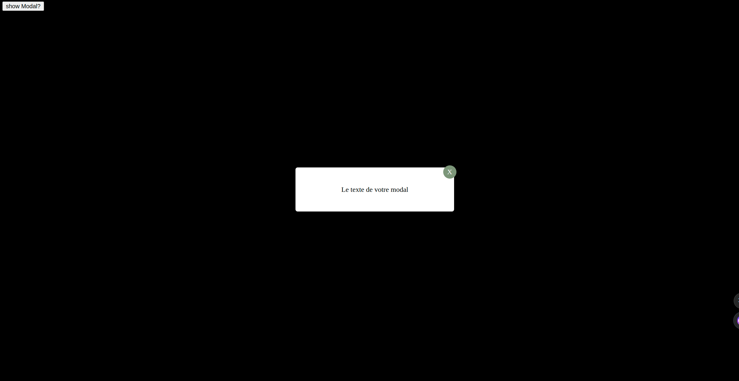
<button onClick={() => setShowModal(true)}>show Modal?</button>
{showModal && (
<ModalConfirm text={"Le texte de votre modal"} closeFct={closeModal} />
)}
</div>
);
};
export default App;Props
-
text(obligatoire) : Le texte à afficher dans la modal. -
closeFct(obligatoire) : La fonction de rappel qui ferme la modal.
Exemples
Voici un exemple d'utilisation du composant en l'affichant selon le state redux :
import React from "react";
import { useDispatch, useSelector } from "react-redux";
import ModalConfirm from "modal_shiffff";
import { setShowModal } from "../../Feature/modalToggle.slice";

const EmployeeCreate = () => {
  const dispatch = useDispatch();
  const showModal = useSelector((state) => state.ModalToggle.showModal);
  const closeModal = () => {
    dispatch(setShowModal(false));
  };

  return (
    <div>
      {showModal && (
        <ModalConfirm text={"Employee Created!"} closeFct={closeModal} />
      )}
    </div>
  );
};

export default EmployeeCreate;
ScreenShot
Node
version: Node.js v18.14.2.