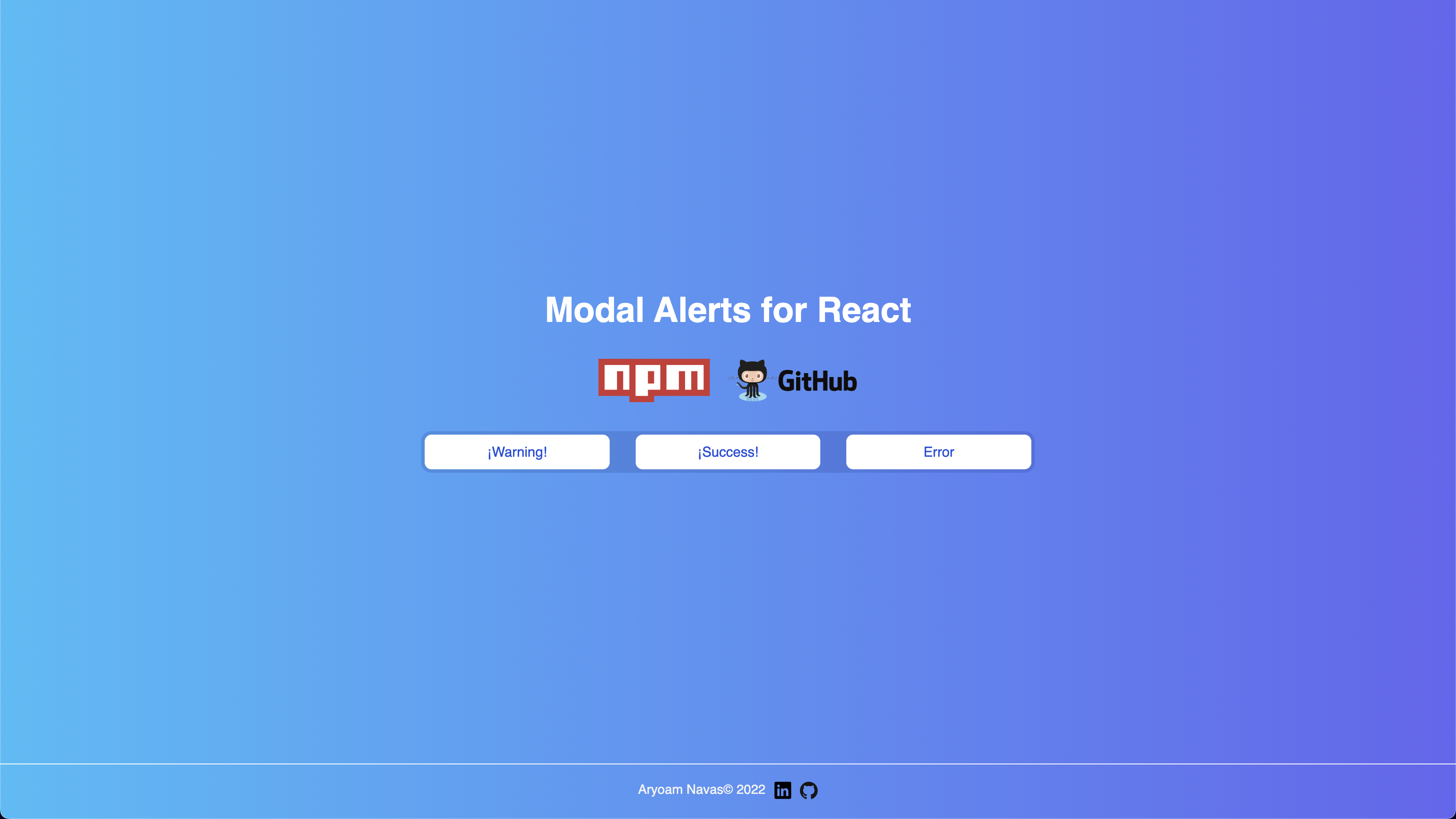
Modal Alerts for React
Customizable alert modals for react
Installation
Install Modal Alerts for React with npm
npm i modal-alerts-reactDemo
Documentation
Import Modal and useModal.
import Modal from "modal-alerts-react";
import { useModal } from "modal-alerts-react/useModal";
Define three variables that come from the useModal hook, the first is to control the modal, the second to open it and the third to close it.
const [isOpenWarning, openWarning, closeWarning] = useModal(false);Define a button for call the action:
<button onClick={openWarning}>Alert</button>The modal component can receive 5 properties:
type
(require): you can usesuccess,warningorerror
title
(optional)
text
(optional)
isOpen={isOpenWarning}
(required)
closeModal={closeWarning}
(required)
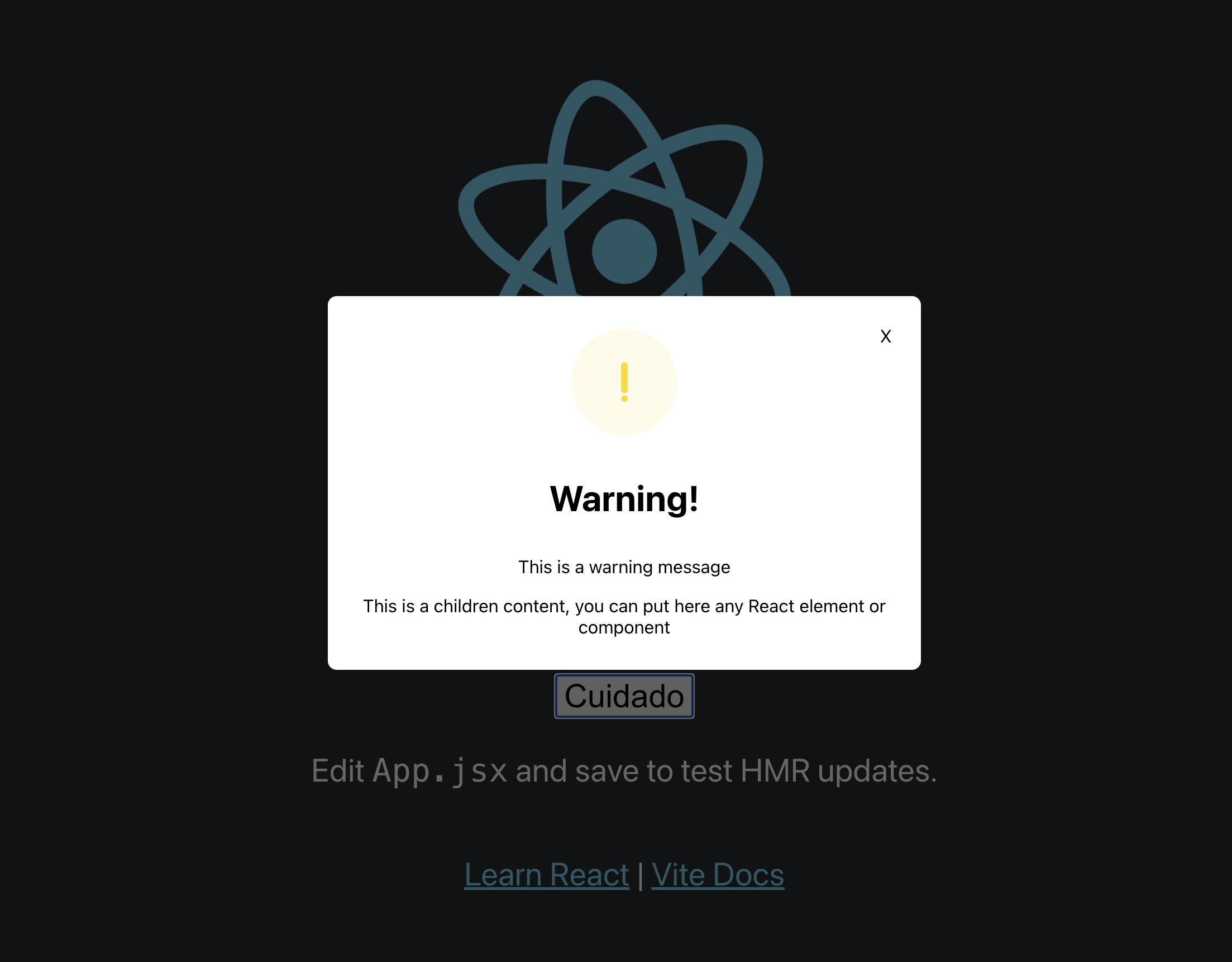
Example:
<Modal
type="warning"
title="¡Warning!"
text="Are you sure of this action?"
isOpen={isOpenWarning}
closeModal={closeWarning}
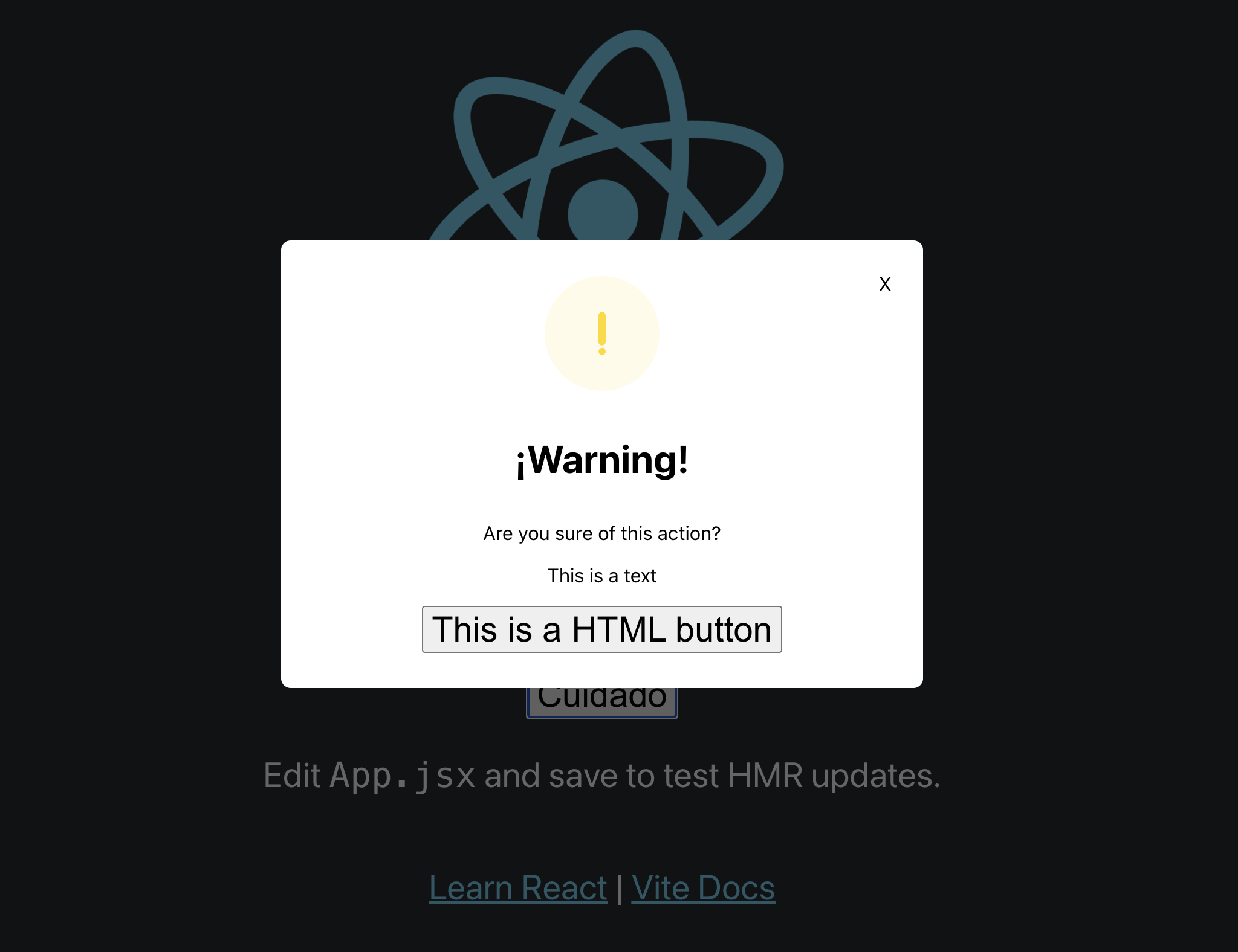
/>You can also add any type of content as children:
<Modal
  type="warning"
  title="¡Warning!"
  text="Are you sure of this action?"
  isOpen={isOpenWarning}
  closeModal={closeWarning}
>
  <p>This is a text</p>
  <button>This is a HTML button</button>
  <Cards /> {/* This is a component*/}
</Modal>
Result:
Usage/Examples
import Modal from "modal-alerts-react";
import { useModal } from "modal-alerts-react/useModal";
const Example = () => {
const [isOpenWarning, openWarning, closeWarning] = useModal(false);
const [isOpenSuccess, openSuccess, closeSuccess] = useModal(false);
const [isOpenError, openError, closeError] = useModal(false);
return (
<div>
<button onClick={openWarning}>Warning</button>
<Modal
type="warning"
title="¡Warning!"
text="Are you sure of this action?"
isOpen={isOpenWarning}
closeModal={closeWarning}
>
{/* This is a children content, you can put here any React element or
components */}
</Modal>
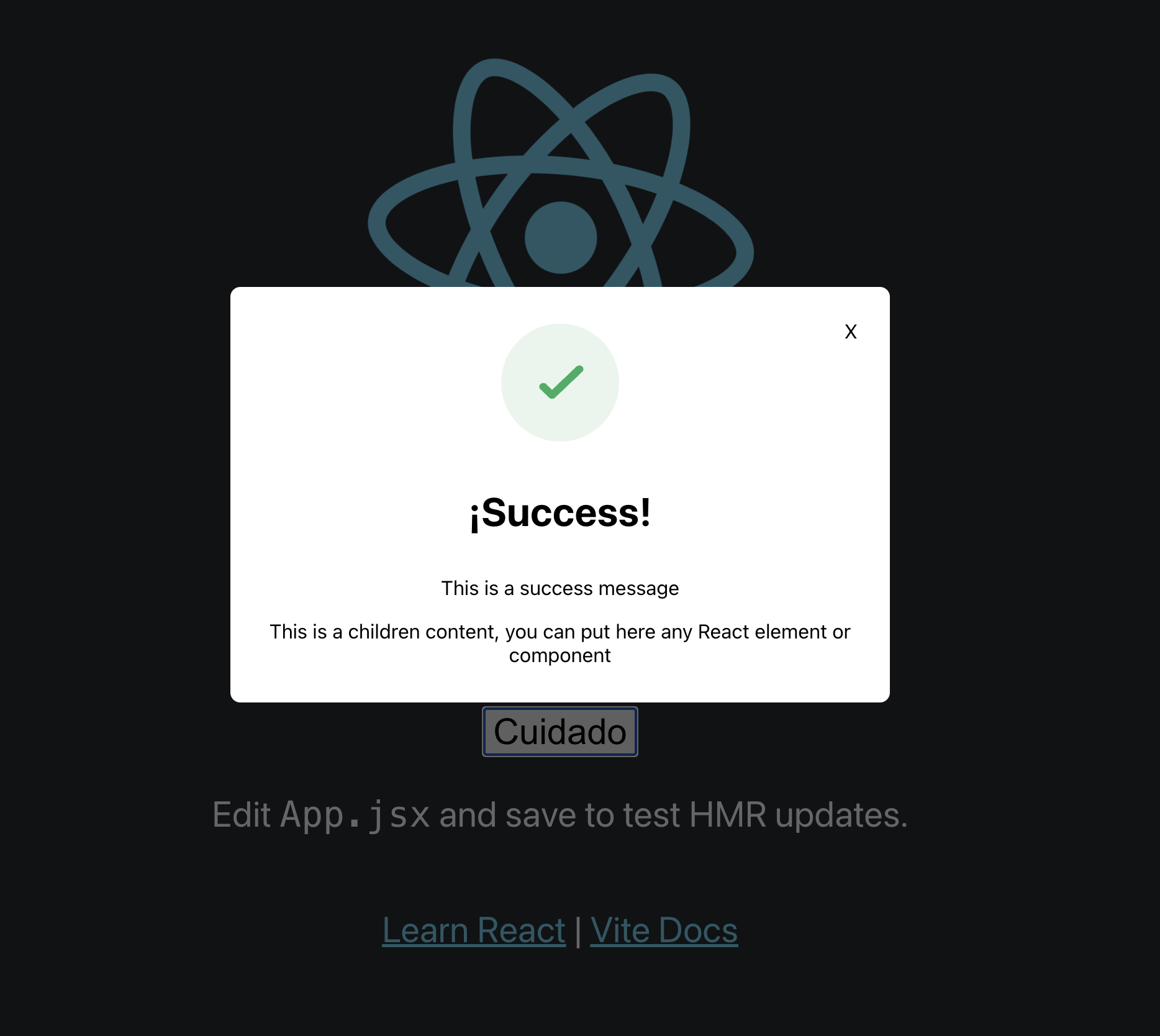
<button onClick={openSuccess}>Success</button>
<Modal
type="success"
title="¡Lets Go!"
text="Everything's fine"
isOpen={isOpenSuccess}
closeModal={closeSuccess}
></Modal>
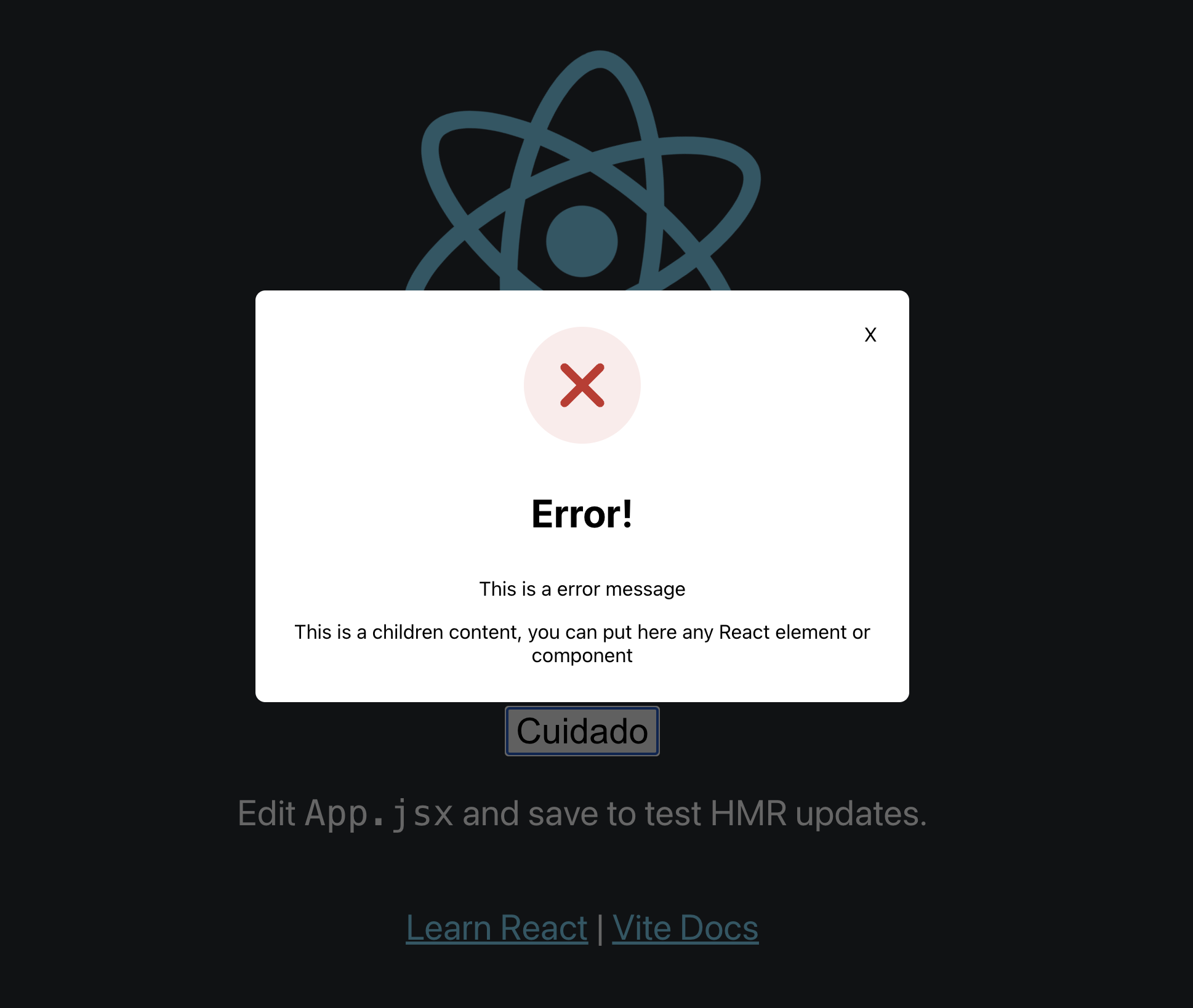
<button onClick={openError}>Error</button>
<Modal
type="error"
title="Upss"
text="An error occurred"
isOpen={isOpenError}
closeModal={closeError}
>
{/* This is a children content, you can put here any React element or
components */}
</Modal>
</div>
);
};
export default Example;Authors
Aryoam Navas.
https://www.linkedin.com/in/aryoam-navas/
Support
For support or suggestions, you can send a message for linkedIn https://www.linkedin.com/in/aryoam-navas/
License
Copyright (c) 2022 Aryoam Navas
Permission is hereby granted, free of charge, to any person obtaining a copy of this software and associated documentation files (the "Software"), to deal in the Software without restriction, including without limitation the rights to use, copy, modify, merge, publish, distribute, sublicense, and/or sell copies of the Software, and to permit persons to whom the Software is furnished to do so, subject to the following conditions:
The above copyright notice and this permission notice shall be included in all copies or substantial portions of the Software.
THE SOFTWARE IS PROVIDED "AS IS", WITHOUT WARRANTY OF ANY KIND, EXPRESS OR IMPLIED, INCLUDING BUT NOT LIMITED TO THE WARRANTIES OF MERCHANTABILITY, FITNESS FOR A PARTICULAR PURPOSE AND NONINFRINGEMENT. IN NO EVENT SHALL THE AUTHORS OR COPYRIGHT HOLDERS BE LIABLE FOR ANY CLAIM, DAMAGES OR OTHER LIABILITY, WHETHER IN AN ACTION OF CONTRACT, TORT OR OTHERWISE, ARISING FROM, OUT OF OR IN CONNECTION WITH THE SOFTWARE OR THE USE OR OTHER DEALINGS IN THE SOFTWARE.