


mn-option
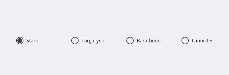
Minimalist radio/checkbox component, agnostic to framworks.
See the demo
Install
npm install --save mn-optionAnd bundle dependencies and main files in dist/ with your preferred tool.
Usage
Add to your html, the tag mn-option with respective type, default is checkbox, e.g.
<!-- checkbox -->To define as radio, use the attribute type
<!-- radio -->Custom attributes
- placeholder - custom attribute, to define the text visible
- type (only checkbox and radio)
Natural checkbox or radio
Is just a css class, to define a minimal design. Useful in some cases. E.g.
<!-- checkboxes, but if you want radio, just implement the type attribute with radio value -->The following attributes from inputs are supported in this component
Too works with a separted label with an attribute for