
A modern, plugin-extensible rich text editor for React, built with Slate.js. Features beautiful custom dialogs, notification system, and comprehensive text editing capabilities.
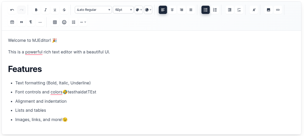
- Text Formatting: Bold, Italic, Underline, Strikethrough
- Font Controls: Font family, size, color, background color
- Text Alignment: Left, Center, Right, Justify
- Lists: Bulleted lists, numbered lists, checklists
- Indentation: Increase/decrease text indentation
- Headings: H1-H6 heading support with paragraph options
- Images: Insert images with URL, alt text, and captions
- Links: Insert hyperlinks with custom text
- Tables: Create tables with custom rows and columns
- Emojis: Insert emojis with categorized selection
- Code Blocks: Syntax-highlighted code blocks
- Horizontal Rules: Insert dividers
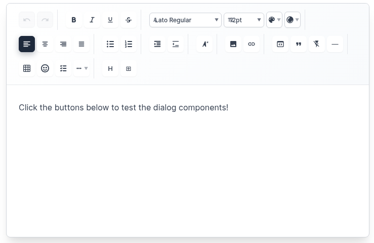
- Custom Dialogs: Beautiful modal dialogs for all insertions
- Notification System: Custom notification cards (no browser alerts)
- Responsive Design: Works perfectly on desktop and mobile
- Dark/Light Themes: Built-in theme support
- Auto-save: Automatic content saving with configurable intervals
- Keyboard Shortcuts: Full keyboard navigation support
- Plugin System: Extensible architecture with custom plugins
- TypeScript Support: Full type safety
- Customizable Toolbar: Show/hide specific tools
- Export Options: HTML, Markdown, and JSON export
- Import Support: Import from HTML and Markdown
npm install mjeditorimport React, { useState } from 'react';
import { MJEditor } from 'mjeditor';
import 'mjeditor/dist/editor.css';
function App() {
const [value, setValue] = useState([
{
type: 'paragraph',
children: [{ text: 'Hello, MJ Editor!' }],
},
]);
return (
<MJEditor
value={value}
onChange={setValue}
placeholder="Start typing..."
theme="light"
autoSave={true}
autoSaveInterval={5000}
onSave={(content) => console.log('Saved:', content)}
/>
);
}import React, { useState } from 'react';
import { MJEditor, NotificationProvider } from 'mjeditor';
import 'mjeditor/dist/editor.css';
function App() {
const [value, setValue] = useState([]);
return (
<NotificationProvider>
<MJEditor
value={value}
onChange={setValue}
placeholder="Start typing..."
theme="light"
toolbarConfig={{
showTextFormatting: true,
showFontControls: true,
showTextStyling: true,
showTextAlignment: true,
showIndentation: true,
showLists: true,
showTextPositioning: true,
showInsertOptions: true,
showAdvancedFeatures: true,
showUndoRedo: true,
disabledTools: ['emoji'], // Disable specific tools
customButtons: [
<button key="custom" onClick={() => alert('Custom action!')}>
Custom
</button>
]
}}
minHeight="400px"
maxHeight="600px"
autoSave={true}
autoSaveInterval={3000}
onSave={(content) => {
console.log('Auto-saved content:', content);
}}
/>
</NotificationProvider>
);
}- URL Input: Enter image URL with validation
- Alt Text: Add accessibility descriptions
- Caption: Optional image captions
- Live Preview: See image before insertion
- URL Input: Enter target URL
- Link Text: Custom display text
- Validation: URL format validation
- Live Preview: See link before insertion
- Rows/Columns: Select table dimensions
- Live Preview: See table structure
- Quick Insert: Instant table creation
- Text Input: Type custom emojis
- Quick Selection: Popular emoji buttons
- Categories: Organized emoji selection
- Search: Find emojis quickly
- Paragraph: Regular paragraph text
- H1-H6: All heading levels
- Visual Preview: See heading styles
- Descriptions: Understand each option
import { NotificationProvider, useNotification } from 'mjeditor';

function MyComponent() {
  const { showSuccess, showError, showWarning, showInfo } = useNotification();

  const handleAction = () => {
    showSuccess('Action completed successfully!');
    showError('Something went wrong!');
    showWarning('Please check your input!');
    showInfo('Here is some information!');
  };

  return (
    <NotificationProvider>
      {/* Your app content */}
    </NotificationProvider>
  );
}- Success: ✅ Green notifications for successful actions
- Error: ❌ Red notifications for errors
-
Warning:
⚠️ Yellow notifications for warnings - Info: ℹ️ Blue notifications for information
-
TablePlugin- Table creation and management -
ImagePlugin- Image insertion and rendering -
LinkPlugin- Hyperlink functionality -
EmojiPlugin- Emoji insertion -
HeadingPlugin- H1-H6 and paragraph support
-
BoldPlugin- Bold text formatting -
ItalicPlugin- Italic text formatting -
UnderlinePlugin- Underline text formatting -
StrikethroughPlugin- Strikethrough text formatting -
ColorPlugin- Text and background colors -
FontPlugin- Font family and size controls
-
AlignmentPlugin- Text alignment controls -
ListPlugin- Bulleted and numbered lists -
IndentationPlugin- Text indentation -
CodeBlockPlugin- Code block insertion -
HorizontalRulePlugin- Horizontal dividers
| Prop | Type | Default | Description |
|---|---|---|---|
value |
CustomElement[] |
[] |
Editor content |
onChange |
(value: CustomElement[]) => void |
- | Change handler |
plugins |
Plugin[] |
[] |
Array of plugins |
placeholder |
string |
'Start typing...' |
Placeholder text |
readOnly |
boolean |
false |
Read-only mode |
theme |
'light' | 'dark' |
'light' |
Editor theme |
className |
string |
'' |
Custom CSS class |
style |
CSSProperties |
{} |
Custom styles |
autoFocus |
boolean |
false |
Auto focus on mount |
autoSave |
boolean |
false |
Enable auto-save |
autoSaveInterval |
number |
30000 |
Auto-save interval (ms) |
onSave |
(value: CustomElement[]) => void |
- | Save handler |
toolbarConfig |
ToolbarConfig |
{} |
Toolbar configuration |
maxLength |
number |
- | Maximum content length |
minHeight |
string |
'200px' |
Minimum editor height |
maxHeight |
string |
- | Maximum editor height |
| Prop | Type | Default | Description |
|---|---|---|---|
showTextFormatting |
boolean |
true |
Show text formatting buttons |
showFontControls |
boolean |
true |
Show font controls |
showTextStyling |
boolean |
true |
Show text styling options |
showTextAlignment |
boolean |
true |
Show alignment controls |
showIndentation |
boolean |
true |
Show indentation controls |
showLists |
boolean |
true |
Show list controls |
showTextPositioning |
boolean |
true |
Show positioning controls |
showInsertOptions |
boolean |
true |
Show insert options |
showAdvancedFeatures |
boolean |
true |
Show advanced features |
showUndoRedo |
boolean |
true |
Show undo/redo buttons |
disabledTools |
string[] |
[] |
Disable specific tools |
customButtons |
ReactNode[] |
[] |
Custom toolbar buttons |
import {
  serializeToHtml,
  serializeToMarkdown
} from 'mjeditor';

// Export to HTML
const html = serializeToHtml(editorValue);

// Export to Markdown
const markdown = serializeToMarkdown(editorValue);import {
deserializeFromHtml,
deserializeFromMarkdown
} from 'mjeditor';
// Import from HTML
const editorValue = deserializeFromHtml(htmlString);
// Import from Markdown
const editorValue = deserializeFromMarkdown(markdownString);/* Override default styles */
.mj-editor {
border: 2px solid #3182ce;
border-radius: 12px;
box-shadow: 0 4px 6px rgba(0, 0, 0, 0.1);
}
.mj-toolbar {
background: linear-gradient(135deg, #667eea 0%, #764ba2 100%);
border-radius: 8px 8px 0 0;
}
.mj-toolbar-button {
border-radius: 6px;
transition: all 0.2s ease;
}
.mj-toolbar-button:hover {
transform: translateY(-2px);
box-shadow: 0 4px 12px rgba(0, 0, 0, 0.15);
}const CustomPlugin = {
name: 'custom',
commands: {
customAction: (editor, data) => {
// Custom command implementation
}
},
renderElement: (props) => {
// Custom element rendering
if (props.element.type === 'custom') {
return <div className="custom-element">{props.children}</div>;
}
return undefined;
},
renderLeaf: (props) => {
// Custom leaf rendering
if (props.leaf.custom) {
return <span className="custom-leaf">{props.children}</span>;
}
return undefined;
}
};- Chrome: 60+
- Firefox: 55+
- Safari: 12+
- Edge: 79+
- Mobile: iOS Safari, Chrome Mobile
mjeditor/
├── dist/                 # Built files
├── src/
│   ├── components/       # Dialog components
│   ├── core/            # Core editor components
│   ├── plugins/         # Built-in plugins
│   ├── styles/          # CSS styles
│   ├── types/           # TypeScript types
│   └── utils/           # Utility functions
├── examples/            # Usage examples
└── demo/               # Demo application
- Fork the repository
- Create your feature branch (
git checkout -b feature/amazing-feature) - Commit your changes (
git commit -m 'Add some amazing feature') - Push to the branch (
git push origin feature/amazing-feature) - Open a Pull Request
MIT License - see LICENSE file for details.
See CHANGELOG.md for detailed version history.
- Issues: GitHub Issues
- Documentation: Full Documentation
- Examples: Live Demo
MJ Editor - Modern, beautiful, and powerful rich text editing for React applications. ✨