Meteor-React-Autoform
meteor-react-autoform will translate your Meteor aldeed:SimpleSchema into a React form using Material-UI components. You can wrap tests around your component and/or the Autoform component, this will also work with Storybook. This is still in active development but is very possible to use today. Basic form elements are already available, see below for todo list and see Changelog.
Example
You can fork an example application to test Meteor-React-Autoform. This application uses Mantra Sample Blog app as it's base.
Requirements
React v15andMaterial-UI v0.15Meteor v1.3
Installation
- Installed the NPM package:
$ npm i meteor-react-autoform --save - Install the required Meteor packages:
$ meteor add aldeed:collection2 aldeed:simple-schema check - Extend your SimpleSchema to allow our
materialFormobject. Place the below code above your schema definitions (see example):
  // Documentation -> https://github.com/MechJosh0/meteor-react-autoform
  // Extend the schema to allow our materialForm object
  SimpleSchema.extendOptions({
    materialForm: Match.Optional(Object)
  })
- See the element examples list to see how to write the
materialFormobject in your schema.
TODO
- Array of elements
- Object fields
- Array of object fields
ReactAutoForm props
| Prop | Type | Required | Description | Example |
|---|---|---|---|---|
buttonComponent |
Node |
No | Write and use your own custom button component. Using this will ignore all other button* props. |
buttonComponent={<button>Submit button</button>} |
buttonIcon |
String |
No | Material-UI Icon name, view available icons. | buttonIcon="check" |
buttonLabel |
String |
No | Custom button label. | buttonLabel="Submit form" |
buttonParentStyle |
Object |
No | Write the parent div element for the Material-UI button. | buttonParentStyle={style.buttonParent} |
buttonProps |
Object |
No | Write your own props for the Material-UI button. This will overwrite existing props that Autoform creates. | buttonProps={{secondary: true}} |
buttonType |
OneOf['FlatButton', 'RaisedButton', 'IconButton'] |
No | You can use either the Material-UI FlatButton or RaisedButton, default is RaisedButton, or you may write your own button using the prop buttonComponent. |
buttonType="RaisedButton" |
debug |
Bool |
No | This will output the form data into the console when the user attempts to submit. | debug={false} |
doc |
Object |
No | To update a document you must set the type="update" and provide the document you wish to update in the doc prop. |
doc={document} |
errors |
Array |
No | When your submit Action is ran and there is an error, it should update the prop here which will in turn update the form to display errors. | errors={errors} |
errorsStyle |
Object |
No | You may provide the style for the errors above the form. See example. | errorsStyle={style.errors} |
errorsTitle |
String |
No | The error header above the form. | errorsTitle="There was an error:" |
formClass" |
String |
No | By default the form className is autoform however you can choose your own. |
formClass="contactForm" |
formStyle |
Object |
No | Provide your own form style, see example. | formStyle={style.form} |
muiTheme |
Bool |
No | Default set to false to allow you to choose your own Material-UI theme, however if you do not have one set up set this to true to use the default. |
muiTheme={false} |
onSubmit |
Function |
Yes | This will run when the user attempts to submit the forum, this will need to be your Action. See onSubmit for more formation. | onSubmit={this.props.handleInsert} |
onSubmitExtra |
Object |
Pass an object which is then returned as an extra parameter on the onSubmit function | ||
schema |
Object |
Yes | You must provide the collection you wish to use for building your form. | schema={{name: {type: String, materialForm: {floatingLabelText: 'Name', hintText: 'Your name...'}}}} |
type |
OneOf['update', 'insert'] |
No | You must set the type prop which must equal either "insert" or "update". |
type="insert" |
useFields |
Array |
No | Only produce the fields name and description from the Collection in the form. |
useFields={['name', 'text']} |
Usage
React Component Example
/client/modules/contact/components/contact_page.js
import React from 'react';
import ReactAutoForm from 'meteor-react-autoform';
import HelpDeskSchema from '/lib/schema/help_desk';
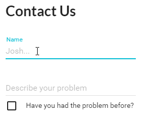
const HelpDesk = () => (
<div>
<h1>Contact Us</h1>
<ReactAutoForm
errors={this.props.errors}
muiTheme={true}
onSubmit={this.props.handleInsert}
schema={HelpDeskSchema}
type="insert"
/>
</div>
);
HelpDesk.propTypes = {
errors: React.PropTypes.array,
handleInsert: React.PropTypes.func.isRequired
};
export default HelpDesk;
onSubmit
You will need to provide your Action (Meteor/Tracker, Redux, Rx.js, etc) as a prop to the React component. When Autoform is submitted it will call your onSubmit Action function. For an type={'insert'} form the Action will be called with just the forumFields parameter, for example yourInsertAction(forumFields), whereas a form with type={'update'} the Action will be called with docId, formFields parameters, for example yourUpdateAction(_id, forumFields).
Redux Action Example
/client/modules/contact/actions/contact_page.js
import {HelpDeskSchema} from './../../../../lib/collections/help_desk';
import * as actions from './../action_types';

export default {
  insertTicket(forumFields) // This is the function that is passed to our `handleInsert` prop in the component via our container
  {
    const _id = Meteor.uuid(); // Generates a random _id to be used in MongoDB
    const context = HelpDeskSchema.newContext(); // Gets the schema context
    context.resetValidation(); // Reset any previous data

    const isValid = context.validate(forumFields); // Check is the form from Autoform is valid against our Schema

    if(isValid) // If everything went well
    {
      // Call the Meteor Method to handle inserting into MongoDB
      Meteor.call('helpDesk.insert', _id, forumFields, (err) =>
      {
        if(err)
        {
          return {type: actions.INSERT_TICKET_ERROR, errors: 'Something went wrong'};
        }
      });

      // We've used a Method stub to insert into the clients mini Mongo already so we can go to the new ticket url path before the server handles the request itself
      FlowRouter.go(`${FlowRouter.path('helpDesk.update')}/${_id}`);

      return {type: actions.INSERT_TICKET_SUCCESS, value: true};
    }

    // There was an error in the form against our schema
    const invalidKeys = context.invalidKeys(); // Get the errors

    Object.keys(invalidKeys).map((field) => // Loop through the errors
    {
      invalidKeys[field].message = context.keyErrorMessage(invalidKeys[field].name); // Translate each error into a readable format
    });

    return {type: actions.INSERT_TICKET_ERROR, errors: invalidKeys}; // Update Redux error array
  }
};
My examples follow the Meteor Mantra specification which I recommend following.
SimpleSchema object
Example
/lib/schema/helpDesk.js
  const schema = {
    name: {
     type: String,
     materialForm: {
       floatingLabelText: 'Your name',
       hintText: 'Sarah Smith...'
     }
    },
    description: {
     type: String,
     min: 10,
     max: 200,
     materialForm: {
       floatingLabelText: 'Describe your problem',
       rows: 1,
       rowsMax: 10,
       multiLine: true,
       hintText: 'I require a password reset...'
     }
    },
    reoccurringProblem: {
      type: Boolean,
      defaultValue: true,
      label: 'Have you had the problem before?',
      materialForm: {
        switcher: 'Checkbox'
      }
    }
  };

  export default HelpDesk;
/lib/collections/helpDesk.js
  import {Mongo} from 'meteor/mongo';
  import Schema from './../schema/help_desk';
  const HelpDesk = new Mongo.Collection('helpDesk');

  SimpleSchema.extendOptions({
    materialForm: Match.Optional(Object)
  });

  const HelpDeskSchema = new SimpleSchema(Schema);

  HelpDesk.attachSchema(HelpDeskSchema);

  export {HelpDesk, HelpDeskSchema};
Style Example
You may provide styling to the form and error components by following the example:
    const HelpDesk = () => (
           <div>
           <h1>Contact Us</h1>
           <ReactAutoForm
               errors={this.props.errors}
               errorsStyle={{
                  container: {
                      background: 'green'
                  },
                  h3: {
                      background: 'red'
                  },
                  ul: {
                      background: 'purple'
                  },
                  li: {
                      background: 'yellow'
                  }
               }}
               muiTheme={true}
               onSubmit={this.props.handleInsert}
               schema={HelpDeskSchema}
               type="insert"
               formStyle={{
                   background: 'blue'
               }}
           />
           </div>
       );
Element Examples
Global parameters
labelString | Input labelmaxNumber | Set the max length of an input
  description: {
    type: String,
    label: 'Description',
    max: 10
  }
Text
A normal text input will only need a type of String to display. See Material-UI text field to find what properties are available for passing into our materialForm object.
  description: {
    type: String,
    materialForm: {
      hintText: 'Please enter the description...'
    }
 }
  password: {
    type: String,
    label: 'Password',
    materialForm: {
      type: 'password'
    }
  }
Textarea
Inside the materialForm object, using either materialForm.rows materialForm.rowsMax or materialForm.multiLine will cause the input to turn into a textarea. See Material-UI text field to find what properties are available for passing into our materialForm object.
  description: {
    type: String,
    materialForm: {
      rows: 1,
      rowsMax: 3,
      multiLine: true
    }
  }
Number
Type Number will change the element to a number input. min and max values are taken into consideration if available. See Material-UI text field to find what properties are available for passing into our materialForm object.
  favoritePositiveInteger: {
    type: Number,
    max: 10,
    min: 5,
    materialForm: {
      step: 0.2
    }
  }
Date
Type Date will provide a date select. min and max values are taken into consideration if available. See Material-UI date picker to find what properties are available for passing into our materialForm object.
  birthday: {
    type: Date,
    label: 'Your birthday',
    defaultValue: new Date('2014-10-18T00:00:00.000Z'),
    materialForm: {
      dateMode: 'landscape',
      autoOk: true
    }
  }
Tick box
Type Boolean will use materialForm.switcher to determine to display either a checkbox or a toggle component. By default will use the checkbox Material-UI component materialForm.switcher = 'Checkbox', or if you can change it to use the toggle component materialForm.switcher = 'Toggle'. Check out the respective Material-UI documentation on each component to find out what other properties are available for passing into our materialForm object.
  agree: {
    type: Boolean,
    label: 'Do you agree?',
    defaultValue: false,
    materialForm: {
      switcher: 'Checkbox'
      // OR
      //switcher: 'Toggle'
    }
  }
Select dropdown menu
Use allowedValues = [] to create a select dropdown menu. You can provide materialForm.options = [] to pass through an object[label: 'Example', value: 'durp'] for each option. You can pass through any select-field properties by using materialForm.selectOptions = [].
  choose3: {
    type: Number,
    allowedValues: [
      1,
      2,
      3
    ],
    optional: true,
    label: 'Choose a number',
    materialForm: {
      selectOptions: {
        className: 'selectExample'
      },
      options: [
        {
          label: 'One',
          value: 1
        },
        {
          label: 'Two',
          value: 2
        },
        {
          label: 'Three',
          value: 3
        }
      ]
    }
  }
Radio button
When you use allowedValues = [] with materialForm.switcher = 'Radio' this will display radio box options. You can provide materialForm.options = [] and pass through any RadioButton properties into each option, you can also pass through RadioButtonGroup properties by using materialForm.groupOptions = [].
  agree: {
    type: String,
    allowedValues: [
      'red',
      'green'
    ],
    label: 'What colour is the sky?',
    materialForm: {
      switcher: 'Radio',
      groupOptions: {
        className: 'radioExample'
      },
      options: [
        {
          label: 'Red',
          value: 'red'
        },
        {
          label: 'Green',
          value: 'green'
        }
      ]
    }
  }
Credits
Developed and maintained by Aluminati