mdata-table
TypeScript icon, indicating that this package has built-in type declarations

0.9.9 • Public • Published

mdata-table (responsive)

Screenshot

Overview

This library support to angular 4, 5 and 6. There are many options for customize your table you can customize everything cell and everything

Demo

https://demo-mdata-table.stackblitz.io

https://stackblitz.com/edit/demo-mdata-table

Installation

To install this library, run:

$ npm install mdata-table --save

And then in your Angular AppModule:

import { BrowserModule } from '@angular/platform-browser';
import { NgModule } from '@angular/core';
 
import { AppComponent } from './app.component';
 
// Import the library
import { MDataTableModule } from 'mdata-table';
 
@NgModule({
  declarations: [
    AppComponent
  ],
  imports: [
    BrowserModule,
 
    // Specify the library as an import
    MDataTableModule.forRoot()
  ],
  providers: [],
  bootstrap: [AppComponent]
})
export class AppModule { }

Features

mdata-table options

Property Type Default Description
[indexColumn] boolean false The parameter define if you want display index row by default value is false.
[selectColumn] boolean false

It's still in development, it isn't recommended to use

[items] [] [] The items by default is any[] = []; is empty.
[totalPages] number 0 The number of pages.
[totalItems] number 0l The amount of data.
[size] number 10 The records number to show.
[indexColumnHeader] string '' It's related to indexColumn for the header.
[multiExpandableRows] boolean false Define when click on expand icon. true -> if it's true when clicking, it stays expanded when it is expanded in the others.
[classTable] string ''table-condensed table-bordered'' The class default for table table-condensed table-bordered.
(reload) @Output @Output the method define for load data example (reload)="reloadItems($event)" .
[expandableRows] boolean true Define if display expandable icon for mode responsive.
[rowColors] Callback null Define if the row to change background color, click to see example [rowColors]="rowColors"
(rowClick) @Output @Output When you do click the row return the selected row, see example (rowClick)="rowClick($event)".
(rowDoubleClick) @Output @Output When you do double click in the row return the selected row, see example (rowDoubleClick)="rowDoubleClick($event)".
[rowTooltip] Callback undefined [rowTooltip]="rowTooltip".

Examples

reloadItems

Example with a component we need to declare items, totalItems, totalPages, size

import {Component, OnInit} from '@angular/core';
import {DataTableRow, DataTableResource} from 'mdata-table';
import persons from './data-table-demo';
import {Subscription} from 'rxjs/Subscription';
 
@Component({
  selector: 'app-home',
  templateUrl: './home.component.html',
  styleUrls: ['./home.component.css']
})
export class HomeComponent implements OnInit {
 
  itemResource = [];
  items = [];
  totalItems = 204;
  totalPages = 34;
  size = 6;
  index = 1;
 
  constructor() {
  }
 
 
  ngOnInit(): void {
    this.itemResource = new DataTableResource(persons);
  }
 
  reloadItems(params) {
    this.itemResource.query(params).then(items => {
      this.items = items;
    });
  }
}
 
<mdata-table
              [items]="items"
              (reload)="reloadItems($event)"
              >
Eager loading

Sometimes we have a little data so usually we bring all data to frontend, for that we need a table eager this library has support eager You can see in the demo when there are some examples using eager.

reloadItems(params) {
    this.itemResource.query(params).then(items => {
      this.items = items;
    });
}
Lazy loading

When the API rest give us with pagination, sort and everything necessary we can use the lazy loading we can see an example below.

reloadItems(params) {
    this.userApiService.getAllUsers({size: 7, page: params.page }).subscribe(value => {
        this.totalPages = value.json().totalPages;
        this.size = value.json().numberOfElements;
        this.items = value.json().content;
    });
  }
rowColors
<mdata-table
            [rowColors]="rowColors"
              >
rowColors(item, row: DataTableRow) {
    if (item.caseNumber === 'A000000437') {
      return '#fafafa';
    }
}
rowClick
<mdata-table
          (rowClick)="rowClick($event)"
              >
rowClick(rowEvent) {
    console.log('Clicked: ' + rowEvent.row.item.caseNumber);
  }
rowDoubleClick
<mdata-table
         (rowDoubleClick)="rowDoubleClick($event)"
              >
rowDoubleClick(rowEvent) {
    // alert('Double clicked: ' + rowEvent.row.item.name);
  }
rowTooltip
<mdata-table
       [rowTooltip]="rowTooltip"
              >
rowTooltip(item) {
    return item.NPI;
  }

Template Options

icon expand template
<mdata-table>
     <ng-template #iconExpand let-expanded="expanded">
          <span class="fa fa-lg fa-plus-circle text-info" *ngIf="!expanded"></span>
          <span class="fa fa-lg fa-minus-circle text-warning" *ngIf="expanded"></span>
     </ng-template>
 </mdata-table>
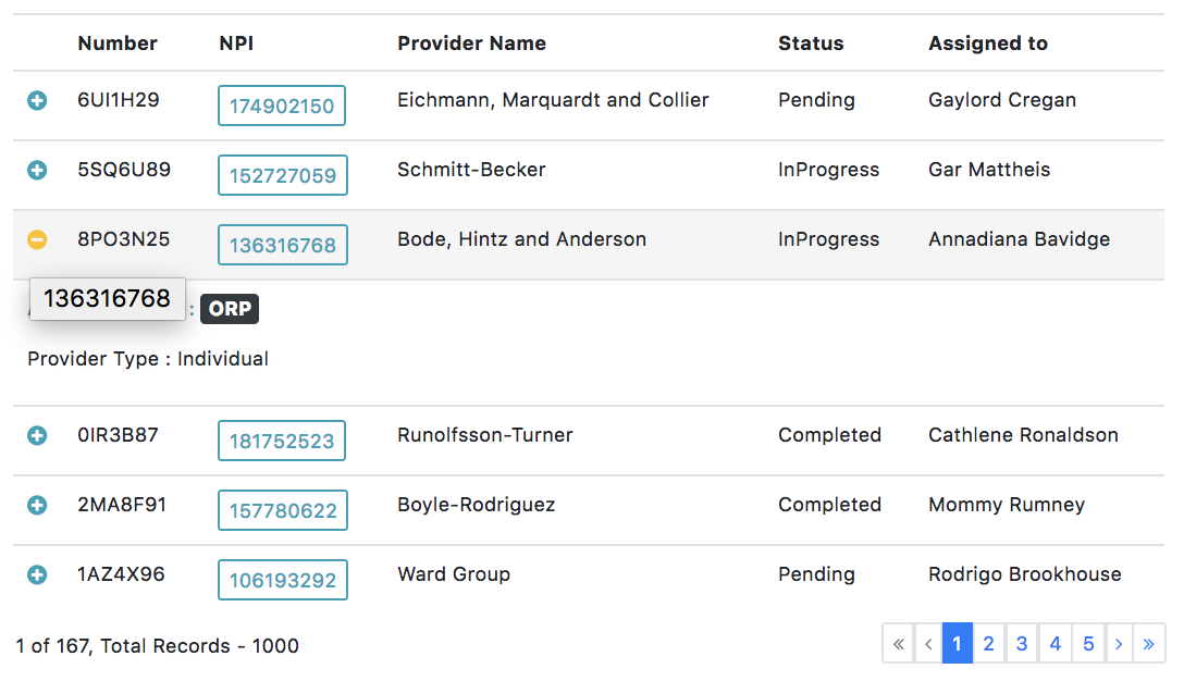
data table expand template
<mdata-table>
    <ng-template #dataTableExpand let-itemExpand="itemExpand">
      <p class="text-info" *ngIf="itemExpand.NPI != null">NPI : {{itemExpand.NPI}}</p>
      <p class="text-warning" *ngIf="itemExpand.providerName != null">Provider : {{itemExpand.providerName}}</p>
      <p *ngIf="itemExpand.status != null">Status : {{itemExpand.status}}</p>
      <p *ngIf="itemExpand.assignedTo != null">Assigned to : {{itemExpand.assignedTo}}</p>
      <p *ngIf="itemExpand.applicationType != null">Application type : {{itemExpand.applicationType}}</p>
      <p *ngIf="itemExpand.providerType != null">Provider Type : {{itemExpand.providerType}}</p>
   </ng-template>
 </mdata-table>

mdata-table-column options

Property Type Default Description
[property] string The propertie search on data by key the value from json format data.
[header] String The name for header
[sortable] boolena false The value by default is false when is true add mode sort.
[visible] boolean true If false the column hide and visible only mode expandable.
[cellColors] Callback undefined

Is still in development, it is recommended not to use it until a new version is published

.

Break points (Responsive table)

The breakpoints defined are.

const breakpointConfig: BreakpointConfig = {
    xss: { max: 400 },
    xs: { min: 400, max: 768 },
    sm: { min: 768, max: 992 },
    md: { min: 992, max: 1200 },
    lgs: { min: 1200, max: 1500 },
    lg: { min: 1500 }
}

xss It'll display when the screen it's how max 400px

xs It'll display when the screen it's how max 768px and minimum 400px

sm It'll display when the screen it's how max 992px and minimum 768px

md It'll display when the screen it's how max 1200px and minimum 992px

lgs It'll display when the screen it's how max 1500px and minimum 1200px

lg It'll display when the screen it's minimum `1500px

For display a column in a size we can define with (xss, xs, sm, md, lgs, lg)

Template Options for column table

Cell template

When we need to custom template for cell we can define the template with id #dataTableCell and use data with let-item="item"

<mdata-table>
    <mdata-table-column
      [property]="'NPI'"
      [header]="'NPI'"
      [breakpoints]="'xxs,xs'"
      [sortable]="true">
      <ng-template #dataTableCell let-item="item">
        <button class="btn btn-outline-info btn-sm" (click)="buttonalert(item.NPI)">{{item.NPI}}</button>
      </ng-template>
    </mdata-table-column>
 </mdata-table>
header template

When we need to custom the template for header we can define the template with id #dataTableHeader and use data with let-item="item"

<mdata-table-column
    [property]="'status'"
    [header]="'Status'"
    [breakpoints]="'xxs,xs,sm,md'"
    [sortable]="false">
    <ng-template #dataTableHeader let-item="item">
        <span style="color: rgb(232, 0, 0)">Active</span>
    </ng-template>
</mdata-table-column>
header extra template

When we need to custom template for header we can define the template with id #dataTableHeader and the extra templete to define id with #dataTableHeaderExtra and use data with let-item="item"

<mdata-table-column
      [property]="'status'"
      [header]="'Status'"
      [breakpoints]="'xxs,xs,sm,md'"
      [sortable]="false">
      <ng-template #dataTableHeader let-item="item">
        <span style="color: rgb(232, 0, 0)">Active</span>
      </ng-template>
      <ng-template #dataTableHeaderExtra>
        <i class="fa fa-filter" aria-hidden="true"></i>
      </ng-template>
 </mdata-table-column>

Use the library example

Once the library is imported, you can use it's components, directives and pipes in your Angular application:

home.component.html

<mdata-table [indexColumn]="column.indexColumn"
              [selectColumn]="column.selectColumn"
              [items]="items"
              [totalPages]="totalPages"
              [totalItems]="totalItems"
              [size]="size"
              [indexColumnHeader]="'#'"
              [multiExpandableRows]="column.multiExpandableRows"
              [classTable]="''"
              (reload)="reloadItems($event)"
              [expandableRows]="true"
              [rowColors]="rowColors"
              (rowClick)="rowClick($event)"
              (rowDoubleClick)="rowDoubleClick($event)"
              [rowTooltip]="rowTooltip">
    <ng-template #iconExpand let-expanded="expanded">
      <span class="fa fa-lg fa-plus-circle text-info" *ngIf="!expanded"></span>
      <span class="fa fa-lg fa-minus-circle text-warning" *ngIf="expanded"></span>
    </ng-template>
    <ng-template #dataTableExpand let-itemExpand="itemExpand">
      <p class="text-info" *ngIf="itemExpand.NPI != null">NPI : {{itemExpand.NPI}}</p>
      <p class="text-warning" *ngIf="itemExpand.providerName != null">Provider Name : {{itemExpand.providerName}}</p>
      <p *ngIf="itemExpand.status != null">Status : {{itemExpand.status}}</p>
      <p *ngIf="itemExpand.assignedTo != null">Assigned to : {{itemExpand.assignedTo}}</p>
      <p *ngIf="itemExpand.applicationType != null">Application type : {{itemExpand.applicationType}}</p>
      <p *ngIf="itemExpand.providerType != null">Provider Type : {{itemExpand.providerType}}</p>
    </ng-template>
    <mdata-table-column
      [property]="'caseNumber'"
      [header]="'Number'"
      [sortable]="true"
      [visible]="true"
      [cellColors]="cellColor">
    </mdata-table-column>
    <mdata-table-column
      [property]="'NPI'"
      [header]="'NPI'"
      [breakpoints]="'xxs,xs'"
      [sortable]="true">
      <ng-template #dataTableCell let-item="item">
        <button class="btn btn-outline-info btn-sm" (click)="buttonalert(item.NPI)">{{item.NPI}}</button>
      </ng-template>
    </mdata-table-column>
    <mdata-table-column
      [property]="'providerName'"
      [header]="'Provider Name'"
      [breakpoints]="'xxs,xs,sm'"
      [sortable]="true"
      [visible]="true">
    </mdata-table-column>
    <mdata-table-column
      [property]="'status'"
      [header]="'Status'"
      [breakpoints]="'xxs,xs,sm,md'"
      [sortable]="false">
      <ng-template #dataTableHeader let-item="item">
        <span style="color: rgb(232, 0, 0)">Active</span>
      </ng-template>
      <ng-template #dataTableHeaderExtra>
        <i class="fa fa-filter" aria-hidden="true"></i>
      </ng-template>
      <ng-template #dataTableCell let-item="item">
        <span style="color: grey">
          <span class="fa fa-check" *ngIf="item.status"></span>
          <span class="fa fa-close" *ngIf="!item.status"></span>
        </span>
      </ng-template>
    </mdata-table-column>
    <mdata-table-column
      [property]="'assignedTo'"
      [header]="'Assigned to'"
      [sortable]="true"
      [resizable]="true"
      [visible]="true">
    </mdata-table-column>
    <mdata-table-column
      [property]="'applicationType'"
      [header]="'Application Type'"
      [breakpoints]="'xxs,xs,sm,md'"
      [sortable]="true"
      [visible]="column.applicationType">
    </mdata-table-column>
    <mdata-table-column
      [property]="'providerType'"
      [header]="'Provider Type'"
      [breakpoints]="'xxs,xs,sm,md,lgs'"
      [sortable]="true"
      [visible]="column.providerType">
    </mdata-table-column>
  </mdata-table>

home.component.ts

import {Component, OnInit} from '@angular/core';
import {DataTableRow, DataTableResource} from 'mdata-table';
import persons from './data-table-demo';
import {Subscription} from 'rxjs/Subscription';
 
@Component({
  selector: 'app-home',
  templateUrl: './home.component.html',
  styleUrls: ['./home.component.css']
})
export class HomeComponent implements OnInit {
 
  itemResource = [];
  items = [];
  totalItems = 204;
  totalPages = 34;
  size = 6;
  index = 1;
 
  constructor() {
  }
 
 
  ngOnInit(): void {
    this.itemResource = new DataTableResource(persons);
  }
 
  reloadItems(params) {
    this.itemResource.query(params).then(items => {
      this.items = items;
    });
  }
 
  // special properties:
  rowClick(rowEvent) {
 
  }
 
  rowDoubleClick(rowEvent) {
 
  }
 
  rowColors(item, row: DataTableRow) {
 
  }
 
  rowTooltip(item) {
 
  }
 
  cellColor(car) {
    return '#ffffff';
  }
 
  buttonalert(param: any) {
    alert(param);
  }
 
}
 

License

MIT © Milver Flores Acevedo

Package Sidebar

Install

npm i mdata-table

Weekly Downloads

0

Version

0.9.9

License

MIT

Unpacked Size

157 kB

Total Files

18

Last publish

Collaborators

  • milverflores