
Material Shapes Svg
An implementation of Material Design Shape for the web extending Svg.js and Svg.filter.js
Demo
SVG Button and Rectangle with CutOut
Install
npm install material-shapes-svgShapes
Chamfer Rectangle
Creates a rectangle with cut corners. 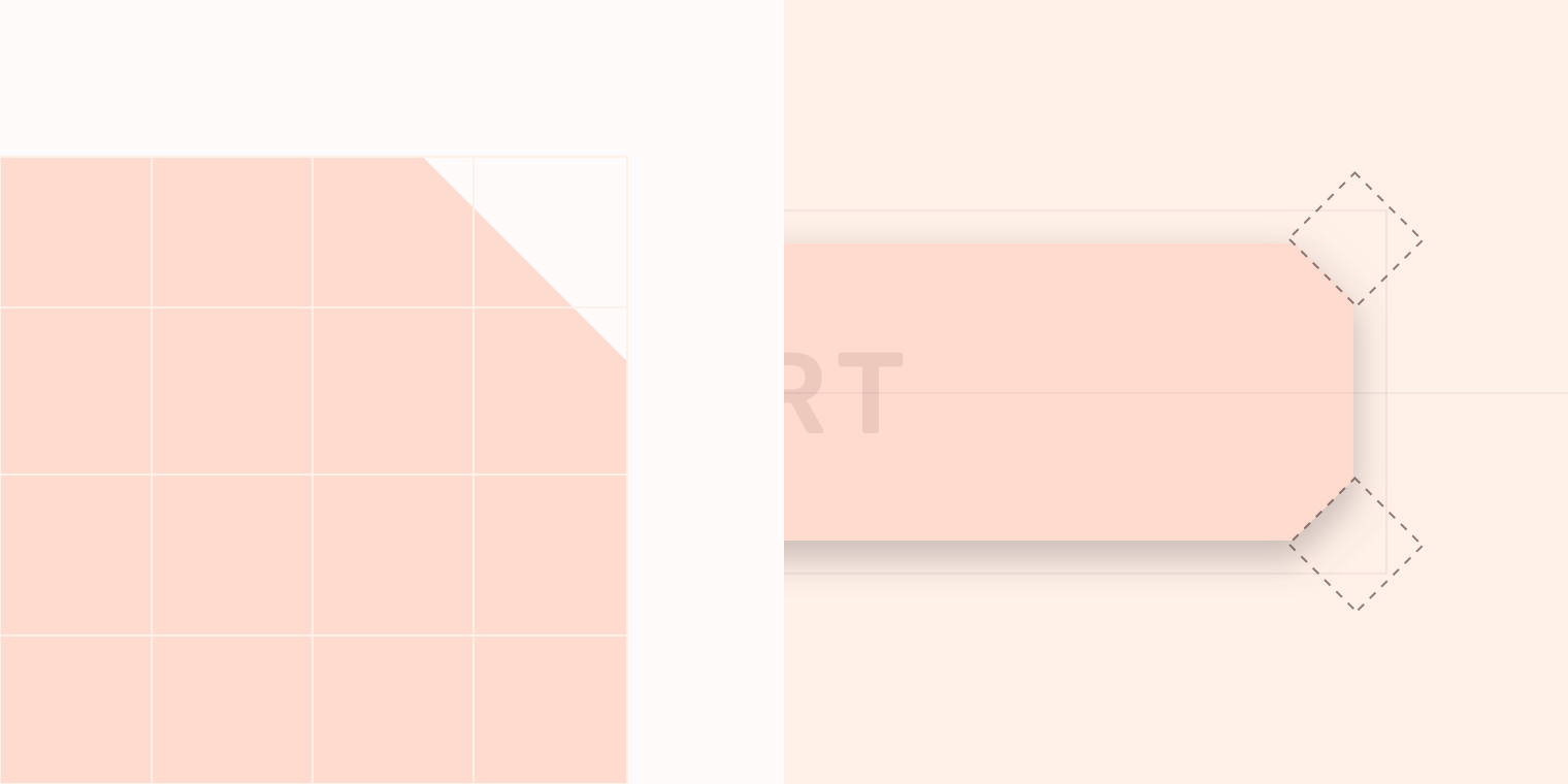
svgjs.Doc.chamferRect(
width:
number,
height:
number,
chamferAllLength:
number,
):
svgjs.MDSChamferRect
svgjs.Doc.chamferRect(
width:
number,
height:
number,
chamferTopLeftLength:
number,
chamferTopRightLength:
number,
chamferBottomRightLength:
number,
chamferBottomLeftLength:
number
):
svgjs.MDSChamferRect
Change the chamfer length later after the ChamferRect has been created using the chamfer method
svgjs.MDSChamferRect.chamfer(
width:
number,
height:
number,
chamferAllLength:
number,
):
svgjs.MDSChamferRect
svgjs.MDSChamferRect.chamfer(
width:
number,
height:
number,
chamferTopLeftLength:
number,
chamferTopRightLength:
number,
chamferBottomRightLength:
number,
chamferBottomLeftLength:
number
):
svgjs.MDSChamferRect
svgjs.MDSChamferRect extends svgjs.Path
<!-- HTML -->/* CSS: for size example */;; // Find example div;;;; // Create container; // Draw the chamfer rectanglecontainer.chamferRectwidth, height, chamferLength;Elevation
Creates a Material Elevation based on the shape.
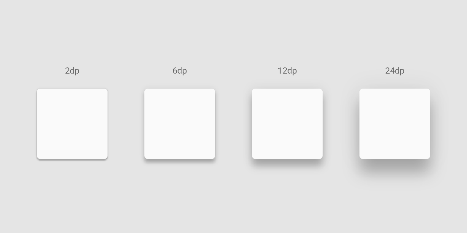
svgjs.Shape.elevation(
z:
svgjs.zDepth
):
svgjs.Filter
svgjs.Filter.elevate(
z:
svgjs.zDepth
):
svgjs.Filter
<!-- HTML -->/* CSS: Make sure shadows dont get clipped */ ;;; // find example div;;; ; // Diamond Shape; ;Ripple
Creates a Material Pressed State aka ripple
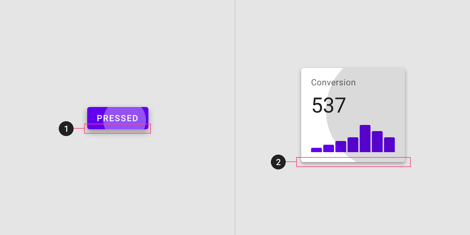
svgjs.Shape.ripple(
contrast?:
svgjs.MDSContrast
):
svgjs.MDSRipple
svgjs.MDSRipple.expand(
x:
number,
y:
number
):
svgjs.MDSRipple
svgjs.MDSRipple.reset():
svgjs.MDSRipple
If you need to update the extents of the ripple use updateMinMax, such as parent container resized.
svgjs.MDSRipple.updateMinMax(
width:
number,
height:
number
):
svgjs.MDSRipple
svgjs.MDSRipple.contrast: svgjs.MDSContrast ( 'light' | 'dark' )
svgjs.MDSRipple extends svgjs.Circle
<!-- HTML --> Click me /* CSS */ ;; // Find example div;;; // Find background div; // Find ripple div; // Create containers;; // Draw a shape that can show off mask effect.fill'#ccc';// You need a separate copy of shape for ripple.fill'#000'; // Add ripple shape; // Add interactions for demodiv.onmousedown =div.onmouseup =Rect Cut Out
Creates cut outs for rectangles. Such as Material App Bottom Bar. See the Inset FAB under the anatomy section.
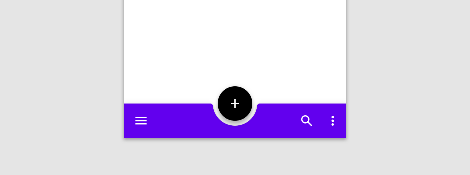
svgjs.Shape.circleCutOut(
width:
number,
height:
number,
cutOutSize:
number,
alignX:
svgjs.CutOutAlignX,
alignY:
svgjs.CutOutAlignY,
padding:
number,
roundedEdge:
number,
showCutOut:
boolean
):
svgjs.MDSRectCutOut
svgjs.Shape.triangleCutOut(
width:
number,
height:
number,
cutOutSize:
number,
alignX:
svgjs.CutOutAlignX,
alignY:
svgjs.CutOutAlignY,
padding:
number,
showCutOut:
boolean
):
svgjs.MDSRectCutOut
svgjs.Shape.customCutOut(
width:
number, // Width of rect
height:
number, // Height of rect
cutOutSize:
number, // Size of cutout
customCutOutOpen:
string, // Relative svg.path data
customCutOutClosed:
string, // Relative svg.path data
alignX:
svgjs.CutOutAlignX,
alignY:
svgjs.CutOutAlignY,
padding:
number,
showCutOut:
boolean
):
svgjs.MDSRectCutOut
svgjs.MDSRectCutOut.showCutOut(
alignX:
svgjs.CutOutAlignX
):
svgjs.MDSRectCutOut
svgjs.MDSRectCutOut.hideCutOut():
svgjs.MDSRectCutOut
If you need to update the extents of the Rect use resize, such as parent container resized.
svgjs.MDSRectCutOut.resize(
width:
number,
height:
number
):
svgjs.MDSRectCutOut
svgjs.MDSRectCutOut.CutOutAlignX: svgjs.CutOutAlignX ( 'start' | 'center' | 'end' )
svgjs.MDSRectCutOut.CutOutAlignY: svgjs.CutOutAlignX ( 'top' | 'bottom' )
svgjs.MDSRectCutOut extends svgjs.Path
<!-- HTML -->/* CSS: for size example */;; // Find example div;;;;;; // fab plus cutout padding;;; // Create container; // Draw the rectangle with circular cutout;For custom shapes use relative path data
; ; ; RoadMap
Custom Chamfer Shapes supply a shape to cutout of chamfered corners
Rect CutOut refactor circle and triangle to use similar method to custom.
Demo Site more examples