
material-angular-select
Angular select for material-design-lite
Live example
JS version
Here you can find JS based version: getmdl-select
Getting started
Step 1: Install material-angular-select:
NPM
npm install --save material-angular-selector
YARN
yarn add material-angular-selectStep 2: Import the MaterialAngularSelectModule
; Step 3 (Optional): Include MDL
If you didn't use material-design-lite in your project before, don't forget to include necessary sources. Follow steps from here or
- add dependencies in
angular.json
... "build": - and import icons to
index.html
Sample implementation
app.module.ts
;; ;; @ app.component.html
app.component.ts
; @ public readonly countries = 'Minsk' 'Berlin' 'Moscow' 'NYC'; public locationValue = 'Minsk'; public { // do something } API
Inputs
| Input | Type | Default | Required | Description |
|---|---|---|---|---|
| [data] | Array [] | [] | yes | Items array |
| name | string | '' | yes | Text for name of input |
| label | string | '' | no | Text for label |
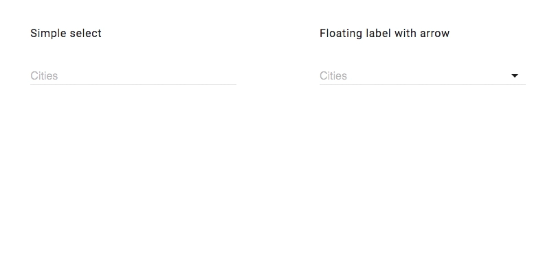
| arrow | boolean | true | no | Allows to hide arrow |
| disabled | boolean | false | no | Allows to disable select |
| fixHeight | boolean | false | no | Allows to fix menu height to 280px |
| isFloatingLabel | boolean | true | no | Allows to fix label |
| [classStyle] | Array | null | no | Added own classes to dropdown element |
| keys | {value: string, title: string} | {value: 'value', title: 'title'} | yes | Required if use array of object with different structure |
| currentValue | string or {title: any, value: any} | {title: '', value: ''} | no | Set default value |
Outputs
| Output | Description |
|---|---|
| selectedValue | Fired on model change. Outputs whole model |
Hire us
We are ready to bring value to your business. Visit our site creativeit.io or drop us a line hello@creativeit.io. We will be happy to help you!
Support the project
- Star the repo
- Create issue report or feature request
- Check our material-angular-dashboard
- Tweet about it
- Follow us on Twitter