A new version of the share modal is available. Click here to check out v3.
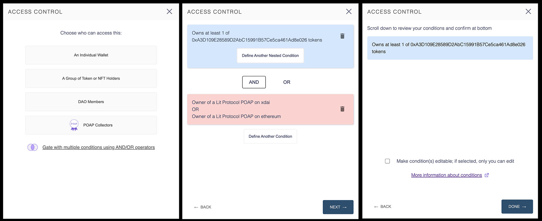
The Lit Share Modal is a tool for creating access control conditions for securing content with Lit Protocol. Click here to visit the Lit Protocol developer docs.
- Secure content based on wallet address, token/NFT holdings, POAP ownership, or DAO membership.
- Create multiple paths for unlocking content by using AND/OR operators.
- Set your most used tokens/NFTs as defaults for quick and easy access.
A Vanilla JS wrapper for the Lit Share Modal is also available.
Note for NextJS users: If you are using NextJS, the CSS injection will not work. Set the injectCSS prop to false, and
import the CSS file directly from node_modules/lit-share-modal/dist/style.css in _app.tsx or _app.jsx.
Installation
with npm
npm install --save lit-share-modal
with yarn
yarn add lit-share-modal
Usage
with React Hooks
import ShareModal from 'lit-share-modal';
import { useState } from 'react';
import './App.css'

const App = () => {
  const [openShareModal, setOpenShareModal] = useState(false);

  const onAccessControlConditionsSelected = (shareModalOutput) => {
    // do things with share modal output
  }

  return (
    <div className={'App'}>
      <ShareModal onClose={() => setOpenShareModal(false)}
                  showModal={openShareModal}
                  onAccessControlConditionsSelected={onAccessControlConditionsSelected} />
    </div>

  );
}

export default App;
Props
Required
-
onClose- callback for actions to take on closing the modal -
showModal- boolean that signals whether modal is open (true) or closed (false) -
onAccessControlConditionsSelected- callback for the share modal output
onAccessControlConditions provides an object with the following properties:
-
accessControlConditions- an array of objects and nested arrays reflecting the selected conditions -
permanent- a boolean signaling whether conditions will be permanent (true) or editable by the author in the future (false)
Documentation on how these properties are used with the LitJsSdk, can be found in
the LitJsSdk docs
Optional
-
injectCSS- a boolean that is set to true by default. When this is true, the CSS styles will be injected into the of the page when the page loads, so there is no need to import any css. You can set this to "false" if you want to use your own CSS. -
defaultTokens- set quick access tokens that appear in theSelect a Token/NFTmenu -
darkTheme-falseby default. Set as 'true' to enable dark mode. -
loadingState-falseinitially, but reflects the loading state on theReview Conditionsscreen. Allows the loader status to be reset from outside the modal.
Three tokens/NFTs appear as default: Ethereum, LitGate, and Blocks
This list can be altered by passing an array of objects with the following properties:
-
label- name of token/NFT -
logo- url of token/NFT favicon -
value- token/NFT address -
symbol- token/NFT symbol -
standard- token standard (ERC20, ERC721, or ERC1155)
Example of a single entry quick access array
export const defaultTokens = [
  {
    label: "Lit Genesis Gate",
    logo: "https://litgateway.com/favicon.png",
    value: "0xA3D109E28589D2AbC15991B57Ce5ca461Ad8e026",
    symbol: "LITGATE",
    standard: "ERC721",
  }
];
