<lit-gauge> 

Live demo and configuration / style editor
Since this is a Lit 3 web component, this will work inside any SPA framework. Read the React integration docs. Framework-agnostic web components are the future!
Installation
npm i lit-gaugeUsage Examples
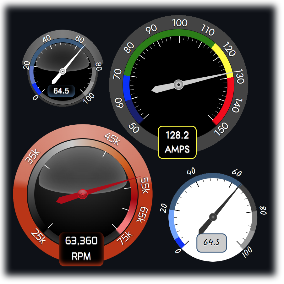
Here are examples using declarative inline attributes. These correspond to the gauges displayed in the screenshot. Styling examples are near the bottom of the readme.
<script type="module">
  import {LitGauge} from 'lit-gauge';
</script>
<lit-gauge
  id="lg1" size="150"
  scaleValues="0,8,20,65,80,90,100"
  scaleColors="#0909FB,#5D73CB,#375a7f,#444,#777,#999"
  ticks="5" minorTicks="5"
  value="40" valuePrecision="1"
></lit-gauge>

<lit-gauge
  id="lg2" size="250"
  scaleColors="blue,aqua,green,yellow,red"
  fluidcolors="true" ticks="10" minorTicks="5"
  value="60" label="AMPS"
  valuePrecision="1"
></lit-gauge>

<lit-gauge
  id="lg3" size="250" fluidcolors="true"
  scaleValues="25000,40000,55000,65000,70000,75000"
  scaleColors="#000,#ccc,#D85F03,#a00,#ff7b7b"
  ticks="thresholds" value="60" label="RPM"
  tickLabels="25k,35k,45k,55k,65k,75k"
  valuePrecision="0" setDynamicOuterColor="true"
></lit-gauge>

<lit-gauge
  id="lg4" size="200"
  scaleValues="0,5,20,65,80,90,100"
  scaleColors="#0909FB,#6BA1FF,#375a7f,#444,#777,#999"
  plain="true" ticks="5" minorTicks="5"
  value="40" valuePrecision="1"
></lit-gauge>
Usage with single options object
<lit-gauge />
<script type='module'>
  import {LitGauge} from 'lit-gauge';

  let g = document.querySelector('lit-gauge');
  g.options = {
    scaleValues: [50, 60, 70, 115, 130, 150],
    scaleColors: ['midnightblue','blue','green','yellow','rgba(255,0,0,1)'],
    ticks: 10, minorTicks: 5,
    fluidColors: false, plain: true,
    valuePrecision: 1
  }
</script>
Attributes
- size: Number - Sets the height and width of the component. This component is square. It starts to look bad below 150px.
-
scaleValues: String -
(scaleValues="0,10,50,90,100")Sets the value ranges that will correspond with the color thresholds. -
scaleColors: String -
(scaleColors="#333,green,yellow,red")Sets the colors that fill each value range. Must be exactly one value less than the scaleValues attrib. If you set ascaleValue=0,10,20,30then you have created 3 ranges (thresholds) that require a color. scaleColors=#333,#888,#ccc would set 0-10 to #333, 10-20 to #888, and 20-30 to #ccc. Use any valid css color string for each value. - fluidColors: Boolean - Shows a fluid gradient instead of hard stops for the color ranges.
-
ticks: String -
(ticks="10")Accepts either a numeric divisor (represents the total count of ranges created by the tick marks), or a csv value string representing custom value positions to place ticks (minor ticks will be disabled). Optionally you can enterticks="thresholds"to place ticks on the scaleValues attrib values. The tick mark total will be one greater than the value you enter since the ranges are bounded on both sizes by marks. -
minorTicks: Number -
(minorTicks="5")Available only when ticks is a numeric value. Subdivides each tick range by the specified value. -
tickLabels: String -
(tickLabels="0%,20%,50%,100%")Override the generated numeric tick values with a CSV string. -
value: Number -
(value=runtimeValue)The runtime value that positions the needle and sets the runtime color value. -
label: String -
(label="Volts")The runtime label to display below the value. If unspecified, the value moves upwards. This should be a short, succinct label. - plain: Boolean - Overrides the lighted glassy appearance. Uses a flat look. You can also do this with the css variables shown below.
- valuePrecision Int - For readability the label displays value.toFixed(decimalPrecision). If you have a suggestion for large numbers, please open an issue and share!
Styling
CSS vars to set custom colors and appearance. Below are the default values. Use the online editor to generate your own theme.
<style>
lit-gauge{
  --font-fam: Roboto, -apple-system, "Helvetica Neue", "Noto Sans", "Liberation Sans", Arial, sans-serif;
  --outer-color:#444;//this is the outermost background ring
  /*outer-lighting is the lighting effect on the outer band. Uses a conic semi-opaque gradient overlay.*/
  --outer-lighting-effect:conic-gradient(from 180deg at 50.0% 50.0%,
    rgba(0,0,0,0) 98.00deg,
    rgba(255,255,255,0.3) 103.00deg,
    rgba(255,255,255,0.5) 180.00deg,
    rgba(255,255,255,0.3) 257.00deg,
    rgba(0,0,0,0) 265.00deg
  );

  /* styles for the label at the bottom center*/
  --label-bg: #000; /*  the label that shows the current value inside*/
  --label-color:#fff; /*  font color of the label*/
  --label-min-width:3em; /*  customize to your value so the container does not jiggle when updating the value*/

  /*  ticks/label styles*/
  --tick-color:#fff; /* the tick line color*/
  --tick-label-color:#fff;/*  the outer numeric tick label colors*/
  --tick-label-shadow:0 1px 1px black;/* shadow to apply to the tick-labels to enhance visibility*/

  /* dial styles*/
  --dial-background:rgb(22,22,22);/* the main inner color*/
  --dial-gradient:none;/* you can play with gradients to create your own lighting effect*/
  --dial-shadow: 0 0 1em .25em rgba(122,122,122,.8), inset 0 0 2em #bbb;/* used to enhance the space between the color thresholds.*/
  --dial-border-width: 1px;/* the dial border is where the outer ring meets the color threshold bands*/
  --dial-border-color:#111;
  --hand-color: #ddd; /* the needle color*/
}
</style>
Styling examples
These are the styles used to create the example screenshot in sequence
<link rel="stylesheet"
      href="https://fonts.googleapis.com/css2?family=Mina&family=Jost&family=Outfit&family=Kalam">
<style>
    #lg1{
      --outer-color: #000;
      --hand-color: white;
      --dial-background: black;
    }
    #lg2{
      --font-fam: Jost;
      --hand-color: #ccc;
      --dial-background: black;
      --dial-shadow:none;
    }
    #lg3{
      --font-fam: Mina;
      --outer-color: #400;
      --dial-background: black;
      --dial-gradient: radial-gradient(200px at 50.0% 10.0%,
        rgba(55, 55, 55, 1) 15%,
        rgba(0, 0, 0, 1) 70%,
        rgba(0, 0, 0, 0) 100%
      );
      --hand-color: #B4080E;
      --dial-border-width: 2px;
      --tick-label-shadow: 0 1px 2px black;
      --dial-shadow: inset 0 -10px 30px #444;
    }
    #lg4{
      --font-fam: Kalam;
      --outer-color: transparent;
      --label-color: black;
      --dial-background: #fff;
      --dial-shadow: none;
      --tick-color: black;
      --tick-label-color: white;
      --hand-color: #333;
      --tick-label-shadow: 0 1px 1px black;
      --label-bg: #ccc;
    }
  </style>
Run local
Uses vite. Will run on node 16+ - but will complain about compatibility if you are stuck on node 16 like me. Ignore this. It's fine.
git clone https://github.com/thewebkid/lit-gauge.git
cd ./lit-gauge
npm i
npm dev