lit-element-lazy
What is it?
lit-element-lazy is a @lazy decorator that allows you to call component method as the user scrolls component into the viewport. On supported browsers (Chrome and chrome based browsers, Firefox and Edge) lit-element-lazy uses IntersectionObserver to accomplish this functionality. For Safari and IE it simply falls back to setTimeout unless you use polyfill.
Polyfilling
If you want lit-element-lazy to work everywhere (also on IE and Safari) use polyfill. You can pop this script tag:
<script src="https://polyfill.io/v3/polyfill.min.js?features=IntersectionObserver"></script>
in index.html and that's it:)
Polyfill is not included in lit-element-lazy not to increase the bundle size and to leave the decision to you: either you go with setTimeout fallback or if you prefer, go with polyfill
Installing
In your lit-element project, add lit-element-lazy to your package.json:
npm i lit-element-lazy
How to use it?
It's very simple: you just need to anotate your method with @lazy and it will be called when host component is scrolled to viewport. Method will be called once - the first time you scroll to component
;; @ @ name = 'World'; @ { console; } { return html`Hello, !`; }Margin
You can also set margin for @lazy. It determines how far from the viewport lazy loading starts. Can have values similar to the CSS margin property, e.g. "10px 20px 30px 40px" (top, right, bottom, left). The values can be percentages.
@ { console; }or if you want to have it dynamic (as web component @Prop)
@ @ margin?: string;All web components here have optional margin prop.
When use it?
Basically you can think of every action that you would normally do with the load of the page/component. Maybe some of those actions are time consuming, generating not needed network traffic and not giving any benefit to most of users? Good example is calling an API to get data to be presented by component. Maybe most of users are not even checking some forgotten carousel on the bottom of every page in your app? Or you need an easy way to implement a listing page with infinie scrolling?
Example
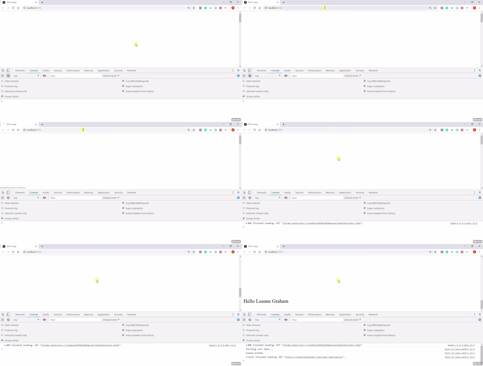
Following component
;; @ @ name: string; @ { console; ; } { return html`!`; }...on the page
gives

