Leaflet.Control.Select
Plugin for Leaflet library that adds a new control class.
Motivation
To create a menu-like component that can be implemented as a native leaflet control and control the interaction.
Demo
See storybook hosted on github.io
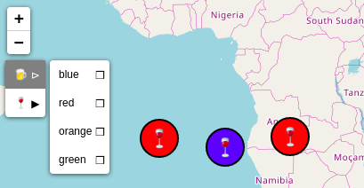
Screenshots


How to use
-
- a) get the npm package
npm i --save leaflet.control.select
- a) get the npm package
-
- b) download/clone/fork this repository and use dist folder (you can also build it (see
How to develop))
- b) download/clone/fork this repository and use dist folder (you can also build it (see
-
- include the original leaflet js and css
-
- define
L.Control.Selectinstance (see options or storybook documentation)
- define
var map = L;var items = label: "sunny" value: "☼" label: "half-sunny" value: "🌤" label: "half-raining" value: "🌦" label: "raining" value: "🌨" label: "tornado" value: "🌪" ;Lcontrol ;How to develop
npm installto get all modules needed for the developmentnpm startto open storybook environment, and set watchers for .js and .css filesnpm run buildto test and create the minified .js code
Options
content
items (default [])
- the content of menu, a collection of objects with label and value keys (if no labels are provided, values will be used as labels)
simple items example:
label: 'option 1' value: 'user-o' label: 'option 2' value: 'bullhorn' label: 'option 3' value: 'book' label: 'option 4' value: 'car' label: 'option 5' value: 'cog' nested items example:
label: "group 1" value: "g1" items: label: "option 1" value: "g11" label: "option 2" value: "g12" label: "option 3" value: "g13" label: "group 3" value: "g3" items: label: "option 1" value: "g131" label: "option 2" value: "g132" label: "option 3" value: "g133" label: "option 5" value: "g5" label: "group 2" value: "g2" items: label: "option 6" value: "g21" label: "option 7" value: "g22" ;multi (default false)
- true possible to choose more items at the same time (radio / checkbox mode)
selectedDefault (default false)
- value or list of values to be selected at the initialization
DOM
id (default "")
- id for the wrapper div element
additionalClass (default "")
- additional class of the wrapper div element
icons
iconMain (default "≡")
- icon for the control button
iconChecked (default "◉")
- icon for checked item
iconUnchecked (default "ⵔ")
- icon for unchecked item
iconGroupChecked (default "▶")
- icon for checked group (a group with a checked item)
iconGroupUnchecked (default "⊳")
- icon for unchecked group (a group without a checked item)
Events
onOpen() (default function(){})
- function emmited after the menu is open
onClose() (default function(){})
- function emmited after the menu is closed
onSelect(item) (default function(item){})
- function emmited after an item is selected, returns the selected item
onGroupOpen(group item) (default function(item){})
- function emmited after the group is clicked, returns the group item
Methods
close()
- closes the menu
TESTS
- test are done with jest and @storybook/addon-storyshots (checking whether it is possible to render all stories from storybook)
- run tests with
npm run testornpm run test-updateto update snapshots
TODO
- unit tests
- better code documentation
- more methods