


Storybook is to create UI components which can be reused in multiple projects.
- Latest Stable Version Release 1.0.30
- To get this package Storybook
Storybook requires React Project to run.
Connect to feed and follow the given steps.
Go to project directory
npm install hcmstorybookTo Use any component of hcmstorybook:
2a. Go to show code of component you want to use & copy the code
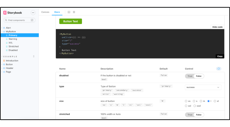
2b. Import the component
import {FloatingButton} from 'hcmstorybook';2c. Use or Modify the component controls as per requirement
 <FloatingButton
  buttonType="Passive"
  label="Hello,Storybook"
/>
2d. Refresh the webpage to see your component
ISC