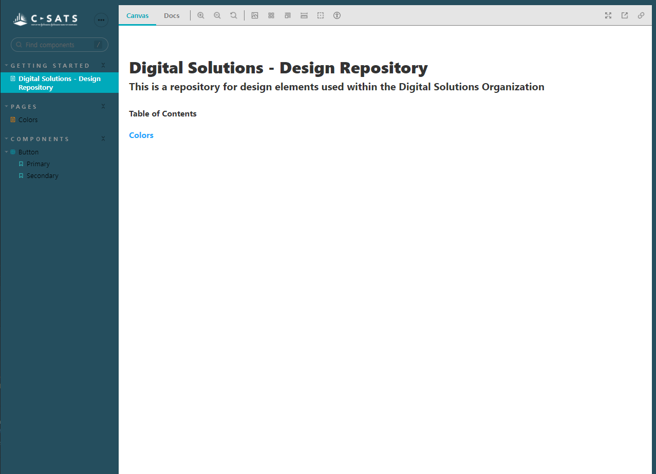
Digital Solutions Design Repository
This repository contains the component library for Digital Solutions. Here you will find all the necessary color schemas and design components for our applications. This repository comprises of Storybook, Svelte and TailwindCSS.
This is a work-in-progress repository.
Steps to build
//Quickstart
npm install
npm run storybook
You can open the Storybook UI at http://localhost:6006
Further Build Steps
- Clone this repo
git clone https://github.com/slee204/digital-solutions-design-repository.git - Go to the directory
cd digital-solutions-design-repository - Install dependencies
npm install - To develop your Svelte App:
npm run dev - To develop UI components independent of your app:
npm run stories - Open storybook UI:
npm run storybook
Storybook UI
The storybook UI will contain components (stories) or color combinations and components that Digital Solution uses. This code will be frequently updated to make sure we are aligned between design and engineering teams.
Documentation
Storybook Addons
- Accessibility Addon
- Accessibility Addon - Colorblindness Emulation
- Actions Addon
- Notes Addon
- Source Addon
- Viewport Addon
