Description
This is an extension of Angular ng-walkthrough and an adaptation to Ionic framework that makes the plugin available to search an element or text in any position
Credits to Sopra Steria Digital SC team digital@sopra.com
ng-walkthrough
After not finding an Angular walkthrough/on-boarding/tour guide/learning page directive which was responsive, dynamic, easy to use and thus good for our Fitness Meal Planner mobile web App I decided to create one.
One of the most common design challenges emerging in mobile design is that of 'invitation' - creating an explanation walk through during user first interaction with the app so to engage him. Following Theresa Neil's design patterns from Mobile Design Pattern Gallery
This angular directive implements a walkthrough via one of the following patterns: the transparency pattern or the tip pattern (an explanation about the different patterns can be found online at ux booth)
Special features
- Use the transparency walkthrough either using transclude or given attributes which contain basics such as text, gesture image, 'got it' button
- In transparency walkthrough easily highlight a DOM element (see demo)
- Use any image you want or choose a gesture image from the given collection (such as swipe with direction or tap) and place it bound to the element mentioned above.
- automatically moves text to bottom if item is covering the text with icon or arrow
- In tip mode add an Icon to sit on top or behind the tip text box
ScreenShots
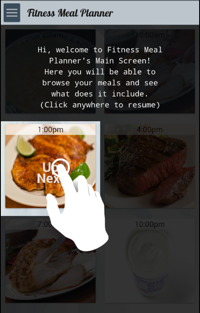
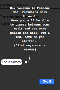
Transparency walkthrough in Classic, Classic with arrow mode and Totally customizable mode respectively:


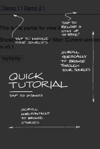
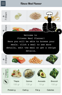
Tip walkthrough mode:

Demo
A demo was created to show:
- The 2 basic transparency overlay types in 3 demoes fitting the screenshot examples - one basic template, one with arrows, and the last freestyle one using transclude.
- The tip mode walkthrough Demo can be found here
Requirements
- AngularJS
- No need for JQuery as JQLite is used
Notes
This directive has been originally developed for the Ionic Framework, so it supports both angular and ionic apps.
Installation
- NPM:
npm install ng-walkthrough - Bower:
bower install ng-walkthrough
Usage
- Load the script files in your application:
Add dependencies on the ng-walkthrough AngularJS module:
angular;If you want to use the directives supplied tap icons add this script file:
You can now use the directive, add the element to your HTML:
...and use one of the two configurations: 1> Place any HTML code as you like instead of the three dotes as this uses the Angular transclude ability. Make sure to specify walkthrough-type="transparency" or "tip" for this to work. 2> Use the additional optional properties the directive has to quickly create a walkthrough screen.
Usage Example 1 - transparency Non transclude option
Usage Example 2 - transparency using transclude option
Usage Example 3 - tip type walkthrough
Directive Attributes
is-active(mandatory) - Any walkthrough type. Bound element controls display the directive. Set 'true' to bound element in order to display.walkthrough-type(mandatory) - Any walkthrough type. Specifies what type of walkthrough to display. Currently supported are 'transparency' and 'tip' typesfocus-element-id(optional) - Any walkthrough type. ID of DOM element we want to give focus to, without it all screen will be grayed outis-round(optional) - Any walkthrough type. Set to 'true' if you want the focused area to be round, otherwise it will be square set to the size of the DOM elementhas-glow(optional) - Any walkthrough type. Set to 'true' if you want the focused area to have a glow around iticon(optional) - Any walkthrough type. If set to any of the predefined values ("single_tap", "double_tap", "swipe_down", "swipe_left", "swipe_right", "swipe_up"), in such case the icon will be bound to focus element (if exists), make sure to add 'ng-walkthrough.tap_icons.js' following instructions above. any other icon can be used and will be loaded from supplied foldermain-caption(optional) - Any walkthrough type. This is the text that will be displayed in the walk-through. Text can be formatteduse-button(optional) - Any walkthrough type. set to 'true' you want a button displayed that most be clicked in order to close walkthrough, otherwise clicking anywhere while walkthrough displayed will close iticon-padding-left(optional) - Any walkthrough type. Add padding to the icon from the left in percentageicon-padding-top(optional) - Any walkthrough type. Add padding to the icon from the top in pixelstip-icon-location(optional) - For tip walkthrough. In case there is an overlap between the tip text box and the tip icon you can define here which is on top. Either "FRONT" or "BACK"force-caption-location(optional) - Any walkthrough type. Set caption location at the top of screen or closer to bottom. Acceptable values: "TOP" or "BOTTOM"tip-color(optional) - For tip walkthrough. Define the tip textbox background color. Currently supports "BLACK" or "WHITE" valuesis-bind-click-event-to-body(optional) - Any walkthrough type. If 'use-botton' is not set to true, then any this will bind the click events to the body to capture events outside walkthrough, for example: ionic headeron-walkthrough-show(optional) - Any walkthrough type. Bind method to be called when walkthrough is displayedon-walkthrough-hide(optional) - Any walkthrough type. Bind method to be called when walkthrough is hiddenheader-bar(optional) - If defined it will look for element to focus in the nav barfooter-bar(optional) - If defined it will look for element to focus in the footertext-position(optional) - Pixels from top to place the text
Testing
Ran on Chrome, Safari, Iphone 4 Emulator and Android S3, For continuous integration with Karma with Jasmine, run on Travis CI for FireFox
License
As AngularJS itself, this module is released under the permissive MIT license. Your contributions are always welcome.