
ionic-angular-theme-switch
This ionic angular switch theme service can be used to easily change your app's theme on the fly.
The actual theme will be stored and restored on reload or revisitation.
To simplify usage, this library provides one component to toggle between two themes and another component to select one of multiple themes.
Demo: https://ionic-angular-theme.jonathan-heilmann.de
Demo app
The ionic angular application holding this library provides a demo on how to use the service or available components.
Current GutHub branch master can be found here: https://ionic-angular-theme.jonathan-heilmann.de
To run this app locally, follow these steps:
- Clone GitHub repository
jonathanheilmann/ionic-angular-theme
($git clone https://github.com/jonathanheilmann/ionic-angular-theme.git) - Navigate
$cd ionic-angular-theme - Install dependencies
$yarn install - Build library
$ng build ionic-angular-theme-switch - Run
$yarn start
Inspired by
https://angularfirebase.com/lessons/css-variables-in-ionic-4/
https://github.com/AngularFirebase/128-ionic4-theme-generator
Integrate service in Ionic v4 project
For basic theming see: https://beta.ionicframework.com/docs/theming/color-generator
For advanced application colors see: https://beta.ionicframework.com/docs/theming/advanced#application-colors
-
Resolve peer dependencies:
yarn add @angular/common @angular/core @ionic/angular @ionic/storage color -
Add
IonicAngularThemeSwitchServiceto yourAppModule'sprovidersandIonicStorageModule.forRoot()to yourAppModule'simportsimport { IonicAngularThemeSwitchService } from 'ionic-angular-theme-switch'; @NgModule({ imports: [ ... IonicStorageModule.forRoot(), ... ], providers: [ ... IonicAngularThemeSwitchService, ... ], }) export class AppModule {} -
In your
AppComponentadd this:import { IonicAngularThemeSwitchService } from 'ionic-angular-theme-switch'; export class AppComponent { constructor( ... private themeSwitchService: IonicAngularThemeSwitchService, ... ) { } } -
To change your theme use this snippet:
this.themeSwitchService.setTheme({ primary: '#549ee7', secondary: '#5fb3b3', tertiary: '#fac863', success: '#90d089', warning: '#f99157', danger: '#ec5f67', light: '#d8dee9', medium: '#65737e', dark: '#1b2b34', 'ion-background-color': '#1b2b34', 'ion-text-color': '#fff' }, 'dark'); -
To load the default ionic theme call
this.themeSwitchService.setTheme();
API
setTheme()
Set theme with given colors.
Parameters:
- theme
Description: Object of colors/CSS variables to set.
Type:IonicColors
Default:{} - name
Description: Theme name
Type:string
Default: `` (empty string)
setVariable()
Set a single CSS variable.
Parameters:
- name
Description: Name of the CSS variable.
Type:string - value
Description: Value if the CSS variable.
Type:string
getStoredTheme()
Returns: Promise with the actual stored theme as string.
getStoredThemeName()
Returns: Promise with the actual stored theme name.
Interfaces
IonicColors
Components
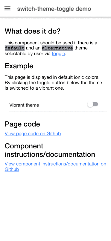
theme-switch-toggle
This component should be used if there is a default and an alternative theme selectable by user via toggle.
Usage
-
Resolve peer dependencies:
yarn add @angular/common @angular/core @ionic/angular @ionic/storage color -
Add
IonicAngularThemeSwitchToggleModule.forRoot()to yourAppModule'simportsimport { IonicAngularThemeSwitchToggleModule } from 'ionic-angular-theme-switch'; @NgModule({ imports: [ ... IonicAngularThemeSwitchToggleModule.forRoot(), ... ] }) export class AppModule {} -
Add
IonicAngularThemeSwitchToggleModuleto yourNgModuleimportswhere you are using the componentimport { IonicAngularThemeSwitchToggleModule } from 'ionic-angular-theme-switch'; @NgModule({ imports: [ ... IonicAngularThemeSwitchToggleModule, ... ] }) export class MyPageModule {} -
Integrate component
TypeScript:;public themes: ToggleThemes =HTML Template:
Properties
themes
Object of default and alternative theme colors.
Attribute: themes
Type: ToggleThemes
color
Inherited from ion-toggle
disabled
Inherited from ion-toggle
mode
Inherited from ion-toggle
Events
ionBlur
Inherited from ion-toggle
ionChange
Inherited from ion-toggle
ionChange is emitted before change is processed by this component!
ionFocus
Inherited from ion-toggle
Interfaces
ToggleThemes
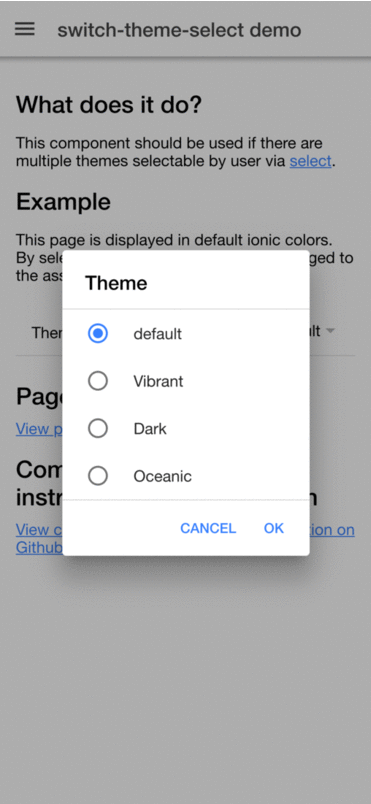
theme-switch-select
This component should be used if there are multiple themes selectable by user via select.
Usage
-
Resolve peer dependencies:
yarn add @angular/common @angular/core @ionic/angular @ionic/storage color -
Add
IonicAngularThemeSwitchSelectModule.forRoot()to yourAppModule'simportsimport { IonicAngularThemeSwitchSelectModule } from 'ionic-angular-theme-switch'; @NgModule({ imports: [ ... IonicAngularThemeSwitchSelectModule.forRoot(), ... ] }) export class AppModule {} -
Add
IonicAngularThemeSwitchSelectModuleto yourNgModuleimportswhere you are using the componentimport { IonicAngularThemeSwitchSelectModule } from 'ionic-angular-theme-switch'; @NgModule({ imports: [ ... IonicAngularThemeSwitchSelectModule, ... ] }) export class MyPageModule {} -
Integrate component
TypeScript:;public themes: SelectTheme =;HTML Template:
Properties
themes
Object of themes.
Attribute: themes
Type: SelectTheme[]
cancel
Inherited from ion-select
disabled
Inherited from ion-select
interface
Inherited from ion-select
interfaceOptions
Inherited from ion-select
mode
Inherited from ion-select
okText
Inherited from ion-select
Events
ionBlur
Inherited from ion-select
ionCancel
Inherited from ion-select
ionChange
Inherited from ion-select
ionChange is emitted before change is processed by this component!
ionFocus
Inherited from ion-select
Interfaces
SelectTheme