IntegralUI Web - Label, v22.2
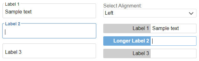
IntegralUI Web - Label is a native Web Component that is fully customizable label with different alignments relative to attached element.
Note This component is part of IntegralUI Web library.
Here is a brief overview of what is included:
Components
Label - A fully customizable label with different alignments relative to attached element
Services
Common - Includes a set of common functions usable in most applications
Dependencies
IntegralUI Web is built on top of LitElement. All necessary files from that library are already included in the /external subfolder of this repository.
DEMO
Online QuickStart App - An online demo of Label component is included
Installation
Install the repository by running
npm install https://github.com/lidorsystems/integralui-web-label.gitor directly from NPM
npm i integralui-web-labelHow to Use
Note A detailed information is available here: How to Use IntegralUI Web Components. Explains how to setup and use components for each framework: Angular, React or Vanilla JavaScript.
In general, you need to open your application and add a reference to a component you want to use. For example, if you are using the IntegralUI Label component:
Angular
import 'integralui-web-label/components/integralui.label.js';
import { IntegralUILabelAlignment, IntegralUITheme } from 'integralui-web-label/components/integralui.enums.js';

@Component({
    selector: '',
    templateUrl: './label-overview.html',
    styleUrls: ['./label-overview.css']
})
export class LabelOverviewSample {
    public labelAlignment: IntegralUILabelAlignment = IntegralUILabelAlignment.Left;
    public labelContentSize: any = { width: 200 }
    public labelSize: any = { width: 350 }
    public currentTheme: IntegralUITheme = IntegralUITheme.Office;
}
Then, place the component in HTML using its tag. Here is an example:
<div class="alignment-block">
    <iui-label [alignment]="labelAlignment" [contentSize]="labelContentSize" [size]="labelSize" [value]="'Label 1'" [theme]="currentTheme">
        <input value="Sample text" />
    </iui-label>
</div>
Depending on current version of TypeScript, you may need to add some settings in tsconfig.json, under "angularCompilerOptions":
"angularCompilerOptions": {

    . . .

    "suppressImplicitAnyIndexErrors": true,     // solves implicit any values
    "noImplicitAny": false,             // solves angular could not find a declaration file for module implicitly has an 'any' type
    "strictNullChecks": false           // solves type null is not assignable to type

}
React
Currently ReactJS doesn't have full support for Web Components. Mainly because of the way data is passed to the component via attributes and their own synthetic event system. For this reason, you can use available wrappers located under /wrappers directory, which are ReactJS components that provide all public API from an IntegralUI component.
import IntegralUILabelComponent from 'integralui-web-label/wrappers/react.integralui.label.js';
import { IntegralUILabelAlignment, IntegralUITheme } from 'integralui-web-label/components/integralui.enums.js';

class LabelOverview extends Component {

    constructor(props){
        super(props);

        this.state = {
            isAnimationAllowed: true,
            labelAlignment: IntegralUILabelAlignment.Left,
            labelContentSize: { width: 200 },
            labelSize: { width: 350 },
            currentTheme: IntegralUITheme.Office
        }
    }
}
Then, place the component in HTML using its tag. Here is an example:
    render() {
        return (
            <div className="alignment-block">
                <IntegralUILabelComponent alignment={this.state.labelAlignment} contentSize={this.state.labelContentSize} size={this.state.labelSize} value={'Label 1'}  theme={this.state.currentTheme}>
                    <input defaultValue="Sample text" />
                </IntegralUILabelComponent>
            </div>
        );
    }
Vanilla JavaScript
<script type="module" src="integralui-web-label/components/integralui.label.js"></script>Then, place the component in HTML using its tag. Here is an example:
<div class="alignment-block">
    <iui-label value="Label 1" alignment="Left" theme="Office"><input value="Sample text" /></iui-label>
</div>
How to Change Appearance
To modify the Label appearance, you can use CSS custom properties:
.alignment-block iui-label {
    --label-background: #cecece;
    --label-display: block;
    --label-focused-background: #6ea9db;
    --label-focused-color: white;
    --label-margin: 10px 0;

    --label-value-padding: 5px;
}
QuickStart App
There is a demo application with source code that contains samples for each component included in the IntegralUI Web library. It can help you to get started quickly with learning about the components and write tests immediatelly.
From IntegralUI Web - QuickStart you can download a demo app for Angular, AngularJS, React and Vanilla JavaScript. A detailed information about each of these quick-start demos is available in ReadMe file, located in the root folder of the demo app.
License Information
You are FREE to use this product to develop Internet and Intranet web sites, web applications and other products, with no-charge.
This project has been released under the IntegralUI Web Lite License, and may not be used except in compliance with the License. A copy of the License should have been installed in the product's root installation directory or it can be found here: License Agreement.
This SOFTWARE is provided "AS IS", WITHOUT WARRANTY OF ANY KIND, either express or implied. See the License for the specific language governing rights and limitations under the License.