ink-autocomplete
Autocomplete component for Ink.
Install
$ npm install ink-autocomplete
Usage
Use arrows to navigate up and down and press enter to submit.
import h render Component Text from 'ink'import AutoComplete from '..' // Demo { thisstate = value: '' selected: null thishandleChange = thishandleChange thishandleSubmit = thishandleSubmit } { const countries = label: 'United Kingdom' value: country: 'United Kingdom' capital: 'London' label: 'United States' value: country: 'United States' capital: 'Washington DC' label: 'United Arab Emirates' value: country: 'United Arab Emirates' capital: 'Abu Dhabi' return <div> <Text >'Enter your country: '</Text> <AutoComplete = = = = = /> selected && <span> <Text>The capital of your country is: </Text> <Text >selectedvaluecapital</Text> </span> </div> } { this } { this } // Ink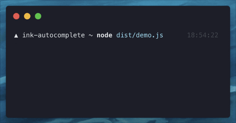
Props
value string
Value of the input.
placeholder string
String displayed when the input is empty.
items array<item>
A list of all items. Each item must include
labelandvalueproperty.
getMatch string => item => bool
Called to determine which items satisfy the input.
onChange function string => ()
Called each time input is changed.
onSubmit function (item) => ()
Called once suggestion is selected.
indicatorComponent Component
Custom component to override the default item component.
itemComponent Component
Custom component to override the default item component.
License
MIT © Matic Zavadlal