HyperTrack Views for ReactJS
A wrapper for views provided through the HyperTrack dashboard. It allows you to integrate the same views into your own application.
Please check out the Views Guide for a closer look at the capabilities provided by HyperTrack Views.

Prerequisites
- Set up a HyperTrack account and obtain your Publishable Key from the Dashboard
- Integrate the HyperTrack SDK in your application (iOS, Android, or React Native) or use our sample app to send location data (iOS or Android)
Explore sample app
You can use the sample app provided to explore the capabilities and usage of this component. Please visit this page to open the sample app.
To run the sample app on your own, follow these steps:
Jump to the sample app folder:
cd sampleInstall all app dependencies:
npm i yarnNote: Do not run the installation in the root folder. If that has been done before sample app dependecies were installed, NPM will use installed packages from the root node_modules, which might reason conflicts and break the build process
Run the sample app:
node run start yarn startThe CLI will open up the locally hosted sample app (http://localhost:3000/) and should look like this:

Installation
You can use either Yarn or NPM to add hypertrack-views-react to your project:
npm install --save hypertrack-views-react yarn add hypertrack-views-reactUsage
; const PUBLISHABLE_KEY = "<your_key>"; <LiveView publishableKey=PUBLISHABLE_KEY showTooltips=true showDeviceList=false showDeviceCard=false selectedDeviceId="00112233-4455-6677-8899-AABBCCDDEEFF" defaultLayer="custom" customLayerUrl="http://mt2.google.com/vt/lyrs=s&x={x}&y={y}&z={z}" assetsUrl="https://abc-sdk-test-assets.s3-us-west-2.amazonaws.com/"/>;Configuration
| Property | Type | Default | Description |
|---|---|---|---|
| publishableKey | string | N/A | The publishable key of your account from the Setup page on the Dashboard |
| showTooltips | boolean | false |
Show the device ID right next to the location marker of a device |
| showDeviceList | boolean | true |
Show the list of all tracked devices, includes filter and search options. A click on a device will place zoom to the device location |
| showDeviceCard | boolean | true |
Show the device detail card on the single device view |
| selectedDeviceId | string | null |
ID of the device to be displayed (case sensistive). Can be obtained using the Device API. Adding this will change the view to a single device mode (including device data, activity, and more) |
| defaultLayer | string | base |
Can be either one of: base, street, satellite, or custom. Custom will only work if a customLayerUrl is provided. |
| customLayerUrl | string | null |
URL to a Leaflet-compatible tiled web map in XYZ format. Only raster is supported and it needs to be public accessible. |
| assetsUrl | string | null |
URL to a public asset folder containig SVG files to replace default icons. The filenames need to match exactly. Missing icons will show the default versions. |
Note: The component passes along all additional properties, so you can use properties like
className.
Showing a single device
When provided with the selectedDeviceId property, the component will render a single device view as opposed to the device overview. You can find more details in the Live device view documentation.

The device info card on the left side can be disabled by setting
showDeviceCardtofalse
Adding a custom map layer
With the customLayerUrl property, you can reference a raster tile to be added as a custom map layer. Users can select the custom view from the  button on the top right side of the view. The layer is pre-selected based on the
 defaultLayer property. After setting the customLayerUrl, you can set the defaultLayer property to custom to render this new tile by default.
There are different ways to obtain and/or generate a custom layer. OpenMapTiles might be of interest. You can also generate/customize MapBox maps and access them as raster tiles.
Note: Please ensure you use the XYZ URL format, which looks something like this:
/tile-name/{z}/{x}/{y}.png
Here are some sample layer tiles:
| Layer | URL | Preview |
|---|---|---|
| Google Maps: Satellite | http://mt0.google.com/vt/lyrs=s&x={x}&y={y}&z={z} |
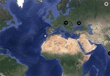 |
| Google Maps: Roadmap/Streets | http://mt0.google.com/vt/lyrs=m&hl=en&x={x}&y={y}&z={z} |
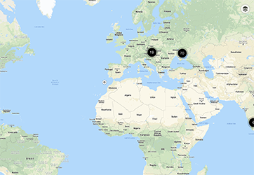 |
| Google Maps: Hybrid | http://mt0.google.com/vt/lyrs=s,h&hl=en&x={x}&y={y}&z={z} |
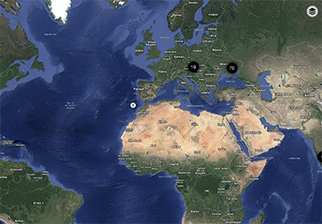 |
Replacing default icons
By default, the views display a set of icons to indicate status, activity, and more. You can replace each icon individually. Below is a list of all the replaceable icons.
Original Icons: You can use the default icons and make your modifications
| Filename | Default | Description |
|---|---|---|
live-direction.svg |
 |
Dot indicated the live location and direction of a device |
live.svg |
 |
Dot indicated the live location of a device |
offline.svg |
 |
Dot indicated the last known location of a device |
walk.svg |
 |
Activity icon for walking activity |
run.svg |
 |
Activity icon for running activity |
cycle.svg |
 |
Activity icon for cycling activity |
drive.svg |
 |
Activity icon for driving activity |
stop.svg |
 |
Activity icon for stopping activity |
unknown.svg |
 |
Activity icon for unknown activity |
inactive.svg |
 |
Status icon for inactive device |
disconnected.svg |
 |
Status icon for disconnected device |
Versioning
We use Semantic Versioning. For the versions available, see the tags on this repository.
License
This project is licensed under the MIT License - see the LICENSE file for details