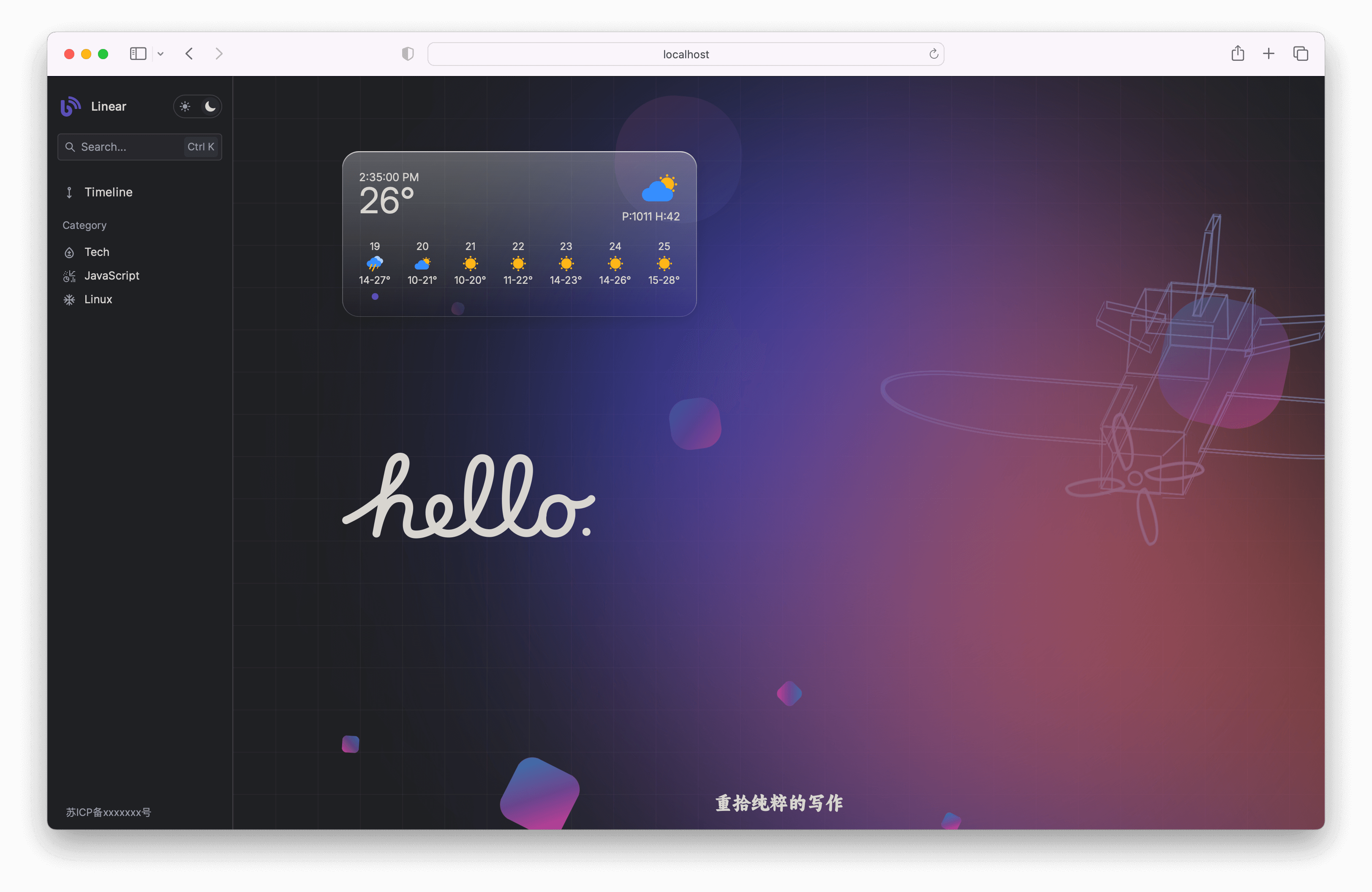
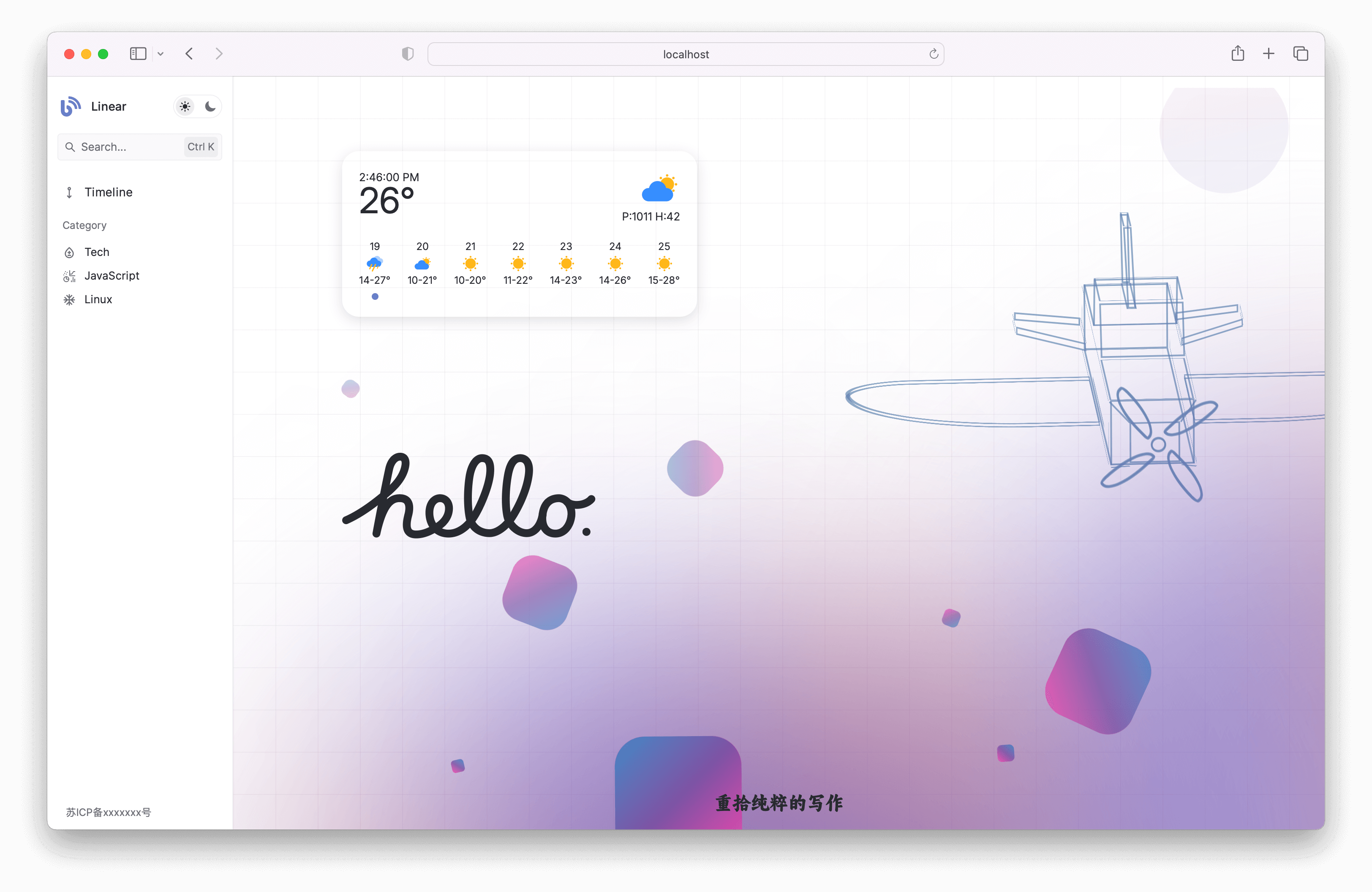
- Developed based on
hexo7.0, the configuration file for hexo is different from the6.3configuration file - Improve the level of engineering and use the
monorepostructure of thepnpm workspaceto better layer the project - Optimize the development phase experience,
webpack dev serverlistens to the public directory of hexo, and implementshot updatesduring the development phase` - Use
Web Componentto separate project UI components, with aLinear Designstyle - Add
Preferencesto custom pages - Add
Tagsto customize the page - add
shortcut keysystem - Global theme colors are controlled by the
colorattribute in the theme configuration file
The hexo theme of document oriented and pursuing ultimate loading speed, with a JS size of gzip compressed, only 52.2 KB
For more configuration information on theme usage or installation, please refer to the "Cosy Starter Guide"
| Feature | Disable Option |
|---|---|
| Theme Switching | |
| Prism Syntax Highlighting | |
| Algolia Search | |
| Global Theme Color Configuration | |
| HeFeng Weather Widget | ✅ |
| Katex Formulae | ✅ |
| Mermaid Flowcharts | ✅ |
| Valine Comments | ✅ |
| Twikoo Comments | ✅ |
Installation dependencies
pnpm installCreate a new terminal and execute
# If the @ cosy/util module is updated, remember to perform packaging
pnpm build:util
# webpack
pnpm dev
# Hot update hexo test. If the UI style is incorrect, execute the command again and refresh the browser
pnpm dev:hexo
# ui package
pnpm dev:ui
Browser open localhost:12004
All Cosy Web Components inherit the CosyElement base class
import { LitElement } from "lit";
import { globalEventBus, EventBus } from "@cosy/util";

export class CosyElement extends LitElement {
  eventBus: EventBus;
  constructor() {
    super();
    this.eventBus = globalEventBus;
  }
}
Therefore, in any web component that inherits from CosyElement, publishing custom events can be used
this.eventBus.emit(eventType, payload);And listening to custom events
this.eventBus.on(eventType,callback);And for external communication needs
import { globalEventBus } from "@cosy/util";

globalEventBus.on("eventType", (event) => {
  console.log("Received:", event.detail);
  globalEventBus.emit("response", "payload");
});
Due to the underlying foundation being based on CustomEvent, a uid attribute has been injected into the CosyElement base class to address the uniqueness issue caused by web component reuse. Taking cosy-drag-box as an example, it is necessary to add a 'uid' attribute
<cosy-drag-box uid="left-aside"><cosy-drag-box/>Create a folder with module names under apps/theme cost/src/modules, using your Module as an example
├── ...
├── ...
├── yourModule
│   ├── index.ejs
│   ├── index.ts
└── └── index.less- index.ejs
<!-- inject:css -->: CSS injection marker points separated from webpack
<!-- inject:js -->: JS injection marker points separated from webpack
<!-- inject:css -->

<div>your module content here</div>

<!-- inject:js -->- index.ts
import './index.less'

// your script here- index.less
// your stylesheet hereWhen adding a new module, please rerun the following command
# 重启启动webpack
pnpm dev<%- partial('yourModule') %>
<!-- or -->
<%- include('yourModule') %>Build Command
pnpm buildAfter the construction is completed, the complete hexo theme resources are output to the theme-cosy/build directory

