fluid-react
React inline-style solution for frontend development. CSS free.
Why Javascript styling instead of CSS? Check out this video
Install
No CSS file needed.
npm install --save fluid-react
Example
Of course I am biased, to me this is the simplest to use library in this category.
Mobile vs Desktop
> npm install --save fluid-react
then
import React, { Component } from 'react';
import { Container, Row, Col } from 'fluid-react';

export default class App extends Component {
    render() {
        return (
            <Container>
                <Row>
                    <Col xs="12" md="3">Sidebar</Col>
                    <Col xs="12" md="9">Main Section</Col>
                </Row>
            </Container>
        )
    }
}
Documentation
Documentation is on Live Demo
To run documentation/demo in local:
git clone https://github.com/richardzcode/fluid-react.git
cd fluid-react/example
npm install
npm start
CSS
MediaQuery
    const style = {
        margin: 'auto 1rem',
        padding: '2rem',
        color: '#fff',
        backgroundColor: '#0275d8',
        borderColor: '#0275d8',
        '@media (min-width: 576px) and (max-width: 767px)': {
            backgroundColor: '#5cb85c',
            borderColor: '#5cb85c'
        },
        '@media (min-width: 768px) and (max-width: 991px)': {
            backgroundColor: '#5bc0de',
            borderColor: '#5bc0de'
        },
        '@media (min-width: 992px) and (max-width: 1199px)': {
            backgroundColor: '#f0ad4e',
            borderColor: '#f0ad4e'
        },
        '@media (min-width: 1200px)': {
            backgroundColor: '#d9534f',
            borderColor: '#d9534f'
        }
    }
Match
    export const MatchBlocks = (props) => (
        <div>
            <Match show="xs,sm">xs, sm</Match>
            <Match show="md,lg">md,lg</Match>
            <Match show="xl">xl</Match>
        </div>
    )
Pseudo Element
    const brandStyle = {
        fontSize: '24px',
        verticalAlign: 'top',
        padding: '4px',
        '::before': {
            content: '',
            display: 'inline-block',
            width: '64px',
            height: '32px',
            backgroundImage: 'url(https://reactjs.org/logo-og.png)',
            backgroundSize: '64px 32px'
        }
    }
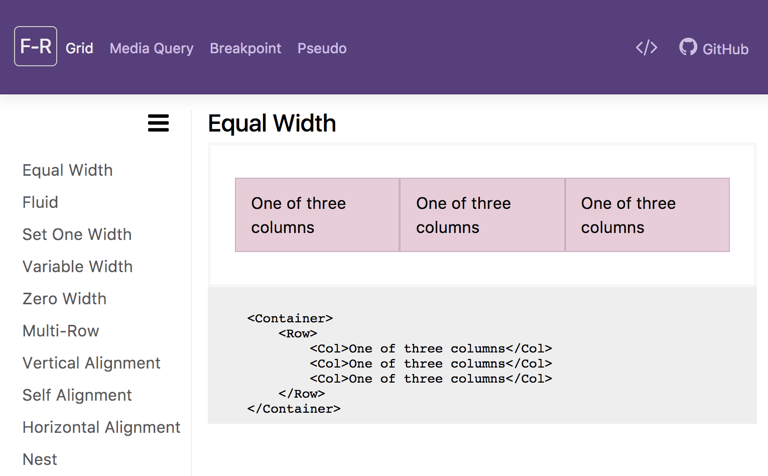
Grid
Base on Bootstrap 12 column grid system. A mobile-first grid system for React.
    <Container>
        <Row>
            <Col xs="12" sm="6" md="4" lg="3" xl="2">1</Col>
            <Col xs="12" sm="6" md="4" lg="3" xl="2">2</Col>
            <Col xs="12" sm="6" md="4" lg="3" xl="2">3</Col>
            <Col xs="12" sm="6" md="4" lg="3" xl="2">4</Col>
            <Col xs="12" sm="6" md="4" lg="3" xl="2">5</Col>
            <Col xs="12" sm="6" md="4" lg="3" xl="2">6</Col>
            <Col xs="12" sm="6" md="4" lg="3" xl="2">7</Col>
            <Col xs="12" sm="6" md="4" lg="3" xl="2">8</Col>
            <Col xs="12" sm="6" md="4" lg="3" xl="2">9</Col>
            <Col xs="12" sm="6" md="4" lg="3" xl="2">10</Col>
            <Col xs="12" sm="6" md="4" lg="3" xl="2">11</Col>
            <Col xs="12" sm="6" md="4" lg="3" xl="2">12</Col>
        </Row>
    </Container>