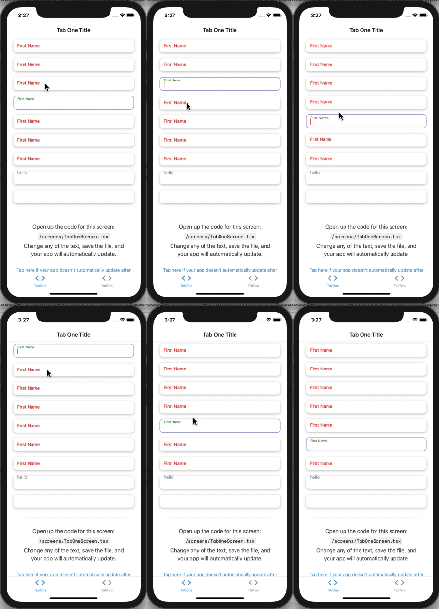
Fully Customizable Floating Label Input By Fiction Developers
Developed with passion by Fiction Developers to support a very dynamic floating action label, you can modify almost everything by just passing some params, i.e, label Y position when focused, and when unFocused, label's color, fontsize both when focused and unfocused, also the container style, text inptu style with focused/unfocused, and you can even modify the courser/selection color
Note: all text input props are supported too, Except onFocus and onBlur, instead focus and blur events are explained in Full Example below
Expo 40 Supported Now!
Install:
$ npm i fiction-expo-floating-label-input
Usage:
import {FictionFloatingLabelInput} from "fiction-expo-floating-label";preview
basic example:
<FictionFloatingLabelInput
    label="First Name"
    value={x} // just a state variable
    labelFocusedTop={10} // Y position of label when focused
    labelUnFocusedTop={-5} // Y position of label when un-focused
    onChangeText={(t)=>setX(t)} // setting state variable
/>
full example:
<FictionFloatingLabelInput
    label="First Name" // label itself
    value={x} // just a state variable

    labelFocusedTop={-5} // Y position of label when focused
    labelUnFocusedTop={10} // Y position of label when un-focused

    containerStyle={{}} // container style
    focusedContainerStyle={{}} // container style when focused
    unFocusedContainerStyle={{}} // container style when un-focused

    subContainerStyle={{}} // child container style
    focusedSubContainerStyle={{}} // child container style when focused
    unfocusedSubContainerStyle={{}} // child container style when un-focused

    labelStyle={{}} // label style
    focusedLabelStyle={{}} // label style when focused
    unfocusedLabelStyle={{}} // label style when un-focused

    textInputStyle={{}} // text input style
    focusedTextInputStyle={{}} // text input style when focused
    unFocusedTextInputStyle={{}} // text input style when un-focused

    labelFontSizeUnFocused={14} // label font size when un-focused
    labelFontSizeFocused={10} // label font size when focused

    labelColorUnFocused={"red"} // label color when un-focused
    labelColorFocused={"green"} // label color when focused

    underlineColorAndroid={"transparent"} // you know this one, right?

    selectionColor={"red"} // cursor and selection color

    onChangeText={(value)=>setX(value)} // setting state variable

    // all other text input props are supported too, Except onFocus and onBlur, instead below focus and blur events are explained

    preOnFocus={()=>{
      // gets called before the animation starts , focusing
    }}

    postOnFocus={()=>{
      // gets called after the animation ends , focusing
    }}

    preOnBlur={()=>{
      // gets called before the animation starts , unfocusing
    }}

    postOnBlur={()=>{
      // gets called after the animation ends, unfocusing
    }}

/>| Prop | Explaination |
|---|---|
Content Cell |
String label itself |
value |
`string |
labelFocusedTop |
number Y position of label when focused |
labelUnFocusedTop |
number Y position of label when un-focused |
containerStyle |
Style container style i.e {padding:2}
|
focusedContainerStyle |
Style container style when focused i.e {padding:2}
|
unFocusedContainerStyle |
Style container style when un-focused i.e {padding:2}
|
subContainerStyle |
Style child container style i.e {padding:2}
|
focusedSubContainerStyle |
Style child container style when focused i.e {padding:2}
|
unfocusedSubContainerStyle |
Style child container style when un-focused i.e {padding:2}
|
labelStyle |
Style label style i.e {padding:2}
|
focusedLabelStyle |
Style label style when focused i.e {padding:2}
|
unfocusedLabelStyle |
Style label style when un-focused i.e {padding:2}
|
textInputStyle |
Style text input style i.e {padding:2}
|
focusedTextInputStyle |
Style text input style when focused i.e {padding:2}
|
unFocusedTextInputStyle |
Style text input style when un-focused i.e {padding:2}
|
labelFontSizeUnFocused |
number label font size when un-focused i.e 12
|
labelFontSizeFocused |
number label font size when focused i.e 12
|
labelColorUnFocused |
string label color when un-focused i.e red or #000
|
labelColorFocused |
string label color when focused i.e red or #000
|
underlineColorAndroid |
string android input underline default: transparent
|
selectionColor |
string cursor and selection color |
preOnFocus |
()=>{ // YOUR CODE HERE } gets called before the animation starts , focusing |
postOnFocus |
()=>{ // YOUR CODE HERE } gets called after the animation ends , focusing |
preOnBlur |
()=>{ // YOUR CODE HERE } gets called before the animation starts , unfocusing |
postOnBlur |
()=>{ // YOUR CODE HERE } gets called after the animation ends, unfocusing |
| all props |
any All of the text input props are also supported except onFocus & onBlur, instead above 4 lines explain these two |
Ping me if you have any problems at: whatsapp: +923009550284 email: csgenius786@gmail.com skype: faisal284hr
Buy me coffee? BTC Wallet:
1NwhcTSq3RGFkN5AUfyYdnqbrsbiBEsoiq
