an universal configurable filter module that will fire an event and gives you a FeathersJS query that you should apply.


# yarn
yarn add feathersjs-filter-ui

# npm
npm i --save feathersjs-filter-uiMount globally:
import Vue from "vue";
import FeathersFilter from "feathersjs-filter-ui";

Vue.use(FeathersFilter);
or directly in the component:
import FeathersFilter from "feathersjs-filter-ui";

export default {
  components: {
    FeathersFilter
  },
}
or on any webpage:
<!-- include vue -->
<script src="https://unpkg.com/vue"></script>
<!-- include the filter module -->
<script src="./dist/lib/FeathersjsFilterUi.umd.js"></script>


<div id="app">
  <demo></demo>
</div>

<script>
new Vue({
  components: {
    demo: FeathersjsFilterUi
  }
}).$mount('#app')
</script>simply include the module into your project and you can use it. Configure it by apply some of the following html-attributes. Then add an eventListener to watch for new querys.
<html>
  <header>
    <meta charset="utf-8">
    <!-- VueJS is not included in the bundle -->
    <script src="https://unpkg.com/vue" defer></script>
    <script src="~feathersjs-filter-ui/dist/wc/feathersjs-filter-ui.min.js" defer></script>
  </header>
  <body>
    <!-- use in plain HTML, or in any other framework -->
    <feathersjs-filter-ui id="filter" add-label="more filter"/>

    <script>
      document.getElementById("filter").addEventListener('newFilter', (e) => {
        // APPLY QUERE HERE...
        console.log("filter:",e.detail[0]);
      })
    </script>
  </body>
</html>the label of the "add more filter" button.
{type: String, default: "Add Filter"}
the label of the apply button of each filter dialog.
{type: String, default: "apply"}
the label of the cancle button of each filter dialog.
{type: String, default: "cancle"}
should the component update the url, of the window it is mounted, for you or do you wan't to handle it yourself?
{type: Boolean, default: false}
Should the chosen filters always appear in the same order (true) or should new filters be appended at the end (false)?
{type: Boolean, default: false}
you can use the "filter" property to configure the available filter. The property should be a stringified JSON Object.
{type: Array, default: []}
You can use as many of each type as you want, but at the moment you only have the following filter types.
Options marked with WIP are Work in Progress and are currently not working.
filter for an date range
{
type: "date", // required
title: 'Created at' // required
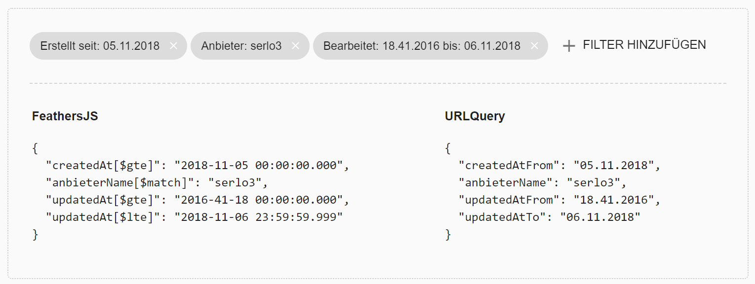
displayTemplate: 'created from %1 to %2', // required ~ %1=fromDate, %2=toDate
property: 'createdAt', // required
mode: 'from', // required 'from', 'to', 'fromto'
autoOrder: false, // optional, default: true
hideOnSelect: false, // WIP ~ optional, default: true
minDate: (UNIX TIMESTAMP), // WIP ~ optional, default: today
maxDate: (UNIX TIMESTAMP), // WIP ~ optional, default: today
fromLabel: "STRING", // optional, default: "from"
toLabel: "STRING", // optional, default: "to"
defaultFromDate: (UNIX TIMESTAMP), // optional, default: undefined
defaultToDate: (UNIX TIMESTAMP) // optional, default: undefined
}if you set minDate or maxDate to false the related input is hidden.
let the user choose an value for a variable
{
  type: "select",                // required
  title: 'Class'                 // required
  displayTemplate: 'class: %1',  // required
  property: 'classId',           // required
  multiple: true,                // optional, default: false
  expanded: true                 // optional, default: false
  options: [                     // required, minLength: 1!
    [123, "Class A"],
    [456, "Class B"],
    [789, "Class C"],
  ],
  defaultSelection: [123, 456]  // optional, if multiple disabled the first value is applied
}let the user order the result
{
  type: "sort",                   // required
  title: 'Sort'                   // required
  displayTemplate: 'Sort by: %1', // required
  options: [                      // required, minLength: 1!
    ['propertyA', "Sort by A"],
    ['propertyB', "Sort by B"],
    ['propertyC', "Sort by C"],
  ],
  defaultSelection: 'propertyA'  // optional, default: undefined
  defaultOrder: 'DESC'           // optional, default: 'DESC'
}toggle if an boolean value should be true or false
{
  type: "boolean",               // required
  title: 'more'                  // required
  options: {                     // required, minLength: 1!
    'propertyA': "Label A",
    'propertyB': "Label B",
    'propertyC': "Label C"
  },
  defaultSelection: {            // optional, default: undefined
    'propertyA': false,
    'propertyC': true
  },
  applyNegated: {               // optional, default: [false, false]
    'propertyA': [true, true],  // false: not true, true: not false
    'propertyB': [false, true], // false: false, true: not false
    'propertyC': [true, false], // false: not true, true: true
  }
}
applyNegated tells the filter how to query for false/true selections and negates the query according to your settings.
e.g. if the user selects true, and you set the property to [false, true] the query is looking for not false
resulting in property[$ne]=false instead of property=true.
limit the result to the selected amount of items
{
  type: "limit",                 // required
  title: 'Anzahl der Einträge'   // required
  displayTemplate: '%1',         // required
  options: [                     // required, minLength: 1!
    10, 25, 50, 100
  ],
  defaultSelection: 25           // optional, default: undefined
}
Theming can be achived using the following css custom properties:
:root{
  --md-theme-default-primary: #009688,
  --md-theme-default-primary-on-background: #009688,
}
# clone repo to your device
> git clone https://github.com/adrianjost/feathersjs-filter-ui.git

# go to directory
> cd feathersjs-filter-ui

# install dependencies
> yarn install# serve with hot reload at localhost:8080
> yarn dev
# build bundle
> yarn build