


Element Plus (Vue 3) & Element UI (Vue 2.7/2.6) 一体通用 UI 组件库
❄️ 不止于 Element
- Vue 2.6/2.7/3 一体通用
- Element UI / Element Plus 一体通用 (定位并不是 Element wrapper,部分组件不依赖 Element 甚至不依赖 Vue,支持任意框架,支持移动端)
- 识别
el-form的disabled状态 - 支持 Vite、Vue CLI、webpack、CDN...
- 支持按需导入、自动导入
- 支持全局属性、全局事件、全局插槽、全局作用域插槽 (vue-global-config 提供技术支持)
- 支持 i18n
npm i faim[!Warning]
由于需要修改 Element Plus 源码才得以实现 FaImageUpload,故该组件在 Element Plus 环境存在以下限制:
- element-plus 不能晚于 faim 安装
- 通过 CDN 的方式使用时需要自行修改 ElUpload 源码
[!Warning]
为了方便用户更换 tinymce 的皮肤、主题、图标,这些样式资源需要用户手动引入
故使用 FaRichText 组件时还需额外安装 tinymce:
npm i faim tinymce
允许 faim 执行生命周期脚本:
// package.json

{
  "trustedDependencies": ["faim"]
}// vite.config.ts
import { defineConfig } from 'vite'
export default defineConfig({
optimizeDeps: {
include: ['faim > qrcode', 'faim > sweetalert2', 'faim > upng-js'],
},
})npm i faim
npm i sass-loader -Dnpm i faim
npm i sass-loader@10 -D// vue.config.js
module.exports = {
transpileDependencies: ['faim', 'mime'],
}// webpack.config.js
module.exports = {
resolve: {
extensions: ['.mjs', '...'],
},
module: {
rules: [
{
test: /\.m?js/,
type: 'javascript/auto',
resolve: {
fullySpecified: false,
},
},
]
}
}npm i unplugin-vue-components -D// vite.config.ts
import { defineConfig } from 'vite'
import Components from 'unplugin-vue-components/vite'
import FaimResolver from 'faim/auto-import-resolver'
export default defineConfig({
// ...
plugins: [
// ...
Components({
resolvers: [FaimResolver()],
}),
],
})// webpack.config.js
const Components = require('unplugin-vue-components/webpack')
const FaimResolver = require('faim/auto-import-resolver')
module.exports = {
// ...
plugins: [
// ...
Components({
resolvers: [FaimResolver()],
}),
],
}<script setup>
import { FaFormDialog, FaImage, FaImageUpload, FaMessageBox, FaPopButton, FaPopSwitch, FaRichText, FaSelect, FaUpload } from 'faim'
// 在 FaRichText 外部引入皮肤、主题、图标等样式资源的目的是方便用户对其进行更换
import 'tinymce/skins/ui/oxide/skin.min.css'
import 'tinymce/themes/silver/theme'
import 'tinymce/icons/default/icons'
const $swal = FaMessageBox
</script>import { createApp, h } from 'vue'
import 'element-plus/dist/index.css'
import ElementPlus from 'element-plus'
import * as ElementPlusIconsVue from '@element-plus/icons-vue'
import { FaFormDialog, FaImage, FaImageUpload, FaMessageBox, FaPopButton, FaPopSwitch, FaRichText, FaSelect, FaUpload } from 'faim'
import App from './App.vue'
// 在 FaRichText 外部引入皮肤、主题、图标等样式资源的目的是方便用户对其进行更换
import 'tinymce/skins/ui/oxide/skin.min.css'
import 'tinymce/themes/silver/theme'
import 'tinymce/icons/default/icons'
const app = createApp(App)
.use(ElementPlus)
.use(FaFormDialog, {
// 全局配置
})
.use(FaImage, {
// 全局配置
})
.use(FaImageUpload, {
// 全局配置
// 完整示例参考 ./demo/useFaImageUpload
})
.use(FaPopButton, {
// 全局配置
})
.use(FaPopSwitch, {
// 全局配置
})
.use(FaRichText, {
// 全局配置
// 完整示例参考 ./demo/useFaRichText
})
.use(FaSelect, {
// 全局配置
})
.use(FaUpload, {
// 全局配置
// 完整示例参考 ./demo/useFaUpload
})
app.config.globalProperties.$swal = FaMessageBox
for (const [key, component] of Object.entries(ElementPlusIconsVue)) {
app.component(key, component)
}
app.mount('#app')[!Note]
请结合 https://github.com/FranckFreiburger/vue3-sfc-loader 自行实现
Faim 输出的格式为包含 SFC 的 ESM + CJS (没有 IIFE),引入依赖的过程会比较繁琐
使用 FaImageUpload 组件需要自行修改 ElUpload 源码
<script>
import { FaFormDialog, FaImage, FaImageUpload, FaMessageBox, FaPopButton, FaPopSwitch, FaRichText, FaSelect, FaUpload } from 'faim'

// 在 FaRichText 外部引入皮肤、主题、图标等样式资源的目的是方便用户对其进行更换
import 'tinymce/skins/ui/oxide/skin.min.css'
import 'tinymce/themes/silver/theme'
import 'tinymce/icons/default/icons'

const $swal = FaMessageBox

export default {
  components: { FaFormDialog, FaImage, FaImageUpload, FaPopButton, FaPopSwitch, FaRichText, FaSelect, FaUpload },
}
</script>import Vue from 'vue'
import 'element-ui/lib/theme-chalk/index.css'
import ElementUI from 'element-ui'
import { FaFormDialog, FaImage, FaImageUpload, FaMessageBox, FaPopButton, FaPopSwitch, FaRichText, FaSelect, FaUpload } from 'faim'
import App from './App.vue'
// 在 FaRichText 外部引入皮肤、主题、图标等样式资源的目的是方便用户对其进行更换
import 'tinymce/skins/ui/oxide/skin.min.css'
import 'tinymce/themes/silver/theme'
import 'tinymce/icons/default/icons'
Vue.use(ElementUI)
Vue.use(FaFormDialog, {
// 全局配置
})
Vue.use(FaImage, {
// 全局配置
})
Vue.use(FaImageUpload, {
// 全局配置
// 完整示例参考 ./demo/useFaImageUpload
})
Vue.use(FaPopButton, {
// 全局配置
})
Vue.use(FaPopSwitch, {
// 全局配置
})
Vue.use(FaRichText, {
// 全局配置
// 完整示例参考 ./demo/useFaRichText
})
Vue.use(FaSelect, {
// 全局配置
})
Vue.use(FaUpload, {
// 全局配置
// 完整示例参考 ./demo/useFaUpload
})
Object.defineProperty(Vue.prototype, '$swal', {
value: FaMessageBox,
})
new Vue({
render: h => h(App),
}).$mount('#app')[!Note]
请结合 https://github.com/FranckFreiburger/vue3-sfc-loader 自行实现
Faim 输出的格式为包含 SFC 的 ESM + CJS (没有 IIFE),引入依赖的过程会比较繁琐
以下组件支持在非 Element 环境中使用:
- FaImage
- FaMessageBox
- FaRichText
- FaUpload
以下组件支持在非 Vue 环境中使用:
- FaMessageBox
[!Warning]
对于基于 Element 的组件,仅写上布尔类型的属性但不传值,支持隐式转换为
true:✓
<FaImageUpload disabled />✓
<FaImageUpload :disabled="true" />与 Element 表现一致:
✓
<el-upload disabled />✓
<el-upload :disabled="true" />但非 Element 环境的组件是不支持的:
✗
<FaUpload disabled />✓
<FaUpload :disabled="true" />
// package.json
{
  // npm/cnpm/bun
  "overrides": {
    "xxx": "yyy"
  },
  // yarn/bun
  "resolutions": {
    "xxx": "yyy"
  },
  // pnpm
  "pnpm": {
    "overrides": {
      "xxx": "yyy"
    }
  }
}
或缩小作用范围:
// package.json
{
  // npm/cnpm/bun
  "overrides": {
    "faim": {
      "xxx": "yyy"
    }
  },
  // yarn/bun
  "resolutions": {
    "faim/xxx": "yyy"
  },
  // pnpm
  "pnpm": {
    "overrides": {
      "faim>xxx": "yyy"
    }
  }
}- 打开对话框自动回显数据,关闭对话框自动重置数据
- 提交、拒绝、保存、重置、全屏一应俱全
- 校验失败时平滑滚动至错误项并震动提示
- 限制高度,始终展示 footer,无页面级滚动条
- 只读模式
| 名称 | 说明 | 类型 | 默认值 |
|---|---|---|---|
| title | 对话框标题 | string | |
| v-model:show (Vue 3) / show.sync (Vue 2) |
是否显示 | boolean | false |
| v-model / modelValue (Vue 3) / value (Vue 2) |
表单数据对象 (el-form 的 model) |
any | |
| elFormProps |
el-form 的属性 |
object | |
| retrieve | 读取数据 | () => Promise | void | |
| retrieving | 读取状态 | boolean | false |
| readonly | 是否只读 | boolean | false |
| showFullscreenToggle | 是否显示全屏开关 | boolean | true |
| showConfirmButton | 是否显示确认按钮 | boolean | !readonly |
| confirm | 确认 | ()= > Promise<void | { show: boolean }> | void | |
| showDenyButton | 是否显示拒绝按钮 | boolean | false |
| deny | 拒绝 | () => Promise<void | { show: boolean }> | void | |
| showSaveButton | 是否显示保存按钮 | boolean | false |
| save | 保存 | () => Promise<void | { show: boolean }> | void | |
| showResetButton | 是否显示重置按钮 | boolean | false |
| reset | 重置 | () => void | |
| showCancelButton | 是否显示取消按钮 | boolean | !readonly |
| reverseButtons | 是否反转按钮顺序 | boolean | false |
| locale | i18n | Record<string, string> | 查看代码 |
| ... |
el-dialog 的属性 |
如果是 plain object 类型,将用于 el-form 的 model
onMounted 时记录初始值 (与 el-form-item 保持一致),关闭对话框时会重置至初始值
<template>
  <FaFormDialog
    :retrieve="() => {
      // 表格打开之后、获取数据之前
      return $POST('xxx').then(() => {
        // 获取数据之后
      })
    }"
  />
</template>开启只读模式时默认隐藏底部操作按钮
跟 <el-form disabled /> 的区别是在样式上,不置灰,提高可读性和美观度
支持在非只读模式下应用只读样式、支持局部应用只读样式:
<FaFormDialog>
  <div class="is-readonly">
    <el-form-item>
      <el-checkbox disabled />
    </el-form-item>
  </div>
  <el-form-item>
    <el-input />
  </el-form-item>
</FaFormDialog>如果返回一个 Promise 实例,则在该 Promise 实例状态终结后对话框才会关闭
<template>
  <FaFormDialog
    :confirm="() => {
      // 确认之前
      return $POST('xxx').then(() => {
        // 确认之后
      })
    }"
  />
</template>
返回 Promise.reject() / Promise.resolve({ show: true }) / { show: true } 时对话框不会关闭
<template>
  <FaFormDialog
    :confirm="() => {
      const valid = true
      if (valid) {
        return $POST('xxx')
      }
      else {
        $swal.warning('校验失败')
        return {
          show: true,
        }
      }
    }"
  />
</template>如果返回一个 Promise 实例,则在该 Promise 实例状态终结后对话框才会关闭
<template>
  <FaFormDialog
    :deny="() => {
      // 拒绝之前
      return $POST('xxx').then(() => {
        // 拒绝之后
      })
    }"
  />
</template>
返回 Promise.reject() / Promise.resolve({ show: true }) / { show: true } 时对话框不会关闭
<template>
  <FaFormDialog
    :deny="() => {
      const valid = true
      if (valid) {
        return $POST('xxx')
      }
      else {
        $swal.warning('校验失败')
        return {
          show: true,
        }
      }
    }"
  />
</template>关于 “确定” 和 “取消” 按钮的顺序,可以看看这篇知乎回答
| 名称 | 说明 | 回调参数 |
|---|---|---|
| fullscreenChange | 切换全屏状态时触发 | (fullscreen: boolean) |
| ... |
el-dialog、el-form 的事件 |
| 名称 | 说明 |
|---|---|
| default |
el-form 的内容 |
| ... |
el-dialog 的插槽 |
| 名称 | 说明 | 类型 |
|---|---|---|
| highlightError | 平滑滚动至校验失败的表单项 | (selectors: string | Element | NodeList = '.el-form .el-form-item.is-error', container = window) => void |
| ... | 通过 ref 调用 el-form 的方法 |
.el-dialog__wrapper,
.v-modal {
  position: absolute;
}

// 在原来的基础上减去 navbar + tab 的高度 (以 90px 为例)
.el-dialog {
  .el-dialog__body {
    max-height: calc(100vh - 190px) !important;
  }

  &.is-fullscreen .el-dialog__body {
    max-height: calc(100vh - 135px) !important;
  }
}Viewer.js + Swiper + node-qrcode 组合拳
- 不依赖 Element,支持任意 UI 框架
- 多样的展示形式:文档流/瀑布流/轮播图/表格嵌套,适配
<table>&<el-table> - 灵活的数据类型:URL/Base64/二维码/object URL
- 任意绑定值类型
| 名称 | 说明 | 类型 | 默认值 |
|---|---|---|---|
| modelValue (Vue 3) / value (Vue 2) |
绑定值 | any | |
| pattern | 展示模式('waterfall', 'swiper' 或 'table-cell') |
string |
undefined(即文档流) |
| srcAt | 图片 src 的位置 |
string / symbol / (value: any) => any | |
| viewable | 是否启用 Viewer.js | boolean | true |
| viewerOptions | Viewer.js 的参数 | object | { zIndex: 5000, zoomRatio: 0.4 } |
| swiperOptions | Swiper 的参数 | object | { observer: true } |
| qrcode | 是否将 value 转换为二维码 |
boolean / 'auto'
|
false |
| qrcodeOptions | node-qrcode 的参数 | object | { margin: 0, errorCorrectionLevel: 'L', width: 444, height: 444 } |
如果将 qrcode 设为 'auto',FaImage 会自动判断是否需要转换 (value 为 Base64 或 URL 时不会转换)
用于定位 value 中的图片 src,适用于绑定值非 src 本身的情况
- 支持属性名,如
'url' - 支持属性路径,如
'data[0].url' - 支持 symbol 类型的属性名
- 支持 Function,如
({ url }) => url
| 名称 | 说明 |
|---|---|
| default | 自定义图片标签 |
| 名称 | 说明 | 类型 |
|---|---|---|
| viewer | Viewer.js 实例 | Object |
| swiper | Swiper 实例 | Object |
| hydrate | 初始化 Viewer.js 和 Swiper | () => void |
<FaImage>
  <template #default="{ src, index }">
    <img :src="src" style="cursor: zoom-in; height: 148px" />
    <div>第{{ index + 1 }}张</div>
  </template>
</FaImage>
通过默认插槽来使用 <el-image>:
<FaImage>
  <template #default="{ src, index }">
    <el-image :src="src" style="cursor: zoom-in; height: 148px" />
    <div>第{{ index + 1 }}张</div>
  </template>
</FaImage>
[!CAUTION]
Element UI 的
<el-image>在图片加载完毕后才会渲染<img>,因此 Viewer.js 和 Swiper 必须在全部图片加载完毕后再进行初始化Element Plus 不存在这个问题
可以这样解决:
<script setup>
const faImageRef = ref()
const value = ref([])
const loadCount = ref(0)
function onLoad() {
  if (++loadCount.value === value.value.length) {
    faImageRef.value.hydrate()
  }
}
</script>

<template>
  <FaImage
    ref="faImageRef"
    :value="value"
    :model-value="value"
  >
    <template #default="{ src, index }">
      <el-image
        :src="src"
        style="cursor: zoom-in; height: 148px"
        @load="onLoad"
        @error="onLoad"
      />
      <div>第{{ index + 1 }}张</div>
    </template>
  </FaImage>
</template><script setup>
import FaImage from 'fa-image'
const faImageRef = ref()
</script>
<template>
<FaImage
ref="faImageRef"
pattern="swiper"
:swiper-options="{
on: {
init: () => {
$nextTick(() => {
console.log(faImageRef.swiper)
})
},
},
}"
/>
</template>默认的图片 CSS 高度为 148px (与 el-upload 保持一致),默认的二维码分辨率为 444 × 444 (三倍图),如果你增大了图片的 CSS 尺寸,将导致图片变模糊
解决方式:将二维码分辨率设置为展示尺寸的三倍
<template>
  <FaImage
    :qrcode-options="{
      width: 900,
      height: 900,
    }"
  />
</template>

<style lang="scss" scoped>
// Vue 2.6 需要将 :deep 替换为 ::v-deep
:deep(.fa-image) img {
  width: 300px;
  height: 300px;
}
</style>el-upload 封装,图片上传一站式解决方案
- FaImageUpload 专攻图片上传,支持图片编辑
- FaImageUpload 支持图片回显,不存在跨域问题
- FaImageUpload 依赖 Element
- 数据双向绑定
v-model,支持任意绑定值类型 - 数据源
- 用户选择本地文件 (File)
- 编程式提供数据源 (File/Blob/Base64/URL/object URL)
- 编辑图片
- 格式转换
- 尺寸指定
- 品质调节 (支持 JPG/PNG/WEBP)
- 自由裁剪、锁定比例裁剪
- 翻转、缩放、无级角度旋转
- 限制图片
- 格式筛选、格式校验
- 数量上限、下限
- 大小上限、下限
- 尺寸、尺寸范围
- 分辨率、分辨率范围
- 比例、比例范围
- 自定义校验
- 限制条件可视化 (让用户根据限制条件去准备图片,而不是准备好了才发现不合适)
- 多选、并发上传
- 拖拉拽上传、拖拉拽排序
- 使用 FaImage 来预览图片
- 支持表格嵌套,适配
<table>&<el-table>
| 名称 | 说明 | 类型 | 默认值 |
|---|---|---|---|
| v-model / modelValue (Vue 3) / value (Vue 2) |
绑定值 | any | |
| upload | 调用接口上传图片,返回图片 URL/ID | Upload | |
| arrayed | 绑定值是否为数组类型,默认自动 | boolean | |
| srcAt | 图片 URL/ID 的位置 | string / symbol / (value: any) => any | |
| disabled | 禁用状态 | boolean | false |
| editable | 是否开启编辑功能 | boolean | true |
| minCount | 最小数量 | number | |
| maxCount | 最大数量 | number | |
| minSize | 大小下限 (字节) | number | |
| maxSize | 大小上限 (字节) | number | |
| width | 宽度 (像素) | number / { min?: number, max?: number } / number[] | |
| height | 高度 (像素) | number / { min?: number, max?: number } / number[] | |
| resolution | 分辨率,即宽高的积 (像素) | number / { min?: number, max?: number } / number[] | |
| aspectRatio | 比例,即宽高的商 | string / { min?: string, max?: string } / string[] | |
| outputType | 图片输出格式 (编辑后),默认原格式 | string | |
| validator | 自定义数据源校验器 | (source: File | Blob | string) => boolean | |
| locale | i18n | Record<string, string> | 查看代码 |
| ... |
el-upload 的属性 |
type Upload = (output: File | Blob) => Promise<string | object> | string | object | void开启编辑功能时,会在编辑完成后调用,未开启编辑功能时,会在选择图片后调用
未配置或函数返回值为空时,绑定值将输出二进制文件
参数为编辑产物:
用户选择本地文件、编程式提供 File 类型的数据源时,编辑产物的类型为 File
编程式提供非 File 类型的数据源且编辑了图片时,编辑产物的类型为 Blob
未开启编辑功能或未编辑时,编辑产物即输入值
编程式提供 string 类型的数据源且未编辑时,不需要上传,该方法不会被调用
返回值类型为 Promise<object> 或 object 时需要配置 srcAt
如果数量上限和图片数量均不超过 1,则处于单选状态,否则为多选
默认情况下,在单选时输出的绑定值形如:item,多选时输出的绑定值形如:[item,item]
item 具体是什么格式?
未配置 srcAt 时,会提取图片 URL/ID 作为 item,配置了则不会
如果将 arrayed 设置为 true 则强制输出数组类型,无论单选还是多选
如果将 arrayed 设置为 false 则强制输出非数组类型,如果此时图片数量为多个,则会执行 JSON.stringify
用于定位 value 和 upload 返回值中的图片 URL/ID,适用于绑定值非图片 URL/ID 本身的情况
- 支持属性名,如
'url' - 支持属性路径,如
'data[0].url' - 支持 symbol 类型的属性名
- 支持 Function,如
value => value.url
-
'16:9':限制比例为 16:9 -
{ min: '16:10' }:限制比例下限为 16:10 -
{ max: '21:9' }:限制比例上限为 21:9 -
{ min: '16:10', max: '21:9' }:限制比例下限为 16:10,且上限为 21:9 -
['16:10', '16:9', '21:9']:限制比例为 16:10,16:9,21:9 其中之一
-
200:限制参数值为 200 -
{ min: 100 }:限制参数值下限为 100 -
{ max: 300 }:限制参数值上限为 300 -
{ min: 100, max: 300 }:限制参数值下限为 100,且上限为 300 -
[100, 200, 300]:限制参数值为 100,200,300 其中之一
[!CAUTION]
为了避免冲突,不允许同时指定 width/height 和 resolution/aspectRatio
关闭编辑模式时,会按照 accept 筛选格式、校验格式
开启编辑模式时,会按照 accept 筛选格式,但不会校验格式,编辑图片后,按照 outputType 指定的格式输出图片
可选值参考 MIME type
关闭编辑模式时,在选择图片时调用该方法进行校验
开启编辑模式时,在输出图片时调用该方法进行校验
同 el-upload
| 名称 | 说明 | 参数 |
|---|---|---|
| openEditor | 打开图片编辑对话框 | async (source: File | Blob | string | File[] | Blob[] | string[]) => void |
| uploading | 图片上传状态 | boolean |
| ... | 通过 ref 调用 el-upload 的方法 |
openEditor 参数为输入的数据源,支持的数据类型有:
- File
- Blob
- Base64
- URL:需要跨域支持
- object URL:需要在当前
document创建
如果没有编辑图片,则输出值类型不变 (与输入值一致)
如果编辑了图片,输入类型为 File 时,输出类型也为 File,其它情况均输出 Blob 类型
<template>
  <!-- eslint-disable vue/no-constant-condition -->
  <FaImageUpload
    v-show="false"
    ref="faImageUploadRef"
    :upload="(file) => $POST.upload(import.meta.env.VITE_APP_UPLOAD_API, {
      file,
    }).then(res => res.data.data)"
  />

  <el-button
    :loading="openingEditor"
    @click="async () => {
      openingEditor = true
      const url = 'https://picsum.photos/100'
      const fileName = '100x100.jpg'
      // 如果需要附加图片名称,可以先转换为 File 类型再输入
      const blob = await (await fetch(url)).blob()
      const file = new File([blob], fileName, { type: blob.type })
      $refs.faImageUploadRef.openEditor(file).finally(() => {
        openingEditor = false
      })
    }"
  >
    编辑图片
  </el-button>
</template>图片经过编辑后,输出的大小与以下因素相关:
- 原图大小
- 配置或用户设置的图片宽度
- 配置或用户设置的图片高度
- 配置的图片格式
- 用户设置的品质系数
<template>
  <FaImageUpload
    class="fa-image-upload__custom-trigger"
    list-type="text"
  >
    <el-button>自定义 trigger</el-button>
  </FaImageUpload>
</template>

<style lang="scss" scoped>
// Vue 2.6 需要将 :deep() 替换为 ::v-deep
:deep(.fa-image-upload__custom-trigger) {
  .fa-image,
  .el-upload-list,
  .el-upload__tip,
  .el-upload__text {
    display: none;
  }
  .el-upload-dragger {
    width: unset;
    height: unset;
    margin-bottom: 8px;
  }
}
</style>sweetalert2 + ElMessageBox 组合拳
- 不依赖 Element,支持任意 UI 框架
- 不依赖 Vue,支持非 Vue 环境
FaMessageBox.success('Operation Success').then(() => {
  // onClose
})

FaMessageBox.info('Information').then(() => {
  // onClose
})

FaMessageBox.warning('Warning').then(() => {
  // onClose
})

FaMessageBox.error('Error Occurred').then(() => {
  // onClose
})

FaMessageBox.confirm('Are You Sure?').then(() => {
  // onConfirmed
}).catch((e) => {
  if (e.isDenied) {
    // onDenied
  }
  else if (e.isDismissed) {
    // onDismissed
  }
})

FaMessageBox.loading().then(() => {
  // onClose
})
FaMessageBox.close()无取消,必须确认
FaMessageBox.confirm({
  titleText: 'Confirm to continue',
  showCancelButton: false,
  allowOutsideClick: false,
  allowEscapeKey: false,
})// form with async submitting
FaMessageBox.confirm({
input: 'text',
inputAttributes: {
placeholder: 'Remark'
},
confirmButtonText: 'Agree',
showLoaderOnConfirm: true,
preConfirm: (input) => {
return new Promise((resolve) => {
setTimeout(resolve, 500)
}).then(() => {
alert('Agree Success')
}).catch((e) => {
alert('Agree Failed')
})
},
showDenyButton: true,
denyButtonText: 'Deny',
returnInputValueOnDeny: true,
preDeny: (input) => {
if (input) {
return new Promise((resolve, reject) => {
setTimeout(reject, 500)
}).then(() => {
alert('Deny Success')
}).catch((e) => {
alert('Deny Failed')
})
}
else {
FaMessageBox.showValidationMessage('Please fill in the remark')
return false
}
},
}).then((e) => {
alert('Agreed')
}).catch((e) => {
if (e.isDenied) {
alert('Denied')
}
else if (e.isDismissed) {
alert('Dismissed')
}
})import FaMessageBox from 'faim/dist/components/MessageBox/index'el-button + el-popconfirm + el-popover + el-tooltip 组合拳
- 操作拦截 (
el-popconfirm点击确定后才会触发click事件) -
el-popover和el-tooltip的content属性均支持渲染 HTML -
el-tooltip不与el-popconfirm、el-popover冲突 -
el-popconfirm、el-popover、el-tooltip内容为空时,默认不启用
| 名称 | 说明 | 类型 | 默认值 |
|---|---|---|---|
| elPopconfirmProps |
el-popconfirm 的属性 |
object | |
| elPopoverProps |
el-popover 的属性,支持事件绑定 |
object | |
elPopoverProps.rawContent |
content 中的内容是否作为 HTML 字符串处理 |
boolean | false |
| elTooltipProps |
el-tooltip 的属性 |
object | |
elTooltipProps.rawContent |
content 中的内容是否作为 HTML 字符串处理 |
boolean | false |
| ... |
el-button 的属性 |
el-popconfirm、el-popover 的事件
| 名称 | 说明 |
|---|---|
| tooltip-content |
el-tooltip 的 content 插槽 |
| popover-content |
el-popover 的 content 插槽 |
el-switch + el-popconfirm + el-popover + el-tooltip 组合拳
- 操作拦截 (
el-popconfirm点击确定后才会触发change事件) - 支持内嵌文字描述,宽度自适应
-
el-popover和el-tooltip的content属性均支持渲染 HTML -
el-tooltip不与el-popconfirm、el-popover冲突 -
el-popconfirm、el-popover、el-tooltip内容为空时,默认不启用
| 名称 | 说明 | 类型 | 默认值 |
|---|---|---|---|
| inlinePrompt | 是否内嵌文字描述 | boolean | false |
| elPopconfirmProps |
el-popconfirm 的属性 |
object | |
| elPopoverProps |
el-popover 的属性,支持事件绑定 |
object | |
elPopoverProps.rawContent |
content 中的内容是否作为 HTML 字符串处理 |
boolean | false |
| elTooltipProps |
el-tooltip 的属性 |
object | |
elTooltipProps.rawContent |
content 中的内容是否作为 HTML 字符串处理 |
boolean | false |
| ... |
el-switch 的属性 |
el-switch、el-popconfirm、el-popover 的事件
| 名称 | 说明 |
|---|---|
| tooltip-content |
el-tooltip 的 content 插槽 |
| popover-content |
el-popover 的 content 插槽 |
通过 ref 调用 el-switch 的方法
富文本编辑器,可离线使用的 TinyMCE Vue 封装
对比 tinymce-vue
- tinymce-vue 需要加载至少 380kB 的网络资源 (开启插件全家桶将达到 563kB,还没算上付费插件),外网会很慢,甚至超时
- tinymce-vue 有域名检测,会弹窗警告
- tinymce-vue 区别适配不同的 Vue 版本,升级成本较高,针对 Vue 2 的 v3 版本最后更时间为 2021-01,有停止维护风险
- tinymce-vue 默认功能最小化,需要繁杂的配置,还不支持全局传参


- 可离线使用,零网络延迟
- 无域名检测,无弹窗困扰
- 使用 tinymce@6 (MIT),无许可证风险
- 插件全家桶开箱即用
- 提供常用自定义插件示例
- 插入本地图片
- 插入本地视频
- 插入本地音频
- 插入 Word 文档 (
.docx),兼容 Microsoft Office、WPS
- 支持浅色模式 & 深色模式,主题、图标、内容样式均可自定义
- 支持将 HTML 输出为普通文本
- 字数统计功能默认统计字符数,而不是单词数
| 名称 | 说明 | 类型 | 默认值 |
|---|---|---|---|
| v-model / modelValue (Vue 3) / value (Vue 2) |
绑定值 | string | |
| disabled | 禁用状态 | boolean | false |
| outputFormat | 输出格式,'html' 或 'text'
|
string | 'html' |
| ... | TinyMCE 配置 | / | 查看代码 |
| 名称 | 说明 | 类型 |
|---|---|---|
| id | 元素 ID | string |
获取 TinyMCE Editor 实例
<!-- 示例: 监听 TinyMCE 的事件 -->

<script setup>
import { reactive, ref } from 'vue'
import tinymce from 'tinymce/tinymce'

const faRichTextRef = ref()
</script>

<template>
  <FaRichText
    ref="faRichTextRef"
    :setup="(editor) => {
      // 方式1
      editor.on('init', (e) => {
        console.log('init', e)

        // 方式2
        tinymce.get(faRichTextRef.value.id).on('Change', (e) => {
          console.log('Change', e)
        })

        // 方式3
        tinymce.activeEditor.on('Change', (e) => {
          console.log('Change', e)
        })
      })
    }"
    :init_instance_callback="(editor) => {
      // 方式4
      editor.on('Change', (e) => {
        console.log('Change', e)
      })
    }"
  />
</template>请使用 v-if 控制显隐
由于实际的富文本元素并没有挂载在 selector 上面,所以使用 v-show 切换显隐会有问题
富文本的内容样式建议在展示侧自行添加,而不是在富文本的生产侧添加,因为:
- 富文本的生产侧无法满足展示侧各自的定制化需求
- 展示侧可能包含小程序,小程序不支持
style标签
TinyMCE 有四种价格计划:
- Core (免费)
- Essential
- Professional
- Flexible
如果没有注册 Tiny 账号、或者没有在账号设置中登记域名,界面上会有警告弹出 (即使你使用的是免费的 Core 计划)
当然,你可以用 CSS 来屏蔽弹窗,只是不推荐这种方式
TinyMCE 提供了两种加载方式:
- CDN (tinymce-vue 采用的方式):需要注册账号以提供
api-key,并在账号设置中登记所有用到 TinyMCE 的项目域名 - NPM (FaRichText 采用的方式):没有
api-key参数,所以不需要注册账号、不需要登记域名,参考 Tiny 官方解释
插入 Word 文档 (.docx),兼容 Microsoft Office、WPS
TinyMCE 提供了 premium 插件 PowerPaste,可用于粘贴 Word 文档,但兼容性一般,尤其是不支持 WPS
FaRichText 提供了插入 Word 文档的插件示例,兼容 Microsoft Office、WPS,可在一定程度上替代 PowerPaste
注意:粘贴可以片段粘贴,插入只能整个文档插入
// PowerPaste 配置示例

import { FaRichText } from 'faim'
import axios from 'axios'
import createAxiosShortcut from 'axios-shortcut'

const { POST } = createAxiosShortcut(axios)

app.use(FaRichText, {
  images_upload_handler(blobInfo, success, failure) {
    const blob = blobInfo.blob()
    const file = new File(
      [blob],
      blobInfo.filename(),
      { type: blob.type }
    )

    POST.upload(process.env.VUE_APP_UPLOAD_API, {
      file
    }).then((res) => {
      if (typeof res.data?.data === 'string') {
        success(res.data.data)
      }
      else {
        failure(res.data?.message)
      }
    }).catch((err) => {
      failure(String(err))
    })
  },
})-
兼容性
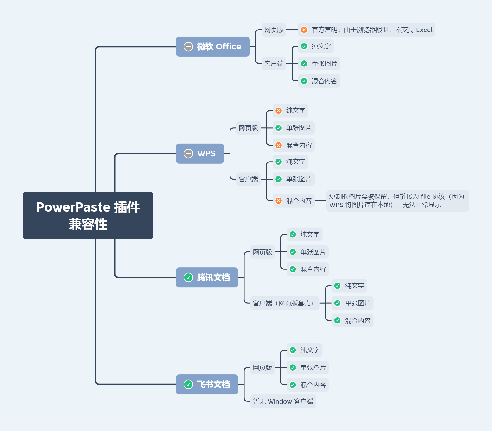
-
受浏览器限制,PowerPaste 插件无法支持微软 Word 和 Excel 文档所支持的所有图片类型。 举个例子,浏览器禁止以编程方式访问文件系统,所以无法解析文档中使用
file://协议的图片 (WPS 使用的就是此协议) -
粘贴微软 Word 文档 (Windows 系统、≥ 2013 版本) 中受保护视图的内容,将仅得到无格式的普通文本,这是受保护视图与剪贴板的交互机制决定的
-
受微软 Excel 网页版限制,粘贴微软 Excel 网页版的内容将仅得到无格式的普通文本

粘贴的网页内容默认会保留一定的源格式,启用 PowerPaste 插件后,对格式的处理将会更加完善。详见 Improved HTML Cleaning
如需获取纯文本,选中编辑-粘贴为文本再进行粘贴
清除格式按钮得到的不是纯文本,可以自定义清除效果: Removing a format
如果用户复制第三方网站的内容到编辑框内,静态资源 (如图片) 可能无法正常显示,这是因为:
-
第三方网站没有开启静态资源的跨域访问
-
第三方网站对静态资源做了 Referer 校验
TinyMCE 的 urlconverter_callback、paste_postprocess API 不支持异步操作,所以批量转存图片可行性低
技术上是可以解决的,可以通过 NGINX 动态代理配合这两个 API 来处理
请自行评估相关风险
el-select + el-option + el-option-group 组合拳
- 单向绑定
label - 远程搜索时无需关心
options和loading - 无匹配选项时展示
label(而不是value) - 多选时支持一键全选、拖拉拽排序
| 名称 | 说明 | 类型 | 默认值 |
|---|---|---|---|
| v-model / modelValue (Vue 3) / value (Vue 2) |
绑定值 | any | |
| v-model:options (Vue 3) / options.sync (Vue 2) |
选项 | any[] | |
| v-model:label (Vue 3) / label.sync (Vue 2) |
绑定值对应的 label (单向数据流) |
string | string[] | |
| props | 定位选项的各项属性 | object | |
| search | 远程搜索 (remote-method 封装) |
(query: string) => Promise<any[]> | any[] |
|
| searchImmediately | 是否立即执行远程搜索 | boolean | true |
| showSelectAllCheckbox | 多选时是否显示全选框 | boolean | true |
| locale | i18n | Record<string, string> | 查看代码 |
| ... |
el-select 的属性 |
默认情况下绑定值将得到选中项的数组元素本身
可使用 props.value 改变此行为 (比如选项的数组元素是 plain object 类型,而绑定值只想要其中某个属性)
interface Props {
  // 定位 option 中的 value
  // 如果是 string 类型,将默认用于 el-select 的 value-key
  value: string | symbol | ((value: any) => any)
  // 定位 option 中的 label
  label: string | symbol | ((value: any) => string)
  // 定位 option 中的 disabled
  disabled: string | symbol | ((value: any) => boolean)
  // 定位 option 中分组的 label
  groupLabel: string | symbol | ((value: any) => string)
  // 定位 option 中分组的 options
  groupOptions: string | symbol | ((value: any) => any[])
  // 定位 option 中分组的 disabled
  groupDisabled: string | symbol | ((value: any) => boolean)
}- 支持属性名,如
'url' - 支持属性路径,如
'data[0].url' - 支持 symbol 类型的属性名
- 支持 Function,如
value => value.url
el-select 的事件
| 名称 | 说明 |
|---|---|
| prefix |
el-select 的 prefix 插槽 |
| empty |
el-select 的 empty 插槽 |
| group-prepend |
el-option-group 的前置内容 |
| group-append |
el-option-group 的后置内容 |
| default |
el-option 的默认插槽,作用域参数为 {option: any, index: number}
|
| option-prepend |
el-option 的前置内容,默认内容为全选框 |
| option-append |
el-option 的后置内容 |
| 名称 | 说明 | 类型 |
|---|---|---|
| remoteMethod |
el-select 的 remoteMethod 属性,自行控制 search 时机时使用 |
(query: string) => void |
| ... | 通过 ref 调用 el-select 的方法 |
关于 value 和 label 的命名:
-
value:这里要表达的含义就是选中目标的 “值”,等同于原生<input type="checkbox">元素的value属性,不一定是其唯一标识,所以不应该使用 id 或者 key,且 key 与 Vue 的特殊 attribute 冲突 -
label:HTML 中<label>与<input>元素相关联,用于对后者进行说明,所以label天生是用来表达选中目标的 “展示名称” 的,而 ‘name’ 由于与原生<input>元素的name属性冲突故不考虑使用 ‘name’
Element 本身没有做到命名的统一,
el-select中label表示选项的标签, 但el-checkbox中label却表示的是选中状态的值
Ant Design 也是使用 value 与 label 命名
<FaSelect
  :search="query => $POST('...', { query }).then(res => res.data)"
  :filterable="false"
/>文件上传,FilePond Vue 封装
对比 vue-filepond
- vue-filepond 不支持
v-model - vue-filepond 不支持全局传参
- vue-filepond 区别适配不同的 Vue 版本,升级成本较高,针对 Vue 2 的 v6 版本最后更新时间为 2020-09,有停止维护风险
- FaUpload 适用于各种文件类型
- FaUpload 适用于大文件上传
- FaUpload 不依赖 Element
- 不依赖 Element,支持任意 UI 框架
- 数据双向绑定
v-model,支持任意绑定值类型 - 数据源
- 用户选择本地文件 (File)
- 编程式提供数据源 (File/Blob/Base64/URL/object URL)
- 限制文件
- 格式筛选、格式校验 (
acceptedFileTypes同时支持 MIME 和扩展名) - 大小上限、下限
- 数量上限、下限
- 图片尺寸、尺寸范围
- 图片分辨率、分辨率范围
- 图片比例、比例范围
- 视频尺寸、尺寸范围
- 视频分辨率、分辨率范围
- 视频比例、比例范围
- 视频时长、时长范围
- 音频时长、时长范围
- 自定义校验
- 限制条件可视化 (让用户根据限制条件去准备文件,而不是准备好了才发现不合适)
- 格式筛选、格式校验 (
- 已上传文件下载
- 多选、并发上传
- 分片上传、断点续传
- 进度展示、中途取消
- 拖拉拽上传、拖拉拽排序
| 名称 | 说明 | 类型 | 默认值 |
|---|---|---|---|
| v-model / modelValue (Vue 3) / value (Vue 2) |
绑定值 | any | |
| upload | 调用接口上传文件,返回 URL/ID | Upload | |
| arrayed | 绑定值是否为数组类型,默认自动 | boolean | |
| srcAt | 文件 URL/ID 的位置 | string / symbol / (value: any) => any | |
| minFiles | 最小数量 | number | |
| imageAspectRatio | 图片比例 | string / { min?: string, max?: string } / string[] | |
| videoWidth | 视频宽度 (像素) | number / { min?: number, max?: number } / number[] | |
| videoHeight | 视频高度 (像素) | number / { min?: number, max?: number } / number[] | |
| videoResolution | 视频分辨率,即宽高的积 (像素) | number / { min?: number, max?: number } / number[] | |
| videoAspectRatio | 视频比例,即宽高的商 | string / { min?: string, max?: string } / string[] | |
| videoDuration | 视频时长 (秒) | number / { min?: number, max?: number } / number[] | |
| audioDuration | 音频时长 (秒) | number / { min?: number, max?: number } / number[] | |
| ... | i18n | Record<string, string> | 查看代码 |
| ... | FilePond 实例的属性 |
type Upload = (file: File, progress: (progress: number) => void, abortController: AbortController) => Promise<string | object> | string | object | void未配置或函数返回值为空时,绑定值将输出二进制文件
返回值类型为 Promise<object> 或 object 时需要配置 srcAt
如果数量上限和文件数量均不超过 1,则处于单选状态,否则为多选
默认情况下,在单选时输出的绑定值形如:item,多选时输出的绑定值形如:[item,item]
item 具体是什么格式?
未配置 srcAt 时,会提取文件 URL/ID 作为 item,配置了则不会
如果将 arrayed 设置为 true 则强制输出数组类型,无论单选还是多选
如果将 arrayed 设置为 false 则强制输出非数组类型,如果此时文件数量为多个,则会执行 JSON.stringify
用于定位 value 和 upload 返回值中的文件 URL/ID,适用于绑定值非文件 URL/ID 本身的情况
- 支持属性名,如
'source' - 支持属性路径,如
'data[0].source' - 支持 symbol 类型的属性名
- 支持 Function,如
value => value.source
-
'16:9':限制比例为 16:9 -
{ min: '16:10' }:限制比例下限为 16:10 -
{ max: '21:9' }:限制比例上限为 21:9 -
{ min: '16:10', max: '21:9' }:限制比例下限为 16:10,且上限为 21:9 -
['16:10', '16:9', '21:9']:限制比例为 16:10,16:9,21:9 其中之一
-
200:限制参数值为 200 -
{ min: 100 }:限制参数值下限为 100 -
{ max: 300 }:限制参数值上限为 300 -
{ min: 100, max: 300 }:限制参数值下限为 100,且上限为 300 -
[100, 200, 300]:限制参数值为 100,200,300 其中之一
[!CAUTION]
videoAspectRatio,videoWidth,videoHeight,videoResolution 和 videoDuration 需要 video 标签支持的视频格式才能生效
即:MP4,WebM 和 OGG (Safari 不支持 OGG)
audioDuration 需要 audio 标签支持的音频格式才能生效
即:MP3,WAV 和 OGG (Safari 不支持 OGG)
[!CAUTION]
为了避免冲突,不允许同时指定图片或视频的宽度/高度和分辨率/比例
Vue 3
<script setup>
const faUploadRef = ref()
</script>

<template>
  <FaUpload
    ref="faUploadRef"
    @vue:mounted="() => {
      faUploadRef.filePond.on('init', () => {

      })
    }"
  />
</template>
Vue 2
<template>
  <FaUpload
    ref="faUploadRef"
    @hook:mounted="() => {
      $refs.faUploadRef.filePond.on('init', () => {

      })
    }"
  />
</template>| 名称 | 说明 |
|---|---|
| filePond | FilePond 实例 |
| uploading | 上传状态 |
各版本详细改动请参考 release notes