
A customisable react-native button component.
npm install ez-buttonyarn add ez-buttonThis button component supports icons but does not include any icon packages by default. To use icons:
Install an icon package from react-native-vector-icons:
Follow the installation instructions for the icon package: https://www.npmjs.com/package/react-native-vector-icons
This button component supports custom svg and png images as props in place of react-native-vector-icons. Make sure your svg image setup is ready before using it. Png images work out of the box.
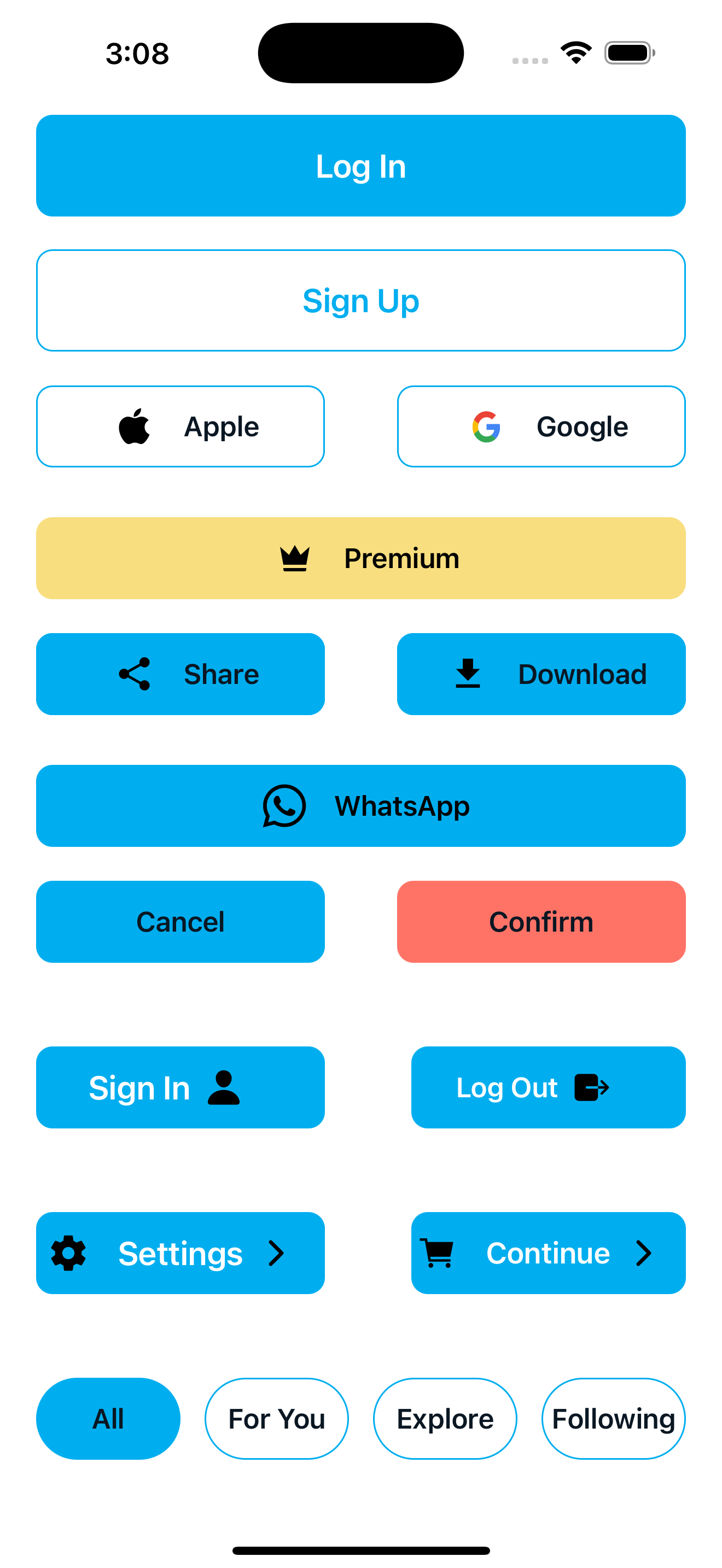
Primary and secondary buttons for key app flows
import { View } from 'react-native';
import EzButton from 'ez-button';

const App = () => {
  return (
    <View>
 <EzButton
    backgroundColor="#00AEEF"
    color="#fff"
    width={90}
    height={50}
    alignSelf="center"
    fontWeight="600"
    fontSize={20}
    borderRadius={10}
    marginTop={150}
    onPress={() => navigation.navigate('Home')}
  >
    Log In
  </EzButton>

  <EzButton
    backgroundColor="#FFF"
    color="#00AEEF"
    width={90}
    height={50}
    alignSelf="center"
    borderColor="#00AEEF"
    borderWidth={1}
    marginTop={20}
    fontSize={20}
    fontWeight="600"
    borderRadius={10}
    onPress={() => navigation.navigate('Home')}
  >
    Sign Up
  </EzButton>
  </View>
   );
};
export default App;Buttons styled with icons with react-native-vector-icons and custom images(svg or png)
import GoogleLogo from '../../assets/icons/Google.svg'
import Ion from 'react-native-vector-icons/Ionicons'
import Mat from 'react-native-vector-icons/MaterialCommunityIcons'

    <EzButton
    width={40}
    alignSelf="center"
    fontSize={17}
    fontFamily="Poppins-Medium"
    fontWeight="600"
    color="#0A1723"
    height={50}
    borderColor="#00AEEF"
    backgroundColor="#ffffff"
    borderRadius={10}
    borderWidth={1}
    buttonIcon={<Ion name="logo-apple" size={25} color="#000" />}
  >
    Apple
  </EzButton>

  <EzButton
    width={40}
    alignSelf="center"
    fontSize={17}
    fontWeight="600"
    color="#0A1723"
    height={50}
    borderColor="#00AEEF"
    backgroundColor="#ffffff"
    borderRadius={10}
    borderWidth={1}
    imagePath={GoogleLogo}
    imageWidth={20}
    imageHeight={20}
  >
    Google
  </EzButton>

  <EzButton
  width={dimensions.width * 0.9}
  alignSelf="center"
  fontSize={17}
  fontFamily="Poppins-Medium"
  fontWeight="600"
  height={50}
  backgroundColor="#F8DE7E"
  borderRadius={10}
  color="#000"
  buttonIcon="crown"
  iconComponent={Mat}
  buttonIconColor="#000"
  buttonIconSize={24}
>
  Premium
</EzButton>

//icon will appear after text on the button
<EzButton
  backgroundColor={'#00AEEF'}
  color={'#fff'}
  width={dimensions.width * 0.4}
  height={50}
  alignSelf='center'
  fontWeight={'600'}
  fontSize={20}
  borderRadius={10}
  endButtonIcon='person'
  iconComponent={Ion}
  endButtonIconColor="#000"
  endButtonIconSize={24}
>
  Sign In
</EzButton>

//icons will appear on both sides of text on the button
<EzButton
  backgroundColor={'#00AEEF'}
  color={'#fff'}
  width={dimensions.width * 0.4}
  height={50}
  alignSelf='center'
  fontWeight={'600'}
  fontSize={20}
  borderRadius={10}
  endButtonIcon='chevron-forward-outline'
  iconComponent={Ion}
  endButtonIconColor="#000"
  endButtonIconSize={24}
  buttonIcon='settings-sharp'
  buttonIconSize={24}
>
  Settings
</EzButton>| Prop | Type | Default | Description |
|---|---|---|---|
| onPress | () => void | Required | Function to call when button is pressed |
| backgroundColor | string | - | Background color of the button |
| marginHorizontal | number | - | Horizontal margin on both sides |
| width | number | string | - | Width of the button |
| marginTop | number | - | Top margin of the button |
| marginBottom | number | - | Bottom margin of the button |
| marginLeft | number | - | Left margin of the button |
| marginRight | number | - | Right margin of the button |
| color | string | - | Text color of the button |
| position | string | - | Position style ('absolute', 'relative') |
| fontWeight | number | string | - | Font weight of the text |
| fontFamily | string | - | Font family of the text |
| borderRadius | number | - | Border radius of the button |
| fontSize | number | - | Font size of the button text |
| disabled | boolean | false | Whether the button is disabled |
| height | number | string | - | Height of the button |
| borderWidth | number | - | Width of the button border |
| borderColor | string | - | Color of the button border |
| left | number | - | Left position when using absolute positioning |
| right | number | - | Right position when using absolute positioning |
| buttonIconColor | string | - | Color of the icon (if using buttonIcon) |
| alignSelf | string | - | Alignment of button within parent ('flex-start', 'center', 'flex-end', etc.) |
| bottom | number | - | Bottom position when using absolute positioning |
| top | number | - | Top position when using absolute positioning |
| marginVertical | number | - | Vertical margin on both top and bottom |
| buttonIcon | string | - | Name of the icon (if using an icon library) |
| imageWidth | number | - | Width of the image when using imagePath |
| imageHeight | number | - | Height of the image when using imagePath |
| iconComponent | ComponentType<{ name: string; size?: number; color?: string }> | - | Icon component library to use |
| imagePath | ComponentType<{ width?: number; height?: number }> | - | Custom image component to display |
| disabledbackGroundColor | string | - | Background color when button is disabled |
| buttonIconSize | number | - | Size of the vector icon on the button |
| endButtonIcon | string | - | Name of the icon after the text (if using an icon library) |
| endButtonIconSize | number | - | Size of the vector icon after the text on the button |
| endButtonIconColor | string | - | Color of the icon after the text on the button (if using buttonIcon) |
| endImageWidth | number | - | Width of the image after the text when using imagePath |
| endImageHeight | number | - | Height of the image after the text when using imagePath |
| endImagePath | ComponentType<{ width?: number; height?: number }> | - | Custom image component to display after the text |
| disabledTextColor | string | - | Text color when button is disabled |
| children | ReactNode | Required | Text on the button |
react
react-native
react-native-vector-icons
typescript
MIT