A all select component for Vue.js.
The component is based on element-ui.it has functions, such as: filter,select all etc.
https://shadowmon.github.io/el-all-select
yarn add el-all-select or
npm i el-all-select<template>
<el-all-select
v-model="value"
select-all
select-label="全选列表"
multiple
collapse-tags
clearable
:options="options"
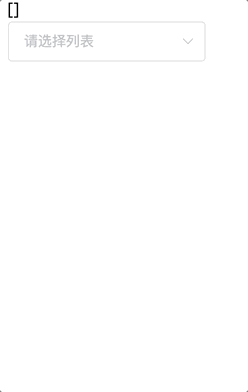
placeholder="请选择列表"
@change="onChange"
@handleLink="onLink">
</el-all-select>
</template>
<script>
import ElAllSelect from 'el-all-select';
export default {
components: {
ElAllSelect
},
data() {
return {
options: [
{ label: '全部日程', value: 1 },
{ label: '个人日程', value: 2, name: '设置' },
{ label: '代办日程', value: 3 },
{ label: '订阅日程', value: 4, name: '设置' },
{ label: '部门日程', value: 5 },
{ label: '公文日程', value: 6, name: '设置' },
{ label: '会议日程', value: 7 }
],
value: [] //选中的值
};
},
methods: {
onChange (val) {
console.log(val)
},
onLink (val) {
console.log(val)
}
}
};
</script>继承了 el-select 所有的 Props/Methods/Events/Slots,这里不再重复,请至官方文档查看。
| 参数 | 说明 | 类型 | 可选值 | 默认值 |
|---|---|---|---|---|
| value / v-model | 绑定值 | string, string[] | — | — |
| color | 是否开启选择框颜色列表 | boolean | true, false | true |
| select-all | 是否开启全选 | boolean | true, false | true |
| select-label | 全选的标签,若不设置则默认为 全选
|
string | — | 全选 |
| placeholder | 输入框占位文本 | string | — | |
| multiple | 是否多选 | boolean | true, false | false |
| 事件名称 | 说明 | 回调参数 |
|---|---|---|
| change | 选中值发生变化时触发 | 目前的选中值 |
| handleLink | 根据option中的name显示,点击name文本时触发 |
目前的选中值 |
| name | 说明 |
|---|---|
| tpl | Option 组件列表内容 |