EasyModal - Bootstrap
EasyModal 是一个 Bootstrap 模态框扩展插件,能提供 alert, confirm, prompt, modal 自定义 等功能,简单易用。
EasyModal is a Bootstrap Modal extension plugin, can provide alert, confirm, prompt, modal custom function and so on, simple and easy to use.
latest version: 1.2.0-RELEASE
安装
-
Download
-
Bower
bower install easymodal-bootstrap
- npm
npm install easymodal-bootstrap
Getting started/开始使用
<!-- Bootstrap start --><link rel="stylesheet" href="bootstrap-3.3.7-dist/css/bootstrap.min.css"><script src="jquery/jquery-3.1.0.min.js"></script><script src="bootstrap-3.3.7-dist/js/bootstrap.min.js"></script><!-- Bootstrap end --> <!-- Bootstrap EasyModal START --><script src="dist/easy.bootstrap.easymodal-1.2.0.min.js"></script><!-- put your locale files after easy.bootstrap.easymodel.js --><script src="dist/lang/easy.bootstrap.easymodal-lang-en.js"></script><!-- Bootstrap EasyModal END -->API
Core API
EasyModal.alert( msg, [callback, title, btnTextArray, params] ); EasyModal.confirm( msg, [callback, title, btnTextArray, params] );EasyModal.prompt( msg, [defaultValue, callback, title, btnTextArray, params] ); EasyModal.modal(title , content , modalFooter, [params]);params
{ // 'modal-sm', '', 'modal-lg'; default is ''; the modal size // 模态对话框大小; 可选值 'modal-sm', '', ' modal-lg'; 默认为 '' size: '', // true, false; default is true; enable fadeIn and fadeOut effect // 开启渐入渐出动画效果;可选值 true, false; 默认为 true fade: true, // true, 'static'; default is true; specify 'static' for a backdrop which doesn't close the modal on click // 点击模块背景是否自动关闭, 'static' 为不关闭; 可选值 true, 'static'; 默认为 true backdrop: true, // true, false; default is true; specify true for enter ESC key to close modal dialog // 键盘上的 esc 键被按下时关闭模态框;可选值 true, false;默认为 true keyboard: true}Global params
EasyModal.defaults={ // 'modal-sm', '', 'modal-lg'; default is ''; the modal size size: '', // true, false; default is true; enable fadeIn and fadeOut effect fade: true, // true, 'static'; default is true; specify 'static' for a backdrop which doesn't close the modal on click backdrop: true, // true, false; default is true; specify true for enter ESC key to close modal dialog keyboard: true}Usage/用例
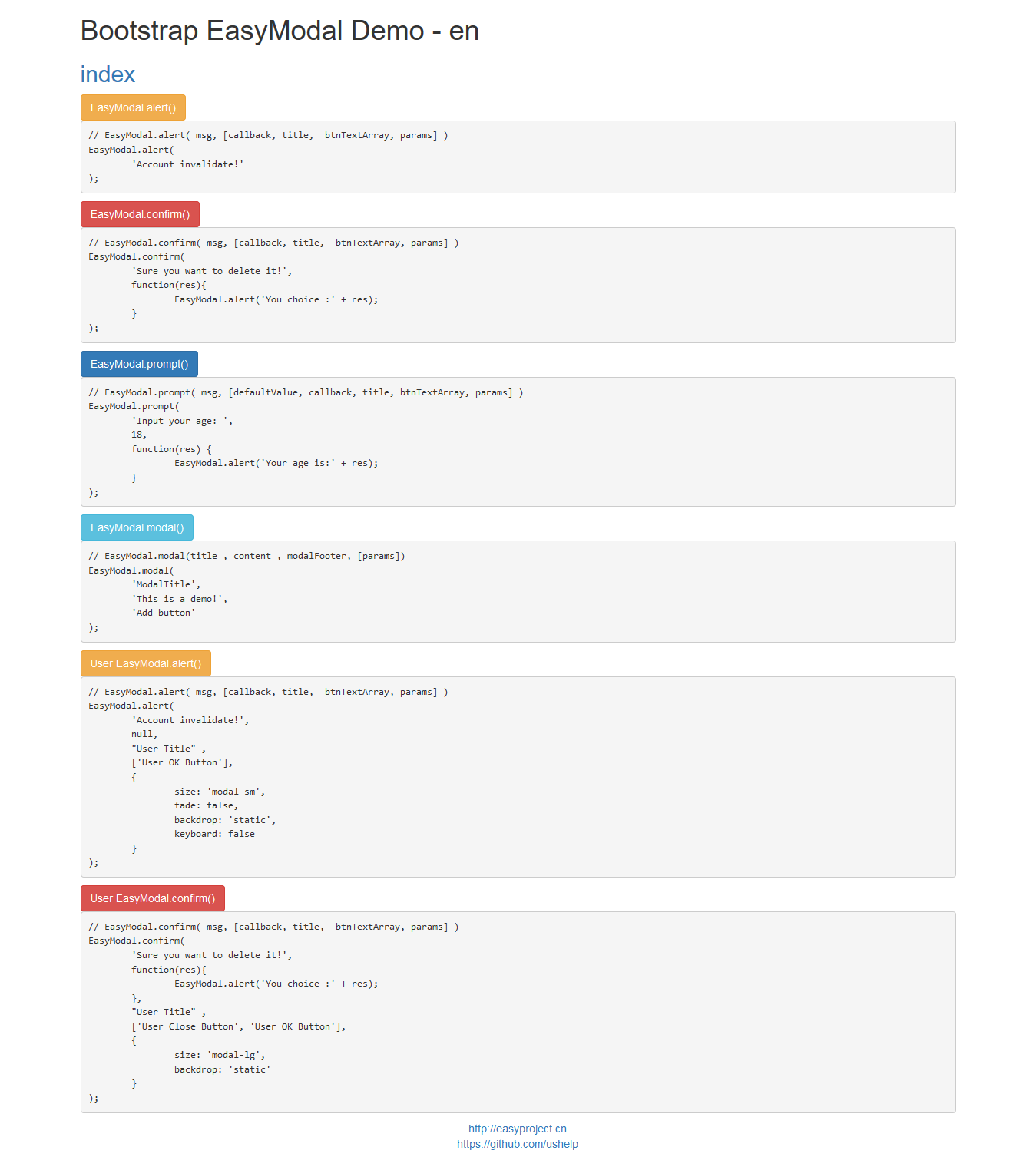
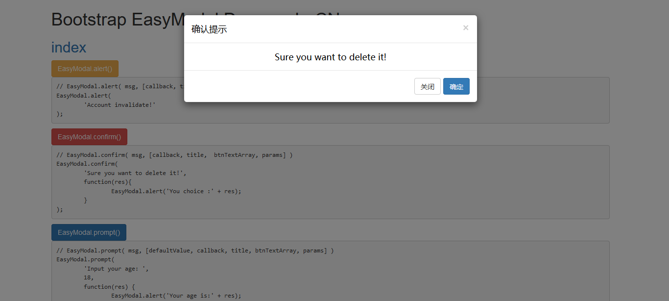
<button id="alertBtn" type="button" class="btn btn-warning">EasyModal.alert()</button><button id="confirmBtn" type="button" class="btn btn-danger">EasyModal.confirm()</button><button id="promptBtn" type="button" class="btn btn-primary">EasyModal.prompt()</button><button id="modalBtn" type="button" class="btn btn-info">EasyModal.modal()</button><button id="alertBtn2" type="button" class="btn btn-warning">User EasyModal.alert()</button><button id="confirmBtn2" type="button" class="btn btn-danger">User EasyModal.confirm()</button> $(function() { $("#alertBtn").on("click", function() { // EasyModal.alert( msg, [callback, title, btnTextArray, params] ) EasyModal.alert('Account invalidate!'); }) $("#confirmBtn").on("click", function() { // EasyModal.confirm( msg, [callback, title, btnTextArray, params] ) EasyModal.confirm('Sure you want to delete it!', function(res) { EasyModal.alert('You choice :' + res); }); }) $("#promptBtn").on("click", function() { // EasyModal.prompt( msg, [defaultValue, callback, title, btnTextArray, params] ) EasyModal.prompt('Input your age: ', 18, function(res) { EasyModal.alert('Your age is:' + res); }); }) $("#modalBtn").on("click", function() { // EasyModal.modal(title , content , modalFooter, [params]) EasyModal.modal('ModalTitle', 'This is a demo!', 'Add button'); }) $("#alertBtn2").on("click", function() { // EasyModal.alert( msg, [callback, title, btnTextArray, params] ) EasyModal.alert( 'Account invalidate!', null, "User Title" , ['User OK Button'], { size: 'modal-sm', fade: false, backdrop: 'static', keyboard: false } ); }) $("#confirmBtn2").on("click", function() { // EasyModal.confirm( msg, [callback, title, btnTextArray, params] ) EasyModal.confirm( 'Sure you want to delete it!', function(res){ EasyModal.alert('You choice :' + res); }, "User Title" , ['User Close Button', 'User OK Button'], { size: 'modal-lg', backdrop: 'static' } ); })})Demo
Document/文档
中文
如果您有更好意见,建议或想法,请联系我。
English
If you have more comments, suggestions or ideas, please contact me.
End
Email:inthinkcolor@gmail.com
支付宝钱包扫一扫捐助:
我们相信,每个人的点滴贡献,都将是推动产生更多、更好免费开源产品的一大步。
感谢慷慨捐助,以支持服务器运行和鼓励更多社区成员。

We believe that the contribution of each bit by bit, will be driven to produce more and better free and open source products a big step.
Thank you donation to support the server running and encourage more community members.