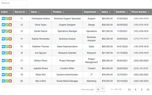
Dynamic Material Grid is a versatile Angular library that enhances your table experience. It offers:
- Server-side pagination, sorting, and searching
- Edit, view, and delete buttons
- Sticky columns for enhanced visibility
- Masking options for phone numbers, currency, and dates
- Customizable column headers
- Responsive design to fit any screen size
See the live demo here.
The source code can be found on StackBlitz here
This project was generated with Angular CLI version 14.0.0.
npm i dynamic-material-grid --saveimport { DynamicMaterialGridModule } from 'dynamic-material-grid';
@NgModule({
declarations: [
AppComponent
],
imports: [
DynamicMaterialGridModule
]
})
export class YourAppModuleClass {}To use an Angular Material prebuilt theme, add the following line to your project's styles file (e.g., styles.scss or styles.css):
@import "~@angular/material/prebuilt-themes/deeppurple-amber.css";<link
href="https://fonts.googleapis.com/icon?family=Material+Icons"
rel="stylesheet"
/>Ensure that the BrowserAnimationsModule is imported in your project. If not, add it to your module as well.
import {BrowserAnimationsModule} from '@angular/platform-browser/animations';
@NgModule({
    imports: [BrowserAnimationsModule]
    })
export class YourAppModuleClass {}Define options in your consuming component:
import { MatTableDataSource } from '@angular/material/table';

 public dataSource: any = new MatTableDataSource();

 columns: Column[] = [
{ id: `action`, label: 'Action', columnWidths: 90, sticky: true, centerAligned: true },
{ id: 'column1', label: 'Column Name 1', sticky: true, centerAligned: true },
{ id: 'column2', label: 'Column Name 2', centerAligned: true },
{ id: 'column3', label: 'Column Name 3', columnWidths: 100, centerAligned: true, phoneField : true },
{ id: 'column4', label: 'Column Name 4', width: 100, centerAligned: true , dateField : true },
{ id: 'column5', label: 'Column Name 5', centerAligned: true , currencyField : true },
];
The sticky property in a column configuration is used to make a specific column "sticky" or fixed while scrolling horizontally in a table. When sticky is set to true for a column, it means that the column will remain visible even when the user scrolls horizontally through the table.
ColumnWidths is optional parameters and can be used if you want to specify width for each columns.
Similarly you can get masking for individual column by using phoneField : true ,dateField : true , currencyField : true
The centerAligned parameter is optional and can be used to make text aligned at the center for specified columns.
When centerAligned is set to true, the text in the specified columns will be centered.
In template use <lib-dynamic-material-grid> component with your options
<!-- add on your Html page -->
 <lib-dynamic-material-grid
[headerBackgroundColor]="'#042e6f'"
[dataSource]="dataSource"
[columnsdef]="columns"
[totalRecords]="totalRecordsCount"
[isViewButton]="true"
[isEditButton]="true"
[isDeleteButton]="true"
[currentPage]="yourCurrentPage"
[pageSize]="yourPageSize"
[columnSearch]="yourColumnSearch"
(viewButtonClicked)="yourViewFunction($event)"
(editButtonClicked)="yourEditFunction($event)"
(deleteButtonClicked)="yourDeleteFunction($event)"
(searchFieldChanged)="yourFilterFunction($event)"
(pageButtonClicked)="yourPageNumberFunction($event)"
(currentPageButtonClicked)="yourCurrentPageFunction($event)"
(sortOrderChanged)="yourSortOrderFunction($event)"
(sortElementChanged)="yourSortElementFunction($event)"
(paginationChanged)="yourPaginationFunction($event)"
(closeButtonClicked)="yourClearFunction()"> </lib-dynamic-material-grid>
<!-- For Header Background Color -->
You can set the header background color using either the color name or the hexadecimal color code. Examples:
- Using color name: `[headerBackgroundColor]= "'[color name]'";`
- Using hexadecimal color code: `[headerBackgroundColor]= "'[hexadecimal code]'";`
Choose the method that suits your design preferences.Enjoy a range of features with Dynamic Material Grid, inspired by Angular Material Table:
- Server-side Pagination: Efficiently manage large datasets with server-side pagination.
- Sorting and Searching: Easily sort and search your data for quick access.
- Edit, View, Delete: Add, view, or delete rows with dedicated buttons for each operation.
- Sticky Columns: Keep essential columns in view while scrolling horizontally.
- Masking Options: Apply masks for phone numbers, currency, and dates.
Explore the full range of features to elevate your table components with Dynamic Material Grid!

