
countries-map-14
World countries datamaps component for Angular.
This package does not depend on 3rd parties
Compatible with angular version 14
Table of contents
Install
npm install --save countries-mapUsage
Import CountriesMapModule in your app.module.ts:
import { CountriesMapModule } from 'countries-map';

@NgModule({
  ...
  imports: [
    ...
    CountriesMapModule,
  ],
})
export class AppModule { }
In your templates, use the <countries-map> component like this:
<countries-map [data]="mapData"></countries-map>and in the corresponding .ts file:
import { CountriesData } from 'countries-map';
...
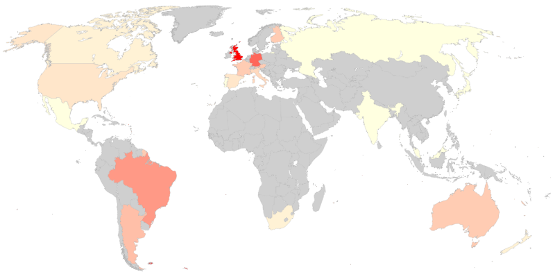
public mapData: CountriesData = {
'ES': { 'value': 416 },
'GB': { 'value': 94 },
'FR': { 'value': 255 }
};Typing
Typing the data input with CountriesData is not mandatory but it is highly recommendable because it will help you correctly define the object to pass to <countries-map>'s [data] attribute.
Attributes
Element <countries-map> accepts the following attributes/inputs:
| Attribute | Type | Default | Description |
|---|---|---|---|
data |
CountriesData |
- | Describes list of countries and their value and extra data (if any). See description for interface CountriesData. |
countryLabel |
string |
'Country' |
Caption label for country name. |
valueLabel |
string |
'Value' |
Caption label for country's value. |
showCaption |
boolean |
true |
Shows/hides caption. |
captionBelow |
boolean |
true |
Places caption below or above the map. |
minValue |
number |
- | If stated, sets the base to be used as lowest value expected in the color scale (values below minValue will have same color). |
maxValue |
number |
- | If stated, sets the base to be used as highest value expected in the color scale (values above maxValue will have same color). |
minColor |
string |
'white' |
Hex or named color representing the lowest value. |
maxColor |
string |
'red' |
Hex or named color representing the highest value. |
noDataColor |
string |
'#CFCFCF' |
Hex or named color for countries not included in data list. |
exceptionColor |
string |
'#FFEE58' |
Hex or named color for countries with value null or undefined. |
backgroundColor |
string |
'white' |
Hex or named color of the map background. |
Interface CountriesData
This interface is a convenience for describing the object to be passed to data attribute.
The list should look like this:
mapData: CountriesData = {
  'ES': { 'value': 416 },
  'GB': { 'value': 94, 'extra': { 'foo': 'bar' } },
  'FR': { 'value': 255, 'extra': { 'baz': 41 } }
};
Actual implementation:
interface CountriesData {
  [countryCode: string]: CountryData;
}
interface CountryData {
  value: number;
  extra?: CountryExtraData;
}
interface CountryExtraData {
  [key: string]: number |string;
}
Events
Element <countries-map> accepts callbacks for the following events:
chartReady
The chartReady event is fired when a chart is completely loaded.
Bind the chartReady event in the countries-map component like this:
<countries-map [data]="mapData" (chartReady)="ready()"></countries-map>Your ready() function receives no parameters. You can use it like:
public ready() {
  // your logic
}
chartError
The chartError event is fired if there are some errors with a chart.
Bind the chartError event in the countries-map component, like this:
<countries-map [data]="mapData" (chartError)="error($event)"></countries-map>Your error() function is passed an event which interface looks like this:
interface ChartErrorEvent {
  id: string | CharErrorCode;
  message: string;
  detailedMessage: string;
  options: Object;
}
You can import the ChartErrorEvent interface and CharErrorCode enum in your .ts file:
import { ChartErrorEvent, CharErrorCode } from 'countries-map';and then use it like:
public error(event: ChartErrorEvent) {
  if (event.id === CharErrorCode.loading) {
    // error was produced during loading
  }
  // your logic
}
See more details about [returned values for error event][google-charts-error-event].
chartSelect
The chartSelect event is fired when a chart is selected/clicked.
Bind the chartSelect event in the countries-map component, like this:
<countries-map [data]="mapData" (chartSelect)="select($event)"></countries-map>Your select() function is passed an event whose interface looks like this:
interface ChartSelectEvent {
  selected: boolean;
  value: number | null;
  country: string;
}
You can import the ChartSelectEvent interface in your .ts file:
import { ChartSelectEvent } from 'countries-map';and then use it like:
public select(event: ChartSelectEvent) {
  // your logic
}
Styles
You can apply styles to most of the countries-map caption area (if you decide to show it) and map container so that you can integrate your countries-map in your site's look&feel.
These are the classes you can apply styles to, hierarchically displayed, and associated to their wrappers:
-
cm-map-content: world map -
cm-caption-container: full caption area-
cm-simple-caption: main caption section (countryLabel/valueLabelarea)-
cm-country-label:countryLabelkeyword or country name (whichever is shown)-
cm-defaut-label:countryLabelkeyword -
cm-country-name: country name
-
-
cm-value-label:valueLabelkeyword or value label, plus actual value-
cm-value-text:valueLabelkeyword or value label (whichever is shown) -
cm-value-content: actual value for the current country
-
-
-
cm-extended-caption: area for the extra items-
cm-extended-item: each of the single extra items (made of key and value)-
cm-extended-label: key of the single extra item -
cm-extended-value: value of the single extra item
-
-
-
Projects
Highlighted projects currently using countries-map:
- Deflaggr: Collect world flags