ColorMode
🎨 Add color theme systme to your page with ColorMode!
Install
npm install color-modeOR Add to <script>
Download
Usage
ColorMode Dark Default 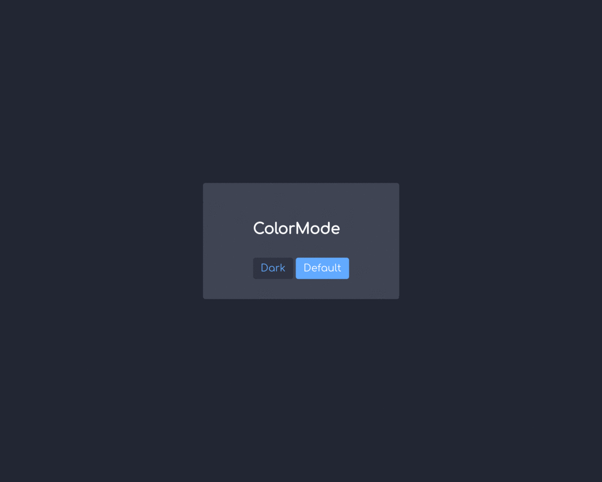
Document
Import ColorMode
// NPM<!-- HTML Script -->Create ColorMode instance
var colorMode = optionColorMode
ColorMode Class
ColorMode instance must be create once.
| Parameter | Type | Required |
|---|---|---|
| option | object | O |
option
| Property | Type | Required | Default | Description |
|---|---|---|---|---|
| initialTheme | string | X | default |
Initial theme name |
| fallbackTheme | string | X | default |
Fallback theme name |
| animation | number | X | 0 |
Theme transform effect duration |
| tags | object | O | none | Theme tags |
| themes | object | O | none | Themes |
option.tags
| Key | Value | Type | Required |
|---|---|---|---|
custom tag name |
CSS Property or Style object | string | object | O |
- (string) CSS Property:
'color','background-color','box-shadow', ... - (object) Style object:
{ color: 'dodgerblue', backgroundColor: '#e0e0e0', ... }- Property name must be CamelCase
(background-color > backgroundColor) - You can using theme's color with
@(ex:@NAMEfind 'NAME' color from theme)
- Property name must be CamelCase
/** * tags: { * TAG_NAME: 'CSS Property', * TAG_NAME: { * boxShadow: '0 0 0 5px @primary' // Using theme's 'primary' named color * } * } */ const option = // ... tags: myTag: ... fg: 'color' // string (CSS Property) bg: 'background-color' detail: // object (Style object) backgroundColor: '#2f2f2f' color: '@primary' // Find 'primary' color from 'option.themes.*' option.themes
| Key | Value | Type | Required |
|---|---|---|---|
| default | CSS Style (color code, etc..) | string | O |
custom theme name |
CSS Style (color code, etc..) | string | X |
defaulttheme required- Define
custom theme nameif you want to add theme- Each theme has style name(s)
/** * themes: { * THEME_NAME: { * STYLE_NAME: 'VALUE' * } * } */ const option = // ... themes: default: // required! tint: '#007aff' tint10: '#d8e7f9' onTint: '#ffffff' bgPrimary: '#e5e9f2' bgSecondary: '#ffffff' bgTertiary: '#eef3fc' panelBorder: '1px solid #007aff' dark: tint: '#6db3ff' tint10: '#e4ecf9' onTint: '#ffffff' bgPrimary: '#262b3a' bgSecondary: '#484d5d' bgTertiary: '#353a4b' panelBorder: '1px solid #6db3ff' myTheme: ... (Property) ColorMode.currentTheme
| Type | Description |
|---|---|
| string | Current theme name |
if colorModecurrentTheme === 'default' // If current theme is default..(Method) ColorMode.getThemeList
Return all of theme names list
const colorMode = //... themes: default: /*...*/ dark: /*...*/ rainbow: /*...*/ colorMode // ['default', 'dark', 'rainbow'](Method) ColorMode.set
Change theme to target theme
| Parameter | Type | Required |
|---|---|---|
| themeName | string | O |
// Set to 'dark' themecolorModeLicense
MIT Licensed