cem-plugin-vs-code-custom-data-generator
This project has been moved to the Custom Element VS Code Integration project.
This is a plugin automatically generates a custom data config file for VS Code using the Custom Element Manifest Analyzer.
This config enables VS Code to display autocomplete and contextual information about your custom elements.

Usage
Pre-installation
Ensure the following steps have been taken in your component library prior to using this plugin:
- Install and set up the Custom Elements Manifest Analyzer
- Create a config file
Install
npm i -D cem-plugin-vs-code-custom-data-generatorImport
// custom-elements-manifest.config.js

import { generateCustomData } from "cem-plugin-vs-code-custom-data-generator";

export default {
  plugins: [
    generateCustomData()
  ],
};
Implementation
If you don't have it already, add a VS Code settings folder and file at the root of your project - .vscode/settings.json. Then add or append the following code:
{
  "html.customData": [
    "./vscode.html-custom-data.json"
  ],
  "css.customData": [
      "./vscode.css-custom-data.json"
    ]
}
If this is included in your npm package, the VS Code configuration will look something like this:
{
  "html.customData": [
    "./node_modules/my-component-library/vscode.html-custom-data.json"
  ],
  "css.customData": [
    "./node_modules/my-component-library/vscode.css-custom-data.json"
  ]
}
Note: The path is relative to the root of the project, not the settings file.
Once it has been added, you will need to restart VS Code in order for it to register the new components. After it has been restarted, you should see autocomplete information for your custom elements!
Configuration
The configuration has the following optional parameters:
{
  /** Path to output directory */
  outdir?: string;
  /** Name of the file with you component's custom HTML data */
  htmlFileName?: string | null;
  /** Name of the file with you component's custom CSS data */
  cssFileName?: string | null;
  /** Class names of any components you would like to exclude from the custom data */
  exclude?: string[];
  /** The property name from the component object constructed by the CEM Analyzer */
  descriptionSrc?: "description" | "summary" | string;
  /** Displays the slot section of the element description */
  slotDocs?: boolean;
  /** Displays the event section of the element description */
  eventDocs?: boolean;
  /** Displays the CSS custom properties section of the element description */
  cssPropertiesDocs?: boolean;
  /** Displays the CSS parts section of the element description */
  cssPartsDocs?: boolean;
  /** Overrides the default section labels in the component description */
  /** Displays the methods section of the element description */
  methodDocs?: boolean;
  labels?: {
    slots?: string;
    events?: string;
    cssProperties?: string;
    cssParts?: string;
    methods?: string;
  };
  /** Creates reusable CSS values for consistency in components */
  cssSets?: CssSet[];
}
// custom-elements-manifest.config.js
import { generateCustomData } from "cem-plugin-vs-code-custom-data-generator";
export default {
plugins: [
generateCustomData({
/** Output directory to write the React wrappers to - default is the root of the project */
outdir: 'dist',
/** Name of the file with you component's custom HTML data */
htmlFileName: 'my-library.html-custom-data.json',
/** Name of the file with you component's custom CSS data */
cssFileName: 'my-library.css-custom-data.json',
/** class names of any components you would like to exclude from the custom data */
exclude: ['MyInternalElement'],
/** The property name from the component object constructed by the CEM Analyzer */
descriptionSrc: "description",
/** Displays the slot section of the element description */
slotDocs: true,
/** Displays the event section of the element description */
eventDocs: true,
/** Displays the CSS custom properties section of the element description */
cssPropertiesDocs: true,
/** Displays the CSS parts section of the element description */
cssPartsDocs: true,
/** Displays the methods section of the element description */
methodDocs: true,
/** Overrides the default section labels in the component description */
labels: {
slots: "Slot Section",
events: "Custom Events",
cssProperties: "CSS Variables",
cssParts: "Style Hooks",
methods: "Functions"
},
/** Creates reusable CSS values for consistency in components */
cssSets: [
{
name: "radiuses",
values: [
{ name: "--radius-sm", description: '2px' },
{ name: "--radius-md", description: '4px' },
{ name: "--radius-lg", description: '8px' },
],
},
],
}),
],
};Example
Here is a basic example of a component configuration using jsDoc:
/**
*
* Radio groups are used to group multiple radio buttons so they function as a single form control.
*
* Here is the [documentation](https://my-site.com/docs.md).
*
* Use it like this:
* ```html
* <radio-group value="2" size="3">
* <span slot="label">My Label</span>
* <radio-button value="1">Option 1</radio-button>
* <radio-button value="2">Option 2</radio-button>
* <radio-button value="3">Option 3</radio-button>
* </radio-group>
* ```
*
* @tag radio-group
* @tagname radio-group
*
* @attr {boolean} disabled - Disables the element
* @attribute {string} value - The value of the selected radio
* @attribute {1,2,3,4} size - This will control the size of radio buttons
*
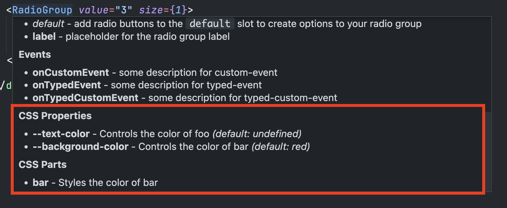
* @csspart bar - Styles the color of bar
*
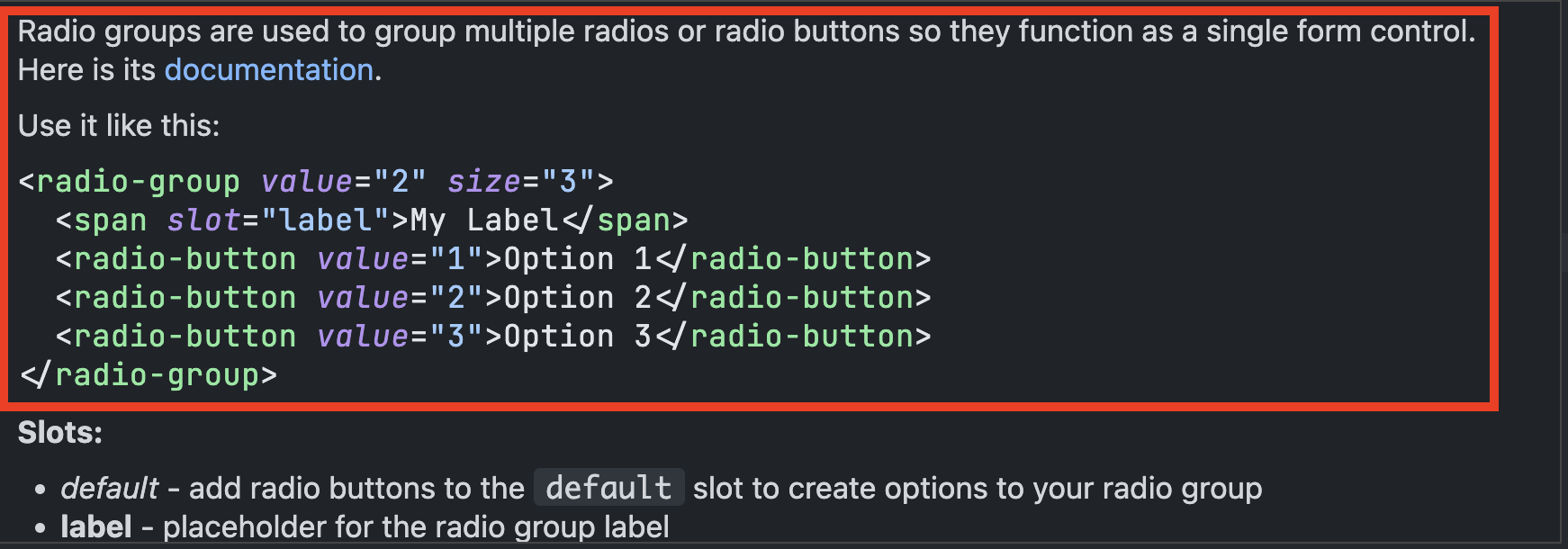
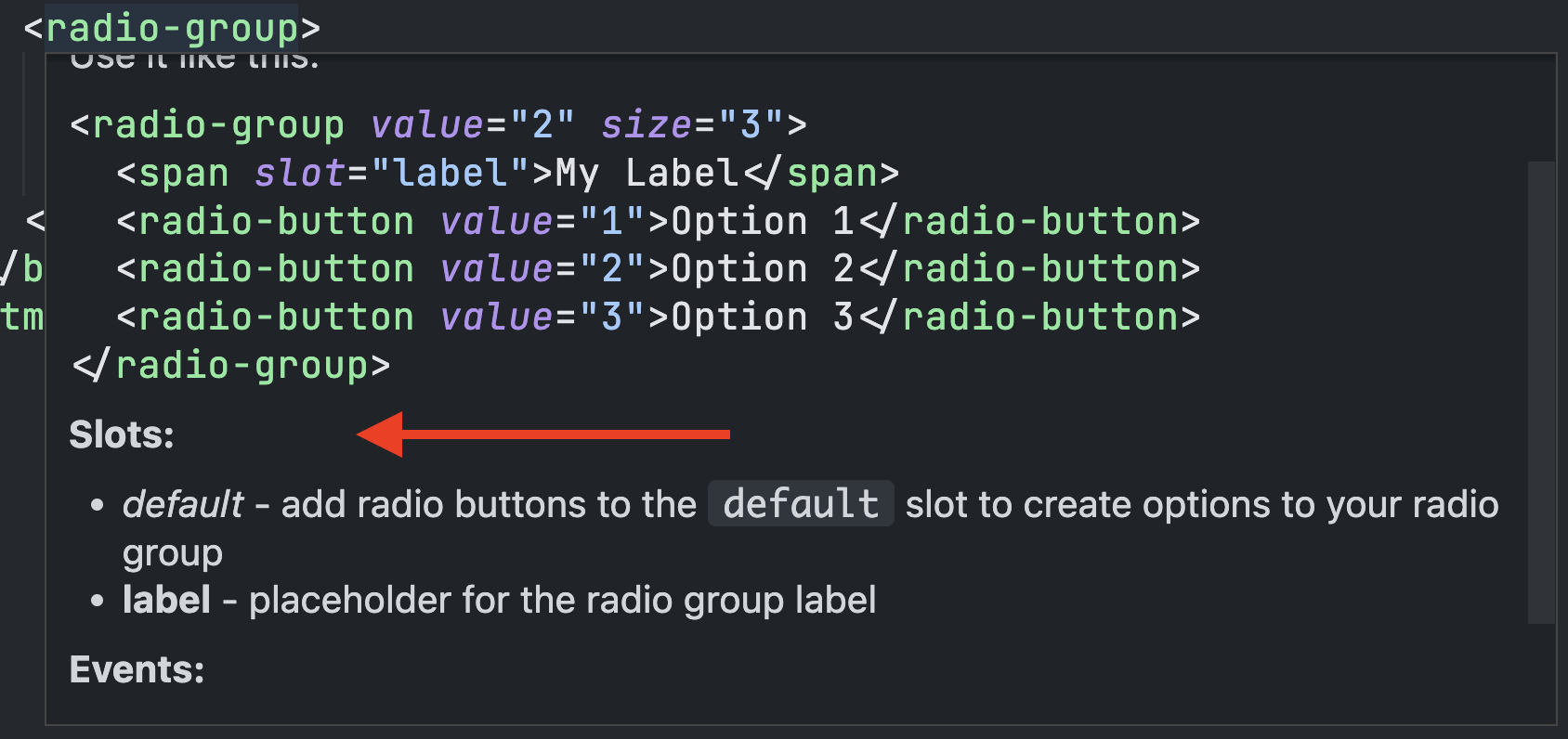
* @slot - add radio buttons to the `default` slot to create options to your radio group
* @slot label - placeholder for the radio group label
*
* @cssprop {--radius-sm|--radius-md|--radius-lg} --border-radius - Controls the color of foo
* @cssproperty [--background-color=red] - Controls the color of bar
*
* @prop {boolean} prop1 - this toggles some unseen feature
* @property {number} prop2 - this will adjust the width of the unit
*
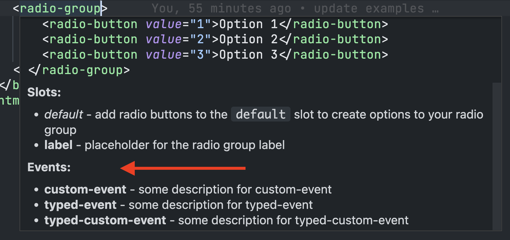
* @fires custom-event - some description for custom-event
* @fires {Event} typed-event - some description for typed-event
* @event {CustomEvent} typed-custom-event - some description for typed-custom-event
*
* @reference Documentation - https://my-site.com/docs
* @reference MDN - https://developer.mozilla.org/en-US/
*
*/
class RadioGroup extends HTMLElement {}Omitting File Output
If you would like to exclude the HTML or CSS output, you can do so by setting the htmlFileName or cssFileName properties to null.
Tag Mapping

| Tag | Description |
|---|---|
@summary / description |
This provides the description for the custom element when autocomplete is used or the element is hovered. If no summary is provided, it will fall back to the description if it is available. |
@attr / @attribute
|
This will provide descriptions for each attribute. If you use union types in TypeScript or in the description, these will display as autocomplete options. Values can also be defined in the jsDoc using comma or pipe delimited values |
@reference |
This is a custom tag for this plugin. It creates reference links at the bottom of the information bubble. Multiple references are supported. |
The @summary and @attr / @attribute descriptions have limited markdown support and enable you to style text, create links, and add code snippets.
Descriptions
Using the descriptionSrc configuration, you can determine the source of the text that gets displayed in the editor autocomplete bubble. This is useful if you want to provide alternate descriptions for your React users.
If no value is provided, the plugin will use the summary property and then fall back to the description property if a summary is not available.
Note: Descriptions support multiple lines by breaking the comment up into multiple lines whereas summaries do not and will need to be manually added using \n.
// description example

/**
 *
 * Radio groups are used to group multiple radios or radio buttons so they function as a single form control. Here is its [documentation](https://my-docsite.com).
 *
 * Use it like this:
 * ```html
 * <radio-group value="2" size="3">
 *   <span slot="label">My Label</span>
 *   <radio-button value="1">Option 1</radio-button>
 *   <radio-button value="2">Option 2</radio-button>
 *   <radio-button value="3">Option 3</radio-button>
 * </radio-group>
 * ```
 *
 */
// summary example
/**
*
* @summary Radios buttons allow users to select a single option from a group. Here is its [documentation](https://my-site.com/documentation).\n\nUse it like this:\n```html\n<radio-button value="1" disabled>Your label</radio-button>\n```
*
* /Slot Documentation
Slot information will display with the element description during autocompletion or when hovered over. This section can be hidden by setting slotDocs to false in the config.
Event Documentation
Event information will display with the element description during autocompletion or when hovered over. This section can be hidden by setting eventDocs to false in the config.
Method Documentation
Methods will display if they are public and have a description. This section can be hidden by setting methodDocs to false in the config.
CSS Documentation
Component-specific CSS Properties and CSS Parts are included in the component documentation. These can be hidden using the cssPropertiesDocs and cssPartsDocs configuration options respectively.
Documentation Labels
There may be instances where you may want to translate or override the default section headers. Using the labels configuration you can change one or all of the headers for the component description sections.
// custom-elements-manifest.config.js
export default {
  plugins: [
    generateCustomData({
      ...

      /** Overrides the default section labels in the component description */
      labels: {
        slots: "Placeholders",
        events: "事件",
        cssProperties: "Propiedades CSS",
        cssParts: "Style Hooks",
        methods: "Actions"
      },
    }),
  ],
};
CSS Custom Data
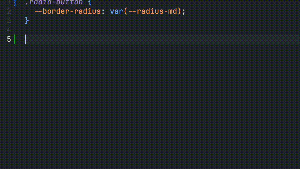
Adding the CSS Custom Data file to your config provides you with autocomplete for your component's CSS custom properties.
These values can be added in your component's jsDoc. The var() wrapper will be added automatically if they are prefixed with --.
/**
 *
 * @cssprop {--radius-sm|--radius-md|--radius-lg} --border-radius - Controls the border radius of the component
 *
 */
CSS Sets
You can define reusable CSS values to simplify your efforts and provide greater consistency from one component to another.
First, define your sets in the config. Values can be an object array with a name and optional description or they can be a simple string array.
// custom-elements-manifest.config.js

import { generateCustomData } from "cem-plugin-vs-code-custom-data-generator";

export default {
  plugins: [
    generateCustomData({
      cssSets: [
        {
          name: "radiuses",
          values: [
            { name: "--radius-sm", description: '2px' },
            { name: "--radius-md", description: '4px' },
            { name: "--radius-lg", description: '8px' },
          ],
        },
        {
          name: "spacing",
          values: [
            '2px',
            '4px',
            '8px',
            '12px',
            '16px'
          ],
        },
      ],
    }),
  ],
};
Once they are defined, you can reference them in your components jsDoc by prefixing it with set: and providing the name of the set.
/**
 *
 * @cssprop {set:radiuses} --border-radius - Controls the border radius of the component
 *
 */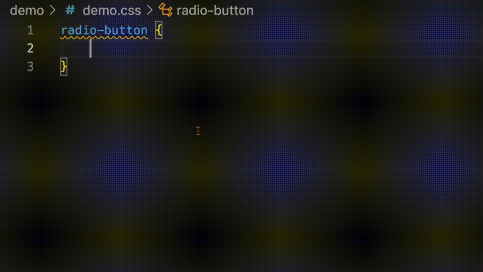
CSS Parts
Developers will also receive autocomplete for defined CSS parts.
/**
 *
 * @csspart radio-label - Applies custom styles the radio group label
 *
 */