Responsive Shopping Carts built with Bootstrap 5. Multiple examples of various designs and functionalities. Ready to use pages and templates.
Check out Bootstrap Shopping Carts Documentation for detailed instructions & even more examples.
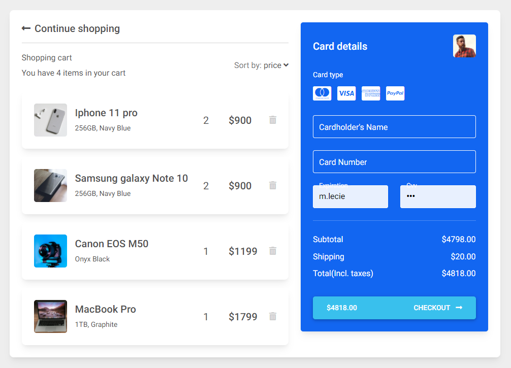
Basic example
<section class="h-100 h-custom" style="background-color: #eee;">
<div class="container py-5 h-100">
<div class="row d-flex justify-content-center align-items-center h-100">
<div class="col">
<div class="card">
<div class="card-body p-4">
<div class="row">
<div class="col-lg-7">
<h5 class="mb-3"><a href="#!" class="text-body"><i
class="fas fa-long-arrow-alt-left me-2"></i>Continue shopping</a></h5>
<hr>
<div class="d-flex justify-content-between align-items-center mb-4">
<div>
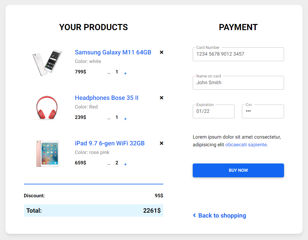
<p class="mb-1">Shopping cart</p>
<p class="mb-0">You have 4 items in your cart</p>
</div>
<div>
<p class="mb-0"><span class="text-muted">Sort by:</span> <a href="#!"
class="text-body">price <i class="fas fa-angle-down mt-1"></i></a></p>
</div>
</div>
<div class="card mb-3">
<div class="card-body">
<div class="d-flex justify-content-between">
<div class="d-flex flex-row align-items-center">
<div>
<img
src="https://mdbcdn.b-cdn.net/img/Photos/new-templates/bootstrap-shopping-carts/img1.webp"
class="img-fluid rounded-3" alt="Shopping item" style="width: 65px;">
</div>
<div class="ms-3">
<h5>Iphone 11 pro</h5>
<p class="small mb-0">256GB, Navy Blue</p>
</div>
</div>
<div class="d-flex flex-row align-items-center">
<div style="width: 50px;">
<h5 class="fw-normal mb-0">2</h5>
</div>
<div style="width: 80px;">
<h5 class="mb-0">$900</h5>
</div>
<a href="#!" style="color: #cecece;"><i class="fas fa-trash-alt"></i></a>
</div>
</div>
</div>
</div>
<div class="card mb-3">
<div class="card-body">
<div class="d-flex justify-content-between">
<div class="d-flex flex-row align-items-center">
<div>
<img
src="https://mdbcdn.b-cdn.net/img/Photos/new-templates/bootstrap-shopping-carts/img2.webp"
class="img-fluid rounded-3" alt="Shopping item" style="width: 65px;">
</div>
<div class="ms-3">
<h5>Samsung galaxy Note 10 </h5>
<p class="small mb-0">256GB, Navy Blue</p>
</div>
</div>
<div class="d-flex flex-row align-items-center">
<div style="width: 50px;">
<h5 class="fw-normal mb-0">2</h5>
</div>
<div style="width: 80px;">
<h5 class="mb-0">$900</h5>
</div>
<a href="#!" style="color: #cecece;"><i class="fas fa-trash-alt"></i></a>
</div>
</div>
</div>
</div>
<div class="card mb-3">
<div class="card-body">
<div class="d-flex justify-content-between">
<div class="d-flex flex-row align-items-center">
<div>
<img
src="https://mdbcdn.b-cdn.net/img/Photos/new-templates/bootstrap-shopping-carts/img3.webp"
class="img-fluid rounded-3" alt="Shopping item" style="width: 65px;">
</div>
<div class="ms-3">
<h5>Canon EOS M50</h5>
<p class="small mb-0">Onyx Black</p>
</div>
</div>
<div class="d-flex flex-row align-items-center">
<div style="width: 50px;">
<h5 class="fw-normal mb-0">1</h5>
</div>
<div style="width: 80px;">
<h5 class="mb-0">$1199</h5>
</div>
<a href="#!" style="color: #cecece;"><i class="fas fa-trash-alt"></i></a>
</div>
</div>
</div>
</div>
<div class="card mb-3 mb-lg-0">
<div class="card-body">
<div class="d-flex justify-content-between">
<div class="d-flex flex-row align-items-center">
<div>
<img
src="https://mdbcdn.b-cdn.net/img/Photos/new-templates/bootstrap-shopping-carts/img4.webp"
class="img-fluid rounded-3" alt="Shopping item" style="width: 65px;">
</div>
<div class="ms-3">
<h5>MacBook Pro</h5>
<p class="small mb-0">1TB, Graphite</p>
</div>
</div>
<div class="d-flex flex-row align-items-center">
<div style="width: 50px;">
<h5 class="fw-normal mb-0">1</h5>
</div>
<div style="width: 80px;">
<h5 class="mb-0">$1799</h5>
</div>
<a href="#!" style="color: #cecece;"><i class="fas fa-trash-alt"></i></a>
</div>
</div>
</div>
</div>
</div>
<div class="col-lg-5">
<div class="card bg-primary text-white rounded-3">
<div class="card-body">
<div class="d-flex justify-content-between align-items-center mb-4">
<h5 class="mb-0">Card details</h5>
<img src="https://mdbcdn.b-cdn.net/img/Photos/Avatars/avatar-6.webp"
class="img-fluid rounded-3" style="width: 45px;" alt="Avatar">
</div>
<p class="small mb-2">Card type</p>
<a href="#!" type="submit" class="text-white"><i
class="fab fa-cc-mastercard fa-2x me-2"></i></a>
<a href="#!" type="submit" class="text-white"><i
class="fab fa-cc-visa fa-2x me-2"></i></a>
<a href="#!" type="submit" class="text-white"><i
class="fab fa-cc-amex fa-2x me-2"></i></a>
<a href="#!" type="submit" class="text-white"><i class="fab fa-cc-paypal fa-2x"></i></a>
<form class="mt-4">
<div class="form-outline form-white mb-4">
<input type="text" id="typeName" class="form-control form-control-lg" siez="17"
placeholder="Cardholder's Name" />
<label class="form-label" for="typeName">Cardholder's Name</label>
</div>
<div class="form-outline form-white mb-4">
<input type="text" id="typeText" class="form-control form-control-lg" siez="17"
placeholder="1234 5678 9012 3457" minlength="19" maxlength="19" />
<label class="form-label" for="typeText">Card Number</label>
</div>
<div class="row mb-4">
<div class="col-md-6">
<div class="form-outline form-white">
<input type="text" id="typeExp" class="form-control form-control-lg"
placeholder="MM/YYYY" size="7" id="exp" minlength="7" maxlength="7" />
<label class="form-label" for="typeExp">Expiration</label>
</div>
</div>
<div class="col-md-6">
<div class="form-outline form-white">
<input type="password" id="typeText" class="form-control form-control-lg"
placeholder="●●●" size="1" minlength="3" maxlength="3" />
<label class="form-label" for="typeText">Cvv</label>
</div>
</div>
</div>
</form>
<hr class="my-4">
<div class="d-flex justify-content-between">
<p class="mb-2">Subtotal</p>
<p class="mb-2">$4798.00</p>
</div>
<div class="d-flex justify-content-between">
<p class="mb-2">Shipping</p>
<p class="mb-2">$20.00</p>
</div>
<div class="d-flex justify-content-between mb-4">
<p class="mb-2">Total(Incl. taxes)</p>
<p class="mb-2">$4818.00</p>
</div>
<button type="button" class="btn btn-info btn-block btn-lg">
<div class="d-flex justify-content-between">
<span>$4818.00</span>
<span>Checkout <i class="fas fa-long-arrow-alt-right ms-2"></i></span>
</div>
</button>
</div>
</div>
</div>
</div>
</div>
</div>
</div>
</div>
</div>
</section>@media (min-width: 1025px) {
.h-custom {
height: 100vh !important;
}
}How to use?
-
Download MDB 5 - free UI KIT
-
Choose your favourite customized component and click on the image
-
Copy & paste the code into your MDB project
More examples
More extended Bootstrap documentation
- Bootstrap Address Form
- Bootstrap Avatar
- Bootstrap Back To Top Button
- Bootstrap Carousel Slider with Thumbnails
- Bootstrap Chat
- Bootstrap Code Blocks
- Bootstrap Comments
- Bootstrap Comparison Table
- Bootstrap Credit Card Form
- Bootstrap Drawer
- Bootstrap Nested Dropdown
- Bootstrap FAQ component / section
- Bootstrap Gallery
- Bootstrap Hamburger Menu
- Bootstrap Invoice
- Bootstrap Jumbotron
- Bootstrap Login Form
- Bootstrap Maps
- Bootstrap Media Object
- Bootstrap Mega Menu
- Bootstrap Multiselect
- Bootstrap News Feed
- Bootstrap Offcanvas
- Bootstrap Order Details
- Bootstrap Page Transitions
- Bootstrap Payment Forms
- Bootstrap Product Cards
- Bootstrap Profiles
- Bootstrap Quotes
- Bootstrap Registration Form
- Bootstrap Expanding Search Bar
- Bootstrap Shopping Carts
- Bootstrap Side Navbar
- Bootstrap Sidebar
- Bootstrap Social Media Icons & Buttons
- Bootstrap Square Buttons
- Bootstrap Survey Form
- Bootstrap Testimonial Slider
- Bootstrap Testimonials
- Bootstrap Textarea
- Bootstrap Timeline
- Bootstrap To Do List
- Bootstrap Video Carousel / Gallery
- Bootstrap Weather