bDialog
A can be multi-layer nested, highly customizable powerful dialog plugin, dialog type including modal dialog, alert dialog, mask layer, toast dialog
Guide、Demo、Docs
Explorer on
If you think the project is also good, please add a Star to the project to support the work of the author, Thank you
Plugin Preview
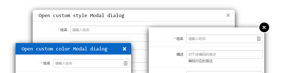
Modal Mode
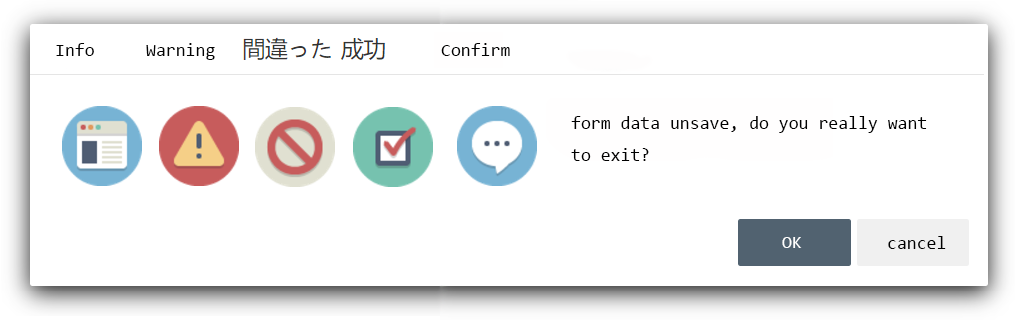
Alert Mode
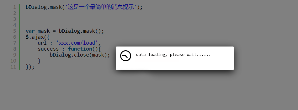
Mask Mode
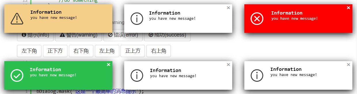
Toast Mode
What is bDialog
bDialog can be multi-layer nested, highly customizable powerful dialog plugin, dialog type including modal dialog, alert dialog, mask layer, toast dialog. bDialog is basis on Boostrap Modal plugin
Key Features
- jQuery plugin, on Bootstrap Modal plugin basis to extend
- can open multi-layer Nested modal dialog
- can open info、warning、error、success、confirm types of alert dialog
- can open mask layer block all element when data loading
- can open toast dialog, have info、warning、error、success type and 6 corner position
- flexible style setting
- When the browser size changes, the window is automatically repositioned to the center of the browser
- dialog area outside the click, the window automatically positioning and other scenes have a corresponding reminder animation
- rich callback function
- brower supper IE8+,chrome,firefox
The Alert Dialog Icon
the icons in alert dialog used are made by Elegant Themes
License
MIT
Why
bDialog development at the beginning, the purpose is to unify the development team for Bootstrap Modal use, such as a unified set of background click does not close the window, close the bottom button area, unified set parameters to receive, callback function and other basic functions; follow-up is to focus on the window Multi-layer nested open functional requirements, in particular, to solve the damn IE8 multi-level nested open will lead to the collapse of the browser.
bDialog for the use of Bootstrap as a base UI framework in the project, while more want to use Bootstrap original ecological components of the group.
bootstrap native modal function components, the function is relatively weak, bDialog does not remake the wheels, on the basis of Bootstrap Modal make it more powerful, more useful, more customizable, making it more in line with the development of functional requirements, through continuous functional improvement and problems Repair, bDialog plugin has been updated to the present. Over the past few years through a number of teams and the use of multiple projects, hope bDialog can make more teams, individuals benefit.
How to use bDialog
Install
download bDialog plugin zip file by last release, or Click me to download bDialog
Usage
As you can see in the Demo page, you will need to include:
- jQuery library (1.6.0+), untest on jquery2.x & 3.x
- The JavaScript file b.dialog.js (or its minified version b.dialog.min.js)
- The css file b.dialog.bootstrap3.css for bootstrap3.x , b.dialog.css for bootstrap2.x
Including files
<!-- include for Bootstrap2.x --><!-- include for Bootstrap3.x --><!-- Above the css file under your css framework choose one of them to include --> <!-- jquery-ui draggable liabrary if you need dialog drag function -->Javascript init plugin
bDialog;Quick Demo
//Modal :bDialog;bDialog; //Alert :bDialog;bDialog; //Mask :bDialog; //Toast :bDialog;bDialog;Options
-
backdrop
string | boolean
default : 'static'
the dialog backdrop layer set- 'static' : click the backdrop can not close the dialog
- false : do not show backdrop
- true : show backdrop, but click the backdrop will close dialog
-
title
string | boolean
default : '对话框'
set text to show in title bar,setfalseto close the title bar -
language
string
default : 'cn'
dialog using language
| Code | Language |
|---|---|
| cn | chinese |
| en | english |
| jp | japanse |
-
width
number
default : 700
dialog width, only work on modal dialog mode -
height
number
default : 400
dialog height, only work on modal dialog mode -
animation
boolean
default : true
whether show animation when dialog open -
dialogCloseButton
boolean
default : true
whether show the 'X' close button -
dialogMaxButton
boolean
default : true
whether show maximize button -
closeButton
boolean
default : false
whether to close dialog bottom bar, only work in Modal dialog mode -
scroll
boolean
default : true
whether to display the scroll bar -
drag
boolean
default : true
whether to allow the window to be draggedthe drag function is depend on jquery-ui draggable liabrary,if not include it, drag function will auto close
-
url
string
default : false
the remote page url open in modal dialog -
params
object
default : undefined
pass the parameters to the new open modal dialog, in the new modal dialog you can get parameters like thisvar params = bDialog;example
params :name : 'Michael'num : 23 -
dom
object
default : undefined
the html element or javascript object or jquery object to show in modal dialog -
fullWidth
boolean
default : false
whether to show full width modal dialog -
customClass
string
default : undefined
specify custom style class name -
show
boolean
default : false whether show dialog when dialog init finish -
onShow
function
default : undefined
before dialog show callback -
onShowed
function
default : undefined
when the dialog has been made visible to call this callback -
onHide
function
default : undefined
before dialog close callback -
onHidden
function
default : undefined
when dialog completely close callback -
callback
function
default : undefined
when dialog close callback, this callback different from others callback its can be return data to caller.
param
dataobjectreturn to caller data
example{ifdata && dataresults && dataresultslength > 0;}//the param data is come frombDialog; -
messageType
string
default : 'info'
setup alert dialog, toast dialog type, the full type is- info(default)
- warning
- error
- success
- confirm(only work on alert dialog)
the different type will show different icon
-
position
string
default : 'bottomRight'
toast dialog display position, the full position is- topLeft
- topCenter
- topRight
- bottomLeft
- bottomCenter
- bottomRight(default)
-
closeTime
number
default : 3(second)
auto close toast dialog time, set 0 to disabled auto close dialog -
cancel
function
default : undefined
when alert dialog mode, and alert type is confirm, this callback is used to the cancel button callback
example{bDialog;}
API
- open
open a modal dialog
param- params example
bDialog;//so simple to open a remote page in modal dialog - close
close opened dialog (modal, alert, mask)
param- data
objectreturn to caller data - [dialog]
objectoptional to set, if you have a opened dialog object,you can directly to it. if no setup this param, plugin will close the last open dialog example
bDialog;//close and return data(last open dialog)var dlg = bDialog;; - data
- getDialog
get last opened dialog (modal, alert, mask)var dlg = bDialog; - getDialogParams
get params data from open dialog paramsin the opened modal dialog, you can get params like thisbDialog;var params = bDialog;; - alert
open a message alert dialog, the alert dialog can be info, warning, error, success, confirm types param- message
stringthe message show in alert dialog - callback
functionclose alert dialog callback - params
objectsetup alert dialog params
bDialog;//just show messagebDialog;//show message and do something when alert dialog closebDialog;//show message, callback,and setup init params - message
- mask
param- message
- params
bDialog;//show a block every element layer and default prompt messagebDialog;//show a mask and custom text - toast
param- message
- params
//show a corner toast dialog, default position on bottomRightbDialog;bDialog;