
Awesome React Stepper
Highly Customizable Multi Stepper Component for React 🚀


Overview 🚀
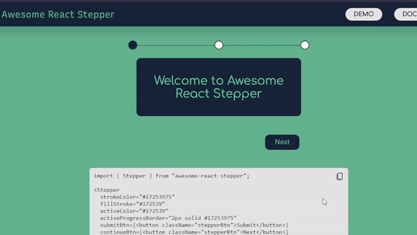
Awesome React Stepper is a component library for building highly customizable multi stepped component. This library helps you to break the process of a form or flow into certain steps with availability of progress bars, customizable action buttons, responsiveness and developer friendly library. You can hide/unhide progress bar as per your needs. Action buttons can also be replaced with your theme and requirement. Hence, a perfect solution for your stepper functionality.
Read the complete in detail documentation on the website.
Getting Started 🎬
To use Awesome React Stepper, install the NPM package.
Install NPM Package
npm install awesome-react-stepperOr
yarn add awesome-react-stepperImport And Use
import Stepper from "awesome-react-stepper";
...
function StepperComponent(props) {
    return (
        ...
        <Stepper>
          <div>
            <h1>Welcome to Awesome React Stepper</h1>
          </div>
          <div>
            <h1>Add your content here!!!</h1>
          </div>
          <div>
            <h1>Thank you for using Awesome React Stepper</h1>
          </div>
        </Stepper>
        ...
    );
}
export default StepperComponent
Demo
To view a DEMO, click here
Documentation
For other features of the stepper to make it customizable, check the documentation.
Contributing 💡
All suggestions and ideas are welcomed. Please don't hesitate to open an pull request or issue.
To contribute to this project, take a look at the contributing guide.
License 📄
LICENSED UNDER THE MIT LICENSE