Angular Percent Circle Directive

AngularJS directive for adding animated percent circle.
Getting started
Install via Bower or Node
bower install --save angular-percent-circle-directiveor
npm install --save angular-percent-circle-directiveLink to CSS File
Alternatively, if you are using Sass, you can import the provided .scss file into your library
;Add Script Tag
Include the percentCircle-directive dependency in your Angular App
var app = angular;That's it! The directive should now be ready to use.
How to use it
Call the Directive
Enter the percent-circle tag into your HTML where you would like the percent circle to appear.
percent is a required attribute. It can either be a number or the name of the scope variable where the percent number is stored (myPercentModel, in the above case).
Customize the Colors
The directive takes an optional attribute called colors. The value should be an object with one or all of the following keys:
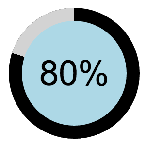
center : 'lightBlue' // the color in the center of the circle. Default: #F5FBFC highlight : 'black' // the highlighted section of the circle, representing the percentage number. Default: #2BCBED remaining : 'lightGrey' // the color of the circle before highlighting occurs, representing the amount left until the percent equals 100. Default: #C8E0E8The above customization would appear as:
Add the colors attribute to the percent-circle HTML tag like this:
The above will change the center of the circle to be green, but continue to use the default colors for highlight and remaining.
Customize the Speed
The directive takes an optional attribute called speed. The value should be a number representing the amount of milliseconds between each percentage increment. Default is 10.
Add the speed attribute to the percent-circle HTML tag like this:
If you do not want the animation, simply set the speed attribute to false.
Now the percent circle will jump to the provided percent without incrementing.