
AngularOpenDatagrid
Demo
Install
npm install angular-open-datagrid --save
Usage
Import app.module.ts
;Add to the Imports @NgModule
imports: BrowserModule AppRoutingModule AngularOpenDatagridModule Use
Icons
For icons install font-awesome
npm install font-awesome --saveand include css in src/styles.scss
;Table Options
New Options Introduced
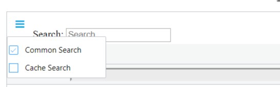
- Common Search: Enable common search for the table
- Cache Search: Cache the search for the table
Pagination
- pagination [boolean]: Enable pagination for the table.
- pageSize [number]: Page size for the table. If pagination enabled the page size is the rows in each page.
Events
dataChanged [event]
Get data change event with parameters.
HTML
JavaScript
{ console; }dataFiltered [event]
Get data change event with parameters.
HTML
JavaScript
{ console; }##### Filter Change Event Parameters
isCommon[boolean]: If filter triggered through common filter.
column[number]: If the filter tiggered from any particular column. This field exists if only isCommon=false.
data[Array]: Filter values.
dataSorted [event]
Get column sort event with parameters.
HTML
JavaScript
{ console; }##### Sorted Event Parameters column[number]: Sort tiggered column.
type[string]: Sort type ascending(ASC) or descending (DESC).
columnRearranged [event]
Get column re-arrange event with parameters.
HTML
JavaScript
{ console; } ##### Re-arrange Event Parameters column[number]: Re-arranged column number.
movedTo[number]: Final column index of the column.
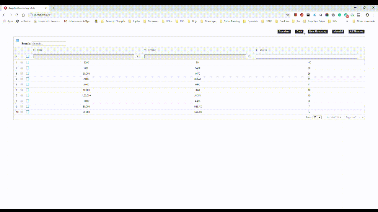
Themes
- theme [string]: Theme based table. The available themes are as follows
- Matrial Theme (metrial-theme)
- Dark Theme (dark-theme)
- Standard Theme (standard-theme)
- Red Theme (red-theme)
Column Definitions
Mandatory Options
- headerName [string]: Header name of the particular column
- field [string]: Field name mapping to the data rows.
- width [number]: Width of the column in pixel.
- sort [boolean]: Column is sortable.
- filter [boolean]: Can filter can be filtered.
colunDefs headerName: 'Model' field: 'model' width: '40px' sort: true filter: trueOptional Options
- columnFilter [boolean]: This filter is group similar values and make a Special filter for the particular column.
- isEdit [boolean]: Editable the prticular column.
- cellRender [function(row, column, data, colDef)]: Custom column renderer.
Column Definition Example
columnDefs headerName: 'Model' field: 'model' width: '40' sort: true filter: true { return '<a href="#">' + data + '</a>'; } headerName: 'Make' isEdit: true field: 'make' width: '40px'......Rows
Simply array of data. Example:
rowData: make: 'Toyota' model: 'Celica' price: 35000 'mileage': 30 color: 'red' make: 'Ford' model: 'Mondeo' price: 32000 'mileage': 50 color: 'green' ........................................................................... Binding data with table component
Notable Features
- Theme based data table
- Column is re-arrangeable using drag-drop
- Row arrangable.
- Nice animation for visualization.
- Edit Cell
- Copy paste like Microsoft Excel.
- Export the data as CSV.
Demo
- Download the zip.
- Unzip and open CMD and type npm start.
Future Timeline
- Make more fast and smooth.